Disclaimer: While we only recommend products we know and love, we want to note we use affiliate links and may earn a commission for purchases made through those links.
In an earlier post, we described how easy creating your own business letterhead can be in Microsoft Word. Well, they say a picture is worth a thousand words, so a video must be worth . . . a whole lot of words!
We really wanted to be able to show how easy some of our DIYs really are, and how better to do that than in live action? (The task of creating letterhead is done in about two minutes.)
So welcome to our first video . . . . Hope you enjoy it!
Disclaimer: While we only recommend products we know and love, we want to note we use affiliate links and may earn a commission for purchases made through those links.
Every business should have a custom thank you card on file – the piece gives you the opportunity to express appreciation to your customers, employees, business partners, or anyone else deserving of thanks while reinforcing your business’s brand; also, I love gestures that have double-duty impact at minimal (almost no) cost.
So, in case you don’t already have one of these gems saved on your hard drive, I’m going to take you through the process of making a 2-on double-sided 5×7” branded Thank You card in Microsoft Word.
1. Open Microsoft Word and create a New Blank Document. Change the margins of the page by selecting the Layout tab (at the top), clicking the Margins button, selecting Custom Margins, and changing the Top, Bottom, Left, and Right margins to .25 inches.
2. Click the Insert tab (at the top), click Text Box within the Text section, and select Simple Text Box. Click the outline of the rectangle, hover over the center handle of the bottom line, and click and drag downward to increase the size just a bit. Then, right click on the rectangle, choose More Layout Options…, click the Size tab, input a Height of 5”, select Absolute within the Width section and input 7”; click the Position tab and uncheck “Move object with text” from the Options section. Next, right click the rectangle and select Format Shape. Format the Fill as No Fill and the Line as a Solid Line, Black, 1pt in Width, and Dashed. Now your text box is ready to be customized.
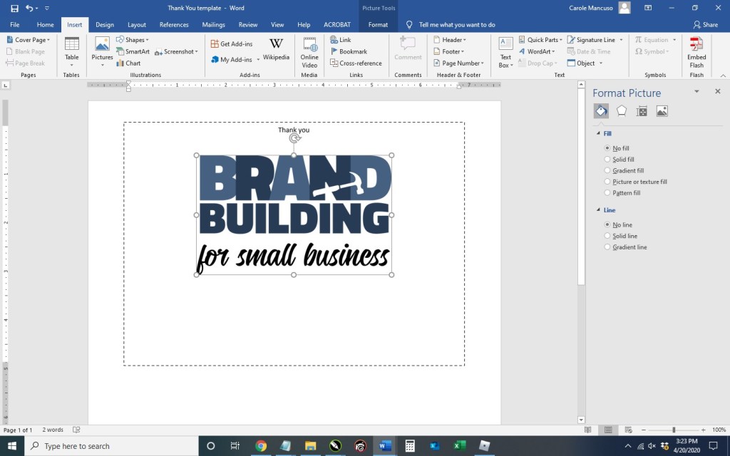
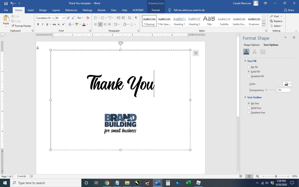
Click the content within the rectangle, which will select everything, and press delete. Set the alignment to centered by pressing Ctrl + E and then type “Thank You”. Press the enter key to advance a couple lines spaces and then insert your logo (Insert tab > Pictures > This Device > browse to the image file for your logo > Insert).
Now you’re obviously going to want to do some formatting. I decrease the size of our logo to 1” in height (the width automatically adjusts proportionately), change the font of “Thank You” to Candellion in 80 pt. and add some line spaces.
3. With the rectangle selected, press Ctrl + C and then Ctrl + V to make a copy. Click and drag the outline of the second rectangle to move about a quarter of an inch from the bottom of the first and horizontally centered on the page (indicated with a green guideline).
4. Duplicate the page: press Ctrl + A to select all the content on the page, press the Insert tab (towards the top), click Blank Page in the Pages section (at top left), and then Ctrl + V to paste the content from the original page onto the new page.
Next, go to the second page and delete the content of the text boxes. You’re going to want to type your message here. (I used the Calibri font in size 11.) Copy and paste the content from one text box to the next (or type different content) and then remove the border of each box. (When you print double sided, the printer will offset the reverse side some small amount and the boxes won’t line up perfectly; therefore, you can just leave the boxes on the front as your cutting guide.)
5. Save your file, print double sided on card stock, and cut!
A lot of other wonderful and necessary business accommodations, information, and tools are available as well, but the focus of this blog will be about creativity. As the saying goes, “When one door closes, another opens.” The lesser known continuation of the quote is “. . . we often look so long and so regretfully upon the closed door that we do not see the one which has opened for us.” In this terrible situation, I challenge you to look for another door through which you can temporarily rebrand your business.
Some business alterations are more obvious in this new climate. Restaurants are open for takeout and offering free “contactless” delivery. Retail stores are encouraging “retail therapy” from home and also offering free delivery.
Some business have had to get a little more creative. A few examples to help inspire your creative thinking include . . .
Craft stores are offering instructions on how to DIY face masks and hand sanitizers.
Gyms are offering virtual classes.
Real estate agents are offering virtual tours.
Some entrepreneurs are investing a portion of their reserves in the stock market, betting on the long game.
Stationery businesses are designing invitations for virtual celebrations.
Charities are hosting virtual auctions.
Some business that simply cannot function now are offering their customers discounts for booking their product/service in advance.
Home improvement stores are providing instructions for DIY projects around the house – since most people are spending more time at home these days.
A blog that strives to help entrepreneurs create and develop their corporate identity is now focusing on crisis communications and rebranding opportunities. (Ya, that one’s us.)
I hope offering a handful of business Coronavirus coping strategies sparked your inner innovator.
Remember . . . “It is not the strongest of the species that survives, nor the most intelligent. It is the one that is most adaptable to change.” (Charles Darwin)
You’ve created your social media pages to reinforce and promote your brand, and you regularly dedicate your time to adding content. Now, you want to be sure you’re taking every opportunity to properly promote your social media presence. If your small business has a physical location (office, retail store, etc.), hanging a sign in a high-traffic area is a great option and relatively quick and easy.
I’ll show you the steps to create such sign in Microsoft Word.
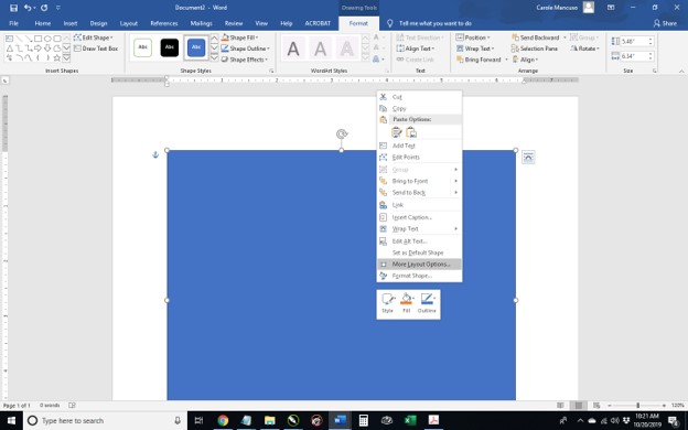
1. Open Word, create a new blank document, and insert a rectangle. (When your cursor turns into a plus sign, you’re able to draw your shape.
By default, mine is blue. Right click the rectangle and select More Layout Options.
Set the properties to . . .
Size: 10” in Height and 8” in Width
Text Wrapping: Behind Text
Position:
Horizontal – Absolute Position of .25” ‘to the right of’: Page
Vertical – Absolute Position of .5” ‘to the right of’: Page
Set the Fill to No Fill and the Line to a Solid Line, Black Color, and .5 pt Width, choosing the Dash Type selection shown below.
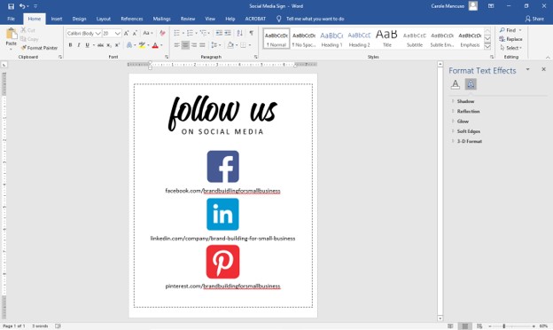
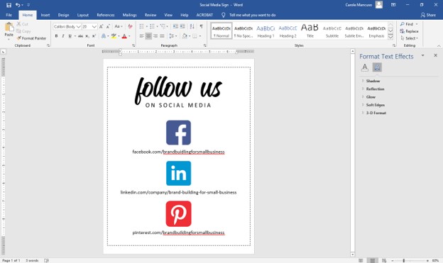
2. Click inside the rectangle and type “Follow Us on Social Media”. Set the font to one or more choices that work as your heading and size to appropriately fill the space. Set the Alignment to Centered. I went with the font Candelion Regular in all lowercase at size 160 for “follow us” and (on the next line) Calibri in all caps at size 25 and added a space between each letter.
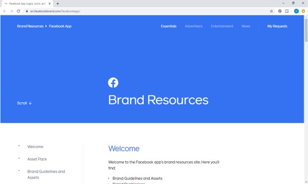
3. Next, decide which review platforms you would like to feature. We are currently active on Facebook, LinkedIn, and Pinterest and will be highlighting those. Then, go to Google to find logos. Most social media outlets will have a corporate page that makes their logo available to the public along with instructions for proper usage. For example, Facebook has a Brand Resources page easily found when searching “facebook logo” on Google.
As you find the appropriate source for each social media outlet, save the logos to your desktop.
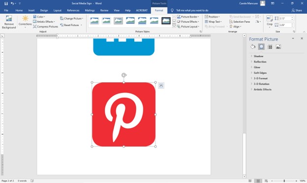
4. Press enter within your document to advance to the next line space and then insert each of your saved logos (from the menu at top, press the Insert tab, and choose Picture) in the order you want them to appear on your sign.
Inserting each of mine took me to the bottom of a second page. So, the first step in adjusting sizing is to crop any excess space from the logos. (As you can see above, the outline of the Pinterest image is directly around the icon, so no need to crop that one.) That’s not the case for LinkedIn . . .
To crop, click Picture Tools (at the very top of the screen), click the Crop icon (at top right), drag the outer edges of the box tight around the logo, and press enter. Once all the logos are cropped as needed, try to match their size to about and 1.4” in height. (This will ensure you have adequate room for text.) To do so, click Picture Tools again and enter a height at top right.
Repeat for the other icons.
5. Click in the space after your first icon, press enter to add a line space, and type your profile name/URL for that platform; repeat for your subsequent logos. This process once again took me onto a second page.
Therefore, decrease the font size as needed. I went with size 20.
And then adjust the spacing a little for each line of text (so you have additional room between each social media outlet).
And you’re done!
6. Save your file, print, cut (on the dotted line, which is 8×10”), and frame!
A Note About Fonts and Colors: While the instructions described above will achieve the simple and modern design pictured, you can (and should) customize the look for your business. If you’ve been brand building from the start, you already have a Style Guide in place, and everything you create for your business should reflect the guidelines you’ve set for your logo usage, fonts, and colors. If you’re new to branding, be sure to review our story on The Role of a Brand Style Guide.
Disclaimer: While we only recommend products we know and love, we want to note we use affiliate links and may earn a commission for purchases made through those links.
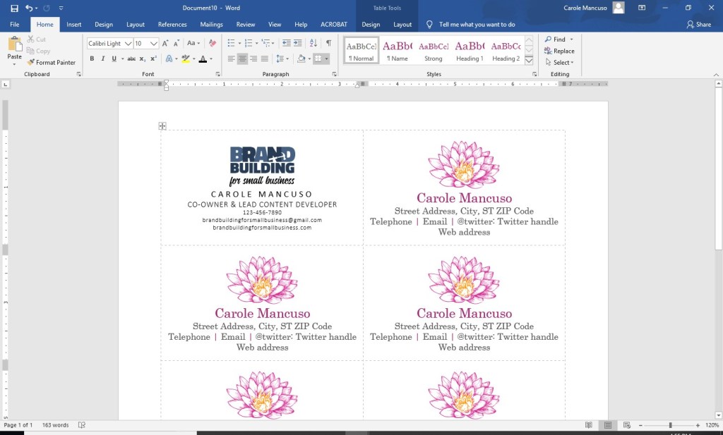
You want simple, nice, and professional looking business cards. Easy, Peasy, right? Unfortunately, creating business cards from scratch can be a little intimidating for even a tech-savvy person. Thankfully, Microsoft Word actually makes a decent amount of business card templates available to you. While the focus is clearly quantity versus quality, their templates do save you a number of groundwork steps, so they are a good place to start. You can go from a blank Word document to print-ready business cards in only ten steps. . . .
(For a personalize-and-print option for $6, skip to the end.)
1. From within Microsoft Word, go to File > New and type “business cards” into the search box.
Scroll down through the search results to the vertical “flower personal business cards”.
Press Create.
2. Right click the cross within a square at the upper left and choose Table Properties.
Select Table > Borders and Shading > Border and set the Setting to All, the Style to dashed, the Color to light gray, and the Width to ¼ pt; press OK.
Then go to Cell and set the Vertical Alignment to Centered and press OK once again. You now have business cards that are horizontally and vertically centered with very faint visual guides for cutting.
3. Delete all the content from the first card, insert your logo, and size to your liking, keeping in mind you will need space for your contact information.
4. Press enter to advance to the next line and set the font to Calibri, the font size to 11, and the font color to black. Press Ctrl + D for advanced font and character options. Click the Advanced tab and set the Character Spacing to Expanded By 3 pt. Press OK and turn your Caps Lock on. Type your name.
5. Press return to advance to the next line. Change the font to Calibri Light and the font size to 10. Click Ctrl + D, change the character spacing to .5 pt, and press OK; then, type your title.
6. Press return to advance to the next line and change the font size to 7.5. Then include your contact information, limiting yourself to three lines.
7. Place your cursor after your logo, right click, and go to Line Spacing Options.
Within Indents and Spacing, set the Spacing After to 6pt, and press OK.
Set the cursor after your title and repeat.
8. Once you’re happy with your layout, select the entire contents of that card, and copy by pressing Ctrl + C. Then, select the contents of another card, press Delete, and Ctrl + V to paste your new design.
Repeat the process for the rest of the page.
9. Save your file and print; be sure to set your printer Print Quality to the best available option. (When choosing your paper, I recommend a quality cardstock in between 80 and 100 lb — any thinner, and your business card will be too flimsy; any thicker, and you risk problems using the paper in a conventional home printer. A matte versus glossy finish is really a personal preference, but you do avoid any potential for fingerprints on a matte stock.)
10. Then, cut! For the cleanest and straightest edges, use a paper cutter.
A Note About Fonts and Colors: While the instructions described above will achieve the simple and modern design pictured, you can (and should) customize the look for your business. If you’ve been brand building from the start, you already have a Style Guide in place, and everything you create for your business should reflect the guidelines you’ve set for your logo usage, fonts, and colors. If you’re new to branding, be sure to review our story on The Role of a Brand Style Guide.
To shamelessly borrow Nike’s slogan, forward movement is the best route for small businessowners looking to broaden their marketing and branding efforts into social media. If you’re a large company with a department or firm devoted to your marketing and branding, you likely have a person or staff of people responsible for social media, and they can analyze demographics, develop goals, create a content inventory, and schedule posts. If that’s a feasible undertaking for your business, this web site probably isn’t for you. Our target is the small businessowner, who is looking to embrace social media while simultaneously doing most everything else . . . which could include staffing, management, finances, strategic planning, daily operations, sales, and customer service as well as marketing and branding. Dedicating a huge amount of time and financial investment to social media simply isn’t feasible and is frankly unnecessary in order to be successful.
JUST DO WHAT?
So how do you move forward into this new corporate endeavor? Focus on what you know. For example, if you don’t have a personal
twitter account and aren’t really sure what or why one would tweet, that’s
probably not the best place for you to start.
We’ve recently decided now is the time to start promoting
our blog content on social media. Personally,
I currently frequent Facebook and Pinterest.
Bob, the other voice of Brand Building for Small Business, frequents
Facebook. (Frequent is actually probably
an overstatement, but he occasionally visits Facebook.) Since we have real experience with these platforms,
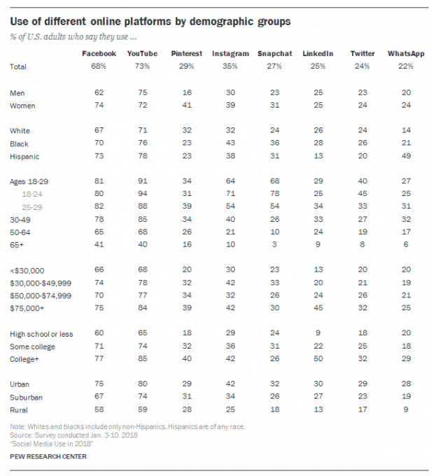
we have a pretty good idea of who else is using them without any research. However, a quick glance at the following
chart, and we can solidify our understanding of the demographics of the most
popular social media platforms.
Facebook and Pinterest’s demographics sufficiently align
with our target audience. We also know
from experience that our content would be an appropriate fit. . . .
“CONTENT IS KING”
What can you, on behalf of your business, contribute to
social media (with the expectation that a meaningful contribution yields
dividends for your business)?
At the risk of sounding repetitive . . . focus on what you
know. You are likely an expert in your field.
You may have managed to generate an income selling your products or
services. You possibly generate revenue
that supports a small staff of people. Or
maybe you just started out and are hopeful about the profits to come. Regardless, you likely have a wealth of
focused knowledge.
You also no doubt have a personality. I’m sure you’ve got a pretty great one at
that. You may be clever, witty, cultured,
or sarcastic. You may be optimistic,
dark, curious, or creative. You have a
voice. Hopefully, that voice is
reflected in your brand, and you can express yourself and your brand on social
media, resonating authenticity with your audience.
A FEW GREAT EXAMPLES . . .
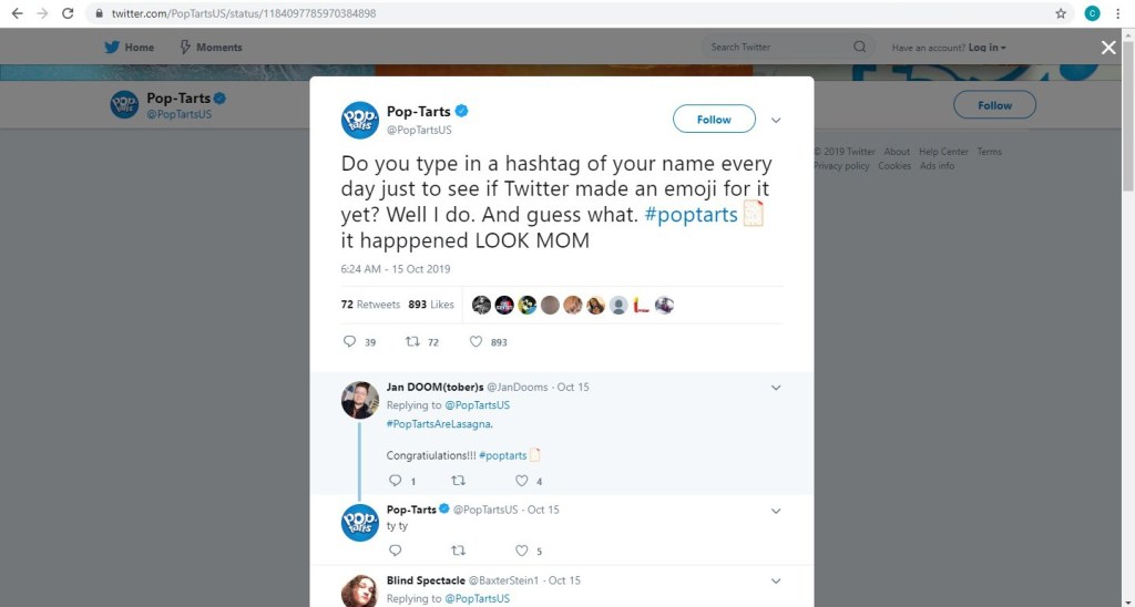
Pop-Tarts
The popular brand of toaster pastries Pop-Tarts has a
Twitter account bursting with personality. . . .
Pop-Tarts’ parent company, Kellogg’s, has a more conservative brand and voice. They have approximately 98,000 Twitter followers while Pop-Tarts has 205,000. With a 280 character limit (up from 140 a couple years ago), a little bit of creativity goes a long way.
Wayfair
A provider of furniture and home goods, Wayfair utilizes the
visual nature of their business on a platform optimal for visuals. Wayfair has approximately 1.3 million
followers on Instagram, and they most often post pictures of their products
with simple captions that engage, entertain, or educate. Many posts will lead you to the link in their
bio, which ultimately leads you to shop the pictured items on their web site.
Mashable
Digital media website Mashable uses Pinterest as an outlet
to reinforce brand awareness and drive traffic to their web site. They have 58 boards, ranging in topic from
“3D Printing Creations” to “WTF” . . .
Mashable has 10 million+ monthly viewers on Pinterest.
A JOURNEY WITHOUT A MAP
Let’s say you glean some inspiration from these social media giants, and you create accounts for your business on the platforms you frequent; you begin regularly posting content – at least once per week – that is optimal for that platform (based on your personal experience), your products or services, and your unique brand; you promote your social media presence as part of your brand on all advertisements, correspondence, etc.; and little by little customers AND potential customers start following you. Fantastic! What now?
According to Comm100, some commons social media goals are to:
Connect with Customers
Increase Brand Awareness
Drive Traffic to Your Website (directly from
social media and indirectly by enhanced search engine results)
Generate Sales and Leads
Boost Brand Engagement
Increase In-Person Sales
Build a Community
Improve Customer Service
While one or two items on this list may be more important to you than others, all of the goals are worthwhile in some respect. See what develops for you as time goes on. You may find that your most useful outcome of social media is invaluable market intel that comes from the comments on your product posts that you originally hoped would generate sales. Or perhaps people start leaving reviews for you on Facebook, which become an important tool in converting leads into sales. Maybe you find that you get complaints via social media that provide an opportunity for you to offer outstanding customer service in a very public way. Navigating without a roadmap means you need to pay attention to your journey. Try to find an opportunity in the issues that arise. Be open to suggestions. Think of creative ways that you can utilize and expand upon the positives you encounter. Grow and evolve. And be patient. Good luck!
P.S. Read more as we begin our social media journey on Pinterest and Facebook.
Reviews have become an important part of our lives. We look at them when choosing a restaurant, selecting a contractor, watching a movie, or even buying a new pair of jeans. As a result, having an abundance of glowing customer reviews can have a big impact upon your business. However, you know that already, which is why you’re here. So, let’s get started. . . .
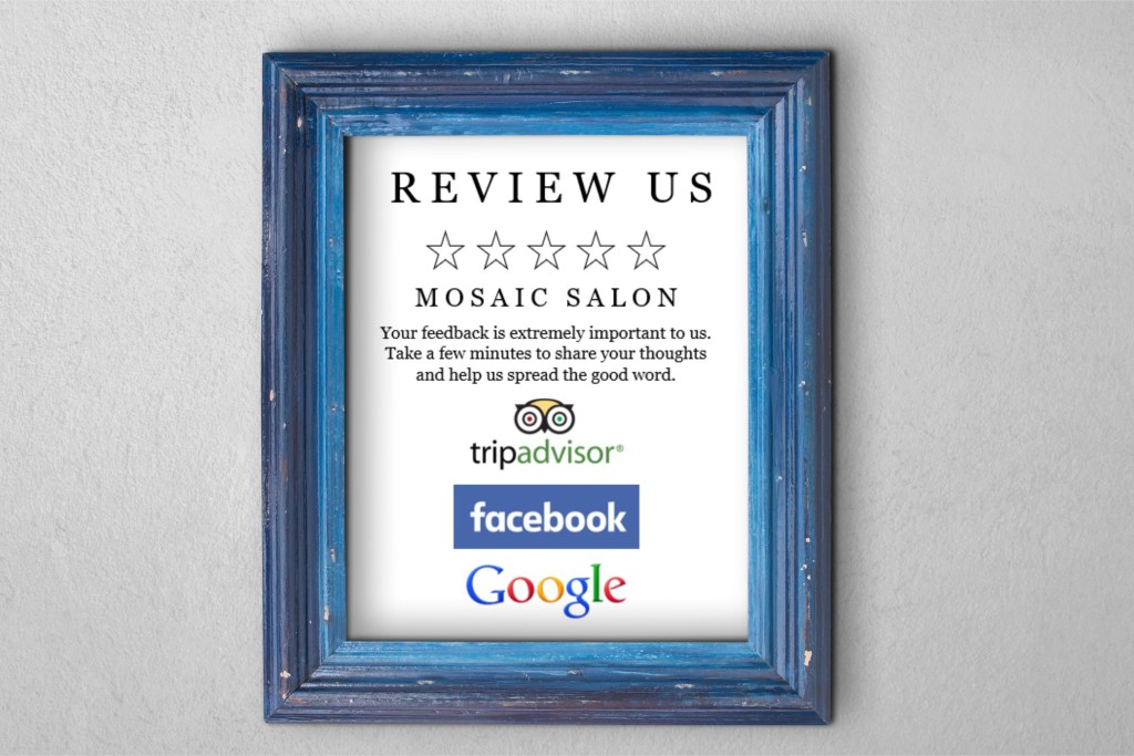
I do believe the most effective way to convince a happy customer to go the extra mile for your business is to personally take the time to ask for a review. However, a personal request isn’t always feasible. For those occasions, a sign placed in a prominent area (possibly next to your register) that makes the request visually can be a good idea. I’ll show you the steps to create such sign in Microsoft Word.
1. Open Word, create a new blank document, and insert a rectangle. (When your cursor turns into a plus sign, you’re able to draw your rectangle.)
By default, mine was blue. Right click on the rectangle and select More Layout Options.
Set the properties to . . .
Size: 10” in Height and 8” in Width
Text Wrapping: Behind Text
Position:
Horizontal – Absolute Position of .25” ‘to the right of’: Page
Vertical – Absolute Position of .5” ‘to the right of’: Page
Right click on the rectangle again and select Format Shape. Set the Fill to No Fill, and set the Line to a Solid Line, Black Color, and .5 pt Width, choosing the Dash Type selection shown below.
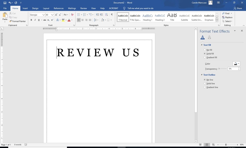
2. Click inside the rectangle and type “Review Us”. Change the font to one that works as your heading and increase the size as needed to appropriately fill the space. Set the Alignment to Centered. I went with the font Georgia in all caps at size 60 and added a space between each letter.
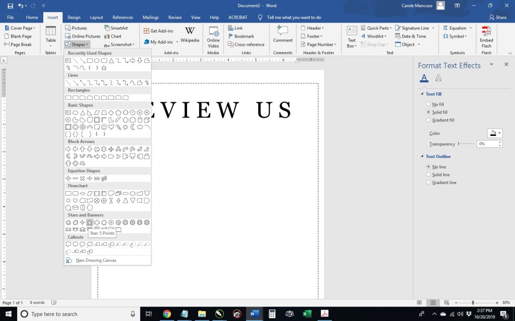
3. Press enter to advance to the next line and then insert a star. Once your cursor is a plus sign, draw the star about a half inch or so in size.
Right click your star and select More Layout Options: within the Text Wrapping tab, select In Line With Text from the Wrapping Style section; within the Size tab, make the star .7” in Width and Height; press OK.
Right click on the star once again and select Format Shape: set the Fill to No Fill; for the Line, select Solid Line, Black color, and 1.5 pt Width.
Right click on the star one last time and select copy. Add a space and paste your star. Repeat three more times.
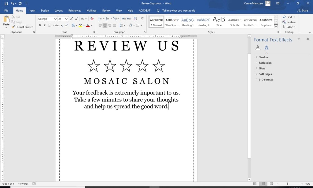
4. Press enter and add your company name. I used the same formatting as the “Review Us” heading but decreased the size to 36.
5. Press enter and include your review request. I went with: “Your feedback is extremely important to us. Take a few minutes to share your thoughts and help us spread the good word.” I kept the font the same and just changed the font size to 24.
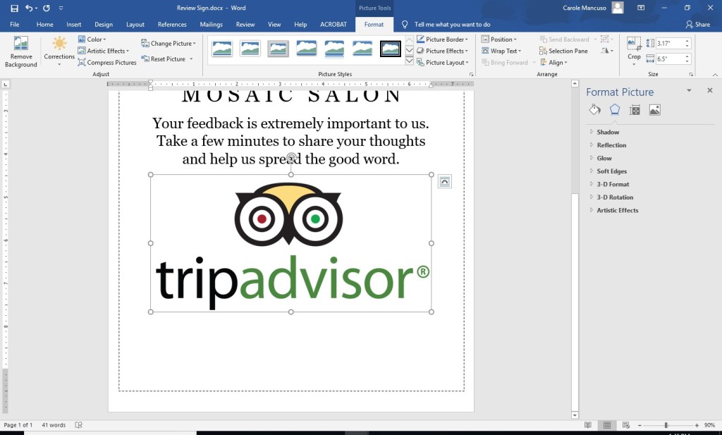
6. Next, decide which review platforms you would like to feature. I decided to use TripAdvisor, Facebook, and Google. Then, go to Google Images (https://www.google.com/imghp) and search for the logo of one of the companies. I searched “tripadvisor logo”.
Save your selection to your desktop. (I chose the 4th logo of the top row. ) Press enter to add a line space to your Word Document and insert the logo.
As you can see, the logo is quite big. Since I plan to include three logos, I decreased the size a bit.
Repeat the process for each logo you would like to include, adding a line space between each one. If you extend onto a new page, don’t worry.
7. The last step in Word is simply a final tweaking so that everything looks nice and professional on the page. I increased the line spacing after the company name, the paragraph, and in between the logos, and decreased the size of each of the logos.
Disclaimer: While we only recommend products we know and love, we want to note we use affiliate links and may earn a commission for purchases made through those links.
Lots of businessowners question whether they’re creative or tech-savvy enough to create their own logo. Unfortunately, I can’t tell you neither of those qualities are needed, but I can safely say they’re not needed in the abundance you probably imagine.
Things you do need to design your own logo:
A little creativity
A little tech savvy
A vector editing program (available for free)
Lots of fonts choices (available for free)
Lots of icon choices – IFyou want a graphical component to your logo (available for very minimal cost; the icon used in our logo cost $2.99)
So where to start?
While graphic design isn’t my specific trade, I’ve been asked
to create dozens of logos throughout my career.
Every time, I start by facing that same dreaded obstacle: the blank
page. I stare at it, thinking about what
the logo should represent and the type of fonts, colors, and imagery to best
suit that message. Meanwhile, a blank page relentlessly stares back.
While a tedious process, you should set your expectations for your logo before you pick up a pencil (or the mouse).
Originally, logos were introduced as an aid to people who couldn’t read. As a result, the earliest designs tended to be very literal. (For example, a shoemaker’s logo would inevitably show a shoe.) Over time, the purpose of logos has evolved to become a broader reflection of brand but remains a key way of differentiating yourself in the marketplace.
So what’s the personality of your company? Is your business youthful and trendsetting? Conservative and financially strong? Fun and whimsical? Product-focused and straightforward? Some combination thereof? This corporate identity (or brand) needs to be communicated in your logo – through your font(s), color(s), placement of words, and any graphics.
If once you have a strong sense of your business “personality”
in mind, your page is still unyielding in its never-ending canvas of white, go
looking for some inspiration. . . .
For the Brand Building for Small Business logo, I
knew I wanted to try something graphical to literally represent the act of “building.” I was initially picturing letters being
nailed but knew that would be tricky to execute in a clear way. So, I went to my go-to spot for inspiration: google images.
I searched for “building logo,” hoping the results would be full of
construction-type logos also looking to convey the literal act of “building.” But no, Carole, searching “building logos”
yields lots of logos of buildings.
. . . Should have foreseen that. Instead, I searched for “building construction logos” and found more of what I had in mind.
A couple screens in, I found inspiration.
Looking at the Hammersmith logo (in navy and white on a
yellow background), I love the way the hammer is a silhouette within the house
and appears to be captured mid-swing. I
immediately knew I wanted to try a hammer silhouette, but I wanted the graphic to
appear within the company name and not as part of a separate graphical
element.
A quick note on inspiration versus copyright infringement: This is an area requiring caution. Whereas you can use a silhouette of a hammer as seen in one logo in another, creating a logo for a construction company with a silhouette of a hammer in a navy house with white windows on a yellow background would most certainly earn you front-row seats to the case of them v. you. An individual idea cannot be copyrighted; however, “a collection of ideas” makes a logo (or any other original work) unique and can be protected by law. Tread carefully.
LOGO ICONS
So, where does one go for icons that could legally be used as part of a logo for minimal cost? A number of options exist, but I like https://thenounproject.com/. They have a large selection and charge nominal, one-time fees per icon. I found the hammer for our logo for $2.99.
A number of choices were available. . . .
I selected a classic and simple hammer.
I then purchased and downloaded the file in PNG (bitmap
image with a transparent background) and SVG (vector) formats. (A
separate article on Vector vs Bitmap file formats is planned.)
VECTOR/GRAPHICS SOFTWARE
Now what to do with your icon? We use the vector and graphics editor, CorelDraw. While the suite is powerful and much cheaper than your standard graphics package, the cost is still pretty steep in the $500 ballpark. I read a few articles on free vector-editing programs, found Inkscape (https://inkscape.org/) to be highly recommended, and gave it a go. The program seems to have the features needed to get the job done. (And, they make a number of tutorials available, including one on the basic tools: https://inkscape.org/en/doc/tutorials/basic/tutorial-basic.html.)
FONTS
An obvious first step when selecting a font to use for your logo is to scroll through the existing fonts on your computer to see whether anything catches your eye. Remember that you’re not looking for the font that necessarily looks the best to you; rather, you’re looking for the one that best represents your business’s brand. If you’ve picked out an icon at this point, you’ll also need to be mindful of the way a given font looks with your chosen icon. You can have an icon and a font that both separately represent your brand perfectly but just don’t look good together. Since I wanted to try including the hammer as a silhouette within the words for Brand Building for Small Business, I needed a really bold, thick font. I gave Arial Black a try, knowing it’s the boldest font currently available on my computer, but I wasn’t really pleased with the result.
Thankfully, a source exists offering hundreds of (*free*) fonts in a searchable format that actually makes the process relatively easy. With Google Fonts (https://fonts.google.com), I was able to type in my sample text, BRAND BUILDING, the size I wanted to preview, 60 px, and my desired font characteristic(s), increased thickness.
After much trial and error (downloading, installing, and trying dozens of fonts), I found Titillium Web Black and a contrasting script, Candelion Regular, to work in black and two shades of navy.
While I am VERY tempted to digress at this point and start talking about some of the many techniques that can be used to marry the fonts/words used in your logo to the images you’ve chosen . . . I keep reminding myself that level of detail is really better suited for another blog entry further down the road. For now, I will stick to my original plan to keep this message broad but nevertheless offer a few . . .
CONSIDERATIONS
At some point, you may choose to print sales materials in grayscale or advertise in a print media in black and white. You may want to have branded pens for your company (requiring a very, very small logo) or you may purchase a building on Times Square and want your logo proudly illuminated on top (requiring a very, very large logo). Before you decide your design is a done deal, you should run a few tests. Try changing your color scheme to grayscale as well as black and white and print a very small version (one half inch on its biggest side should be sufficient) and a very large version (full page). If all variations look ok, you’ve probably got a keeper.
Export your new logo as a high-resolution transparent RGB PNG, which will work well in MOST (but not all) environments. (Inkscape export settings are shown at right below.)
Once you’ve managed to get this far, you’ll want to protect your work. Your logo should be registered as a trademark. If you are not of a mind to involve your lawyer in the process, consider checking out various on-line alternatives and look into the steps involved in going the DIY route (for example: https://www.wikihow.com/Register-a-Trademark-Without-an-Attorney).
Next up . . . confirm your understanding of your business’s audience; read: Know Your Audience.
Was that what I thought it was . . . my first sale?!? I vividly remember the thrill and excitement
I felt that evening. I basked in hugs
from my husband and kids, texted my close friends and family, and uncorked the
champagne (well, sparkling Moscato actually; it was only a $12 sale after all).
Fast forward one year ahead when the profit from my sales
was about half my full-time income, and I was equally thrilled and excited at
the idea of quitting my day job to pursue my business full time. I couldn’t wait to be able to choose the way
I dedicated my work hours, to have creative freedom, to balance my work
schedule with my home life however I saw fit, to be directly responsible for my
earnings . . . my list could go on and on.
The entrepreneurial allure was holy grail level for me.
Once I gave my three weeks’ notice (which my former boss and
now blog partner masterfully managed to extend into three months’ notice), I
was officially on cloud nine.
Fast forward once again to my first day “unemployed” and me staring
at my computer screen. I had so many new
designs I was looking forward to creating and so many ideas for new
products. My mouse and my keyboard and I
forged ahead at full speed.
* * *
Up until that point, I had spent the entirety of my career in marketing communications. I studied organizational communications and marketing for my undergrad and graduate degrees, I taught college public relations courses, and I worked for almost 15 years in the corporate world as an important contributor of a national, billion-dollar brand.
The first item on my new business to-do list – in bold
print – should have been to create a marketing plan.
In reality, that’s not even close to what happened. Why? In
writing this all down, I actually needed a couple minutes to decide exactly why,
and I think it’s the more immediate sense of urgency you get when your business
is responsible for your livelihood. You
want to focus on the areas of your company that are as tangible as your
mortgage payments . . . and groceries . . . and kids’ back-to-school
clothes. I effectually went into
survival mode. Efforts producing and
sustaining immediate profits were crucial while time for endeavors reaping
long-term dividends felt like a luxury.
Don’t get me wrong. I had put in place certain basic brand fundamentals from the beginning. Long before my first sale, I had decided on a name and colors, secured a web site address, and created a logo. I even had a pretty clear sense of the qualities that would differentiate my company from others. However, the idea of taking my brand basics and then creating and executing a blueprint for building a strong and successful brand WHILE running my business was completely and utterly overwhelming to me.
* * *
Well, as they say, the journey of a thousand miles begins
with a single step. Once my survival
instinct numbed a bit, I decided to take one single step. I addressed one new activity per week. Since I still had very little “free time” in
my business AND had no real marketing plan, I didn’t give myself any
constraints on the duration or direction of my efforts; just the quantity – I
just needed to do one brand building task per week.
So one week, I created an Instagram account for my business;
another, I researched local venues to get my brand name out in my community; still
another, I researched blogs that I could partner with to promote my brand,
etc., etc., etc. In essence, I did what
I could/when I could, knowing that as long as these activities reflected my
brand basics, my business would reap long-term benefits.
Over time, I mastered my one-a-week goal, and I built on
that momentum – once a week, I now had to do one maintenance branding task
(writing a blog posting, attending a local “expo/show,” posting content on my social
media platforms, etc.) in addition to my one brand building task
(researching, expanding into new venues/platforms, etc.).
If this is starting to sound like a lot, take a breath. There’s no need to get bogged down with specifics at this point. We’ll cover them all as we go, and we’ll help you get your system into place. We’ll focus on the areas we think are most beneficial to start with first, and we’ll teach you how to execute those initial steps; then, we’ll focus on building that brand – one task at a time. Soon, you’ll find that your successes will justify the time you invest, making the process much easier.
* * *
Next up – What’s in a Name? . . . The first in a series focusing on the initial steps in building your brand.