As a small businessowner, I suspect many of you saw this headline and asked, “What is a Brand Style Guide, and why bother when I have more immediate needs that might generate income?”
“Stop!”
I can see you are about to close this page . . . and I want a shot at keeping you reading. I’ll start by answering those two questions.
A Brand Style Guide is a written statement that defines and describes the way in which you present your business to the world. Typically, both the message and key elements of the visual treatment are encompassed.
Many large companies have invested millions of dollars perfecting the brand image and the message that gets presented. Therefore, no one should be surprised that THEIR style guides are VERY detailed and address a wide variety of circumstances. For example, MacDonald’s is quite protective of their golden arches (see https://news.mcdonalds.com/press/multimedia-library/logos). For 50 more examples, check out https://www.canva.com/learn/50-meticulous-style-guides-every-startup-see-launching/. That said, many smaller businesses want the benefits of having a standardized message but do not see a need for a document that does more than address key elements of branding and style.
For our blog, we fall into that latter category. We recognize that we could benefit from articulating a few basic rules but don’t require a more elaborate guide. Perhaps in time, that other approach might be warranted . . . but not yet. Since we suspect many of you fall into this category, we’ll be devoting this blog entry to the creation of a small manual – our own! (Feel free to download and review a copy . . . and use ours as a template/starting point for your own.)
We began by identifying the issues we wanted to cover:
- Our mission and differentiating qualities (i.e., the synopsis of “Our Story”).
- Our brand voice.
- Our guidelines for use of our logo – attempting to make that icon our unique brand signature.
- Our color palette.
- The fonts used with our logo.
- The types of photos and images selected.
Mission/Differentiating Qualities
When Carole and I decided to start our blog on marketing/communication strategies, we were determined to pass along useful how-to information and instruction that might enable a small business owner to have a highly evolved and very professional brand . . . while doing all of the required work inhouse. Having been practitioners in this field for decades, we knew the difficulties that could be encountered in going DIY . . . as well as the very high cost of hiring third parties to perform these tasks. For example . . . just a few years ago, a company affiliated with my employer paid $25,000 to have a style guide prepared for a new start up. Frankly, the product delivered did not justify the cost.
So . . . think about the characteristics that set you apart. Those features are the heart and soul of your business plan and provide the critical backdrop needed to create your Brand Style Guide.
Brand Voice
Are you traditional or avant garde? Friendly and very personal . . . or somewhat distant and formal? When you are expressing yourself, are you picturing an audience of fellow professionals . . . or the general pubic? The way in which you answer questions such as these determines the voice that will be identified with your brand.
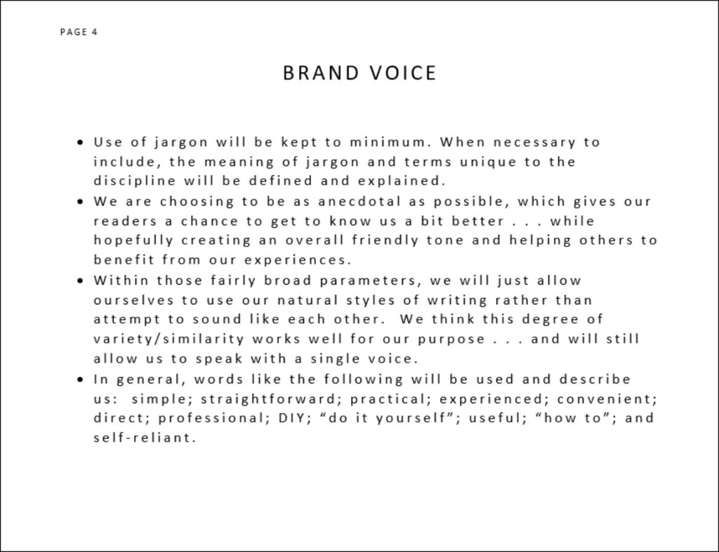
Carole and I naturally write with different styles. And yet, we did set some basic parameters that will, we hope, create a single voice unique to our blog. Specifically, we determined that we would keep our use of jargon to minimum OR (when necessary) be sure to define and explain the meaning of terms. Similarly, we are choosing to be as anecdotal as possible, which gives our readers a chance to get to know us a bit better . . . while hopefully creating an overall friendly tone and helping others to benefit from our experiences.
Within those fairly broad parameters, we figure we will just allow ourselves to use our natural styles of writing rather than attempt to sound like each other. We think this degree of variety/similarity works well for our purpose . . . and hope you agree.
In general, words like the following speak with our voice: simple; straightforward; practical; experienced; convenient; direct; professional; DIY; “do it yourself”; useful; “how to”; and self-reliant.

Use of Logo
Every logo creator hopes and intends for the graphic to become an immediately identifiable symbol. Toward that end, consistent and frequent use of the exact image is necessary. Our basic logo for this blog is pictured to the left. The primary variation to be used both in print and online/onscreen is the three-color version shown at the top. When only a single color is available (either due to the medium used or cost-saving economics) the black and gray version is permissible. A single-color, black alternative has also been created for those select occasions when the method used to reproduce the image will not handle gray successfully. (Example – some photocopying of forms.)
While we believe our logo is sufficiently scalable to become signage atop a building or an imprint on a golf ball . . . and all sizes in between, you need to always be sure the logo you are using has sufficient resolution (i.e., image data or tightly placed Dots Per Inch – DPI) and is being passed along in a file type suitable to the task.
Technical Note . . .
For onscreen use such as web pages, you typically want a resolution of 72 dpi in a file type such as a .jpg, .png, or .gif with an RGB (red-green-blue) color mode. While each of these file types can be successful, only the latter two support a transparent background (jpg’s add white in null spaces rather than allowing no color).
For print purposes (including most print advertisements), you typically want a resolution of 300 dpi rendered in a CMYK (cyan-magenta-yellow-black) color mode. While high resolution .jpg and .png files can also be used for print, other options become available, including more easily scalable .eps (Encapsulated PostScript) or pdf (Portable Document Format) files. If you are printing in one-color black (including the black/gray variation), you will want to use a grayscale color mode. (The logo can be reversed to feature white when used on a dark background.)
Too technical? Perhaps. However, the key to keeping your logo looking good at all times is to make sure the right kind of file has been used . . . and we wanted to acquaint you with some of the basic considerations that will be explored further in future blog entries – including preparation of a logo download page that can provide any third party the kind of source material needed to handle your logo correctly.
Interestingly, style guide pages on logos typically spend more time and space enumerating “Don’ts” rather than spelling out the “Dos.” For Example:
- DO NOT add, move, remove, replace, or reposition any portion of the logo!! (With one of our past corporate logos in particular that was very horizonal, vendors were constantly trying to break the whole into pieces that got restacked vertically.)
- DO NOT change any colors or fonts.
- DO NOT stretch or distort the logo. Remember, you can never change just the horizontal or just the vertical dimension without changing both. Doing so creates distortion. (Note: That’s the reason quick resizing in graphic programs always uses diagonal motions.)
- DO NOT remove elements of the logo. (Example: We like our hammer; don’t fill in the color!)
- DO NOT place the logo on a busy or distracting background.
- DO NOT apply a logo or logotype color variation to a background with insufficient contrast.
- DO NOT create your own variations.
Every logo is custom designed; no other combinations are permitted. In those cases in which a logo has been trademarked, failure to use the exact versions registered can weaken or negate a legal position.
Note: We wanted to mention that our final logo also incorporates a clear box around the icon. We take this step to avoid any image material getting cut off during file handling, especially the rounded bottoms of letters or those with descenders.
Color Palette
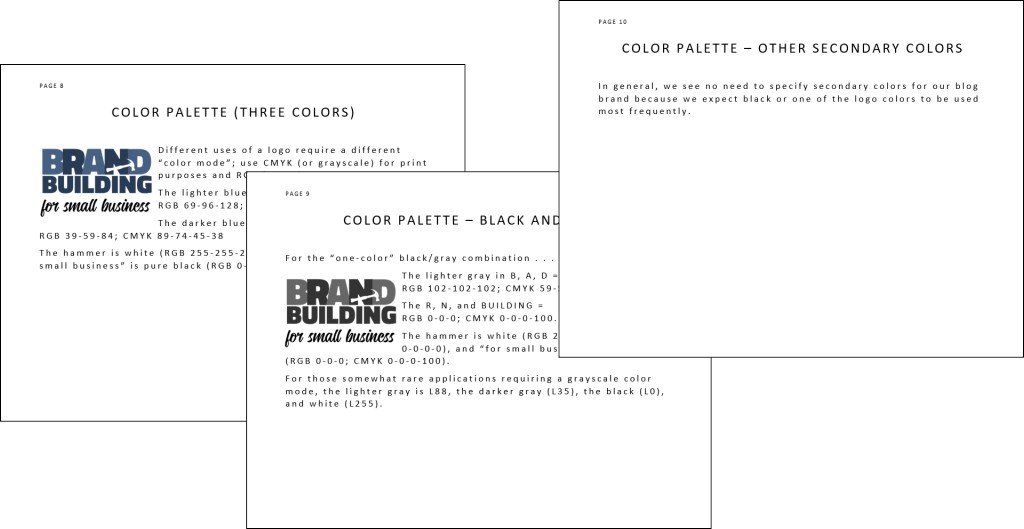
As previously noted, different uses of a logo require a different “color mode” – a very tricky subject involving lots or esoteric technical information. Bottom line: use CMYK (or grayscale) for print and RGB for web use. Most graphic arts programs will give you the ability to switch back and forth between these modes. However, you will note that print and onscreen versions of the same color can vary somewhat, which is the reason these programs include elaborate methods of color correction. Rule of thumb – a CMYK color viewed on your computer will seldom reproduce in exactly the same way when printed. Getting these two to match is as much an art (tempered by experience) as a science. Nevertheless, use of the right color modes will almost always produce a result that is at least acceptable.
For example . . .
- The lighter blue in our logo’s B, A, D = RGB 69-96-128; CMYK 81-60-31-10.
- The darker blue in R, N, and BUILDING = RGB 39-59-84; CMYK 89-74-45-38.
- The hammer is white (RGB 255-255-255; CMYK 0-0-0-0), and “for small business” is pure black (RGB 0-0-0; CMYK 0-0-0-100).
- For those somewhat rare applications requiring a grayscale color mode, the lighter gray is L88, the darker gray is L35, the black is L0, and white is L255.
Once you become familiar with expressing colors as formulas, you will be able to communicate successfully with vendors such as commercial printers, graphic artists, and other professionals. Until then, we wanted you to be aware that these color systems exist (as well as a variety of others such as Pantone/PMS, HEX, LAB, etc.) so you’ll be able to act appropriately upon being told 0-0-0-0, and you’ll understand that 51-51-51 is not a code for an “Area” in Roswell, New Mexico.
Fonts
Our logo incorporates two fonts: Titullian Web Black for the words BRAND and BUILDING and Candelon Regular applied to “for small business.”
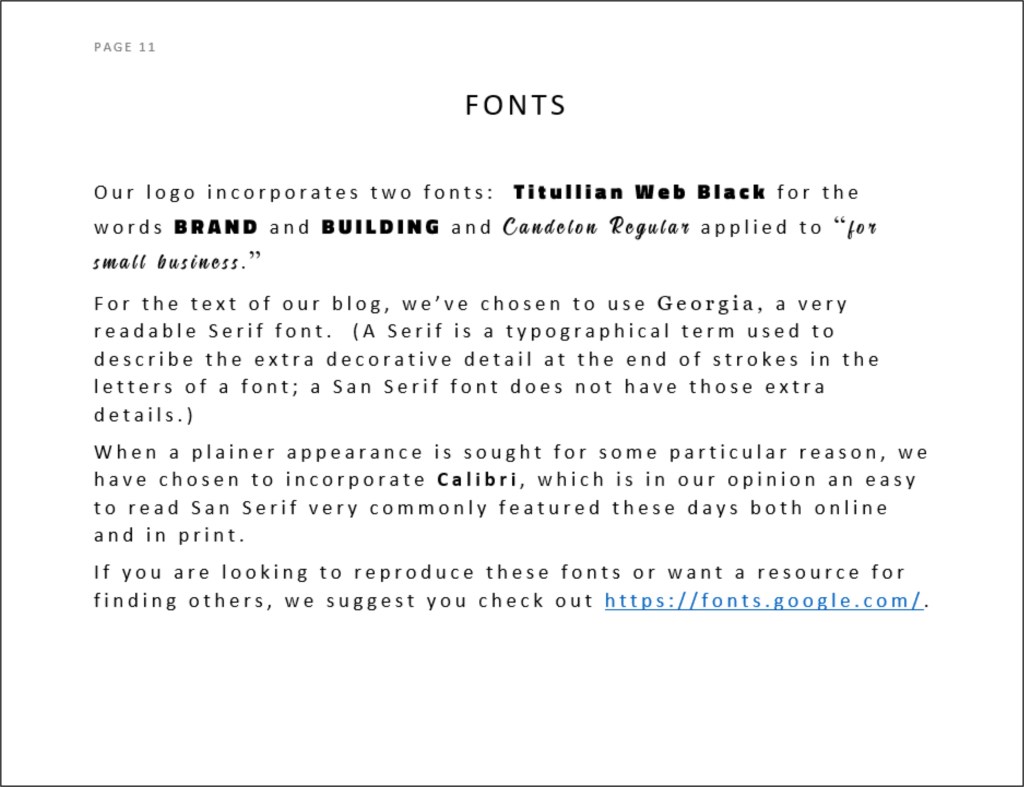
For the text of our blog, we’ve chosen to use Georgia.
If you are looking to reproduce these fonts or want a resource for finding others, we suggest you check out https://fonts.google.com/. Other alternatives exist, but we’ve found this one to be good and useful.
Photos/Other Iconography
For our blog, you’ve probably noticed that we elected to highlight our logo as the primary imagery on the page – hopefully calling added attention to that item. Since we needed some other photo just to properly balance the page, we selected neutral content that would recede into the background and not compete.
Nevertheless, we do anticipate periodically using a photo or other graphic element to enhance the point being made and to add some visual interest. When making such choices, the following will be some of our considerations:
- Use of people; generally speaking, faces make an image more interesting.
- Demographic diversity.
- Positive energy (Are the people smiling and happy? Excited?).
- Contemporary (not necessarily young but avoiding elements, such as old cars or computers, that date a picture).
- Simplicity (not too many elements and generally tending to closer focal points).
- Compatible colors.
- Narrative relevance; humor when possible.
By-lines/Tag Lines
Many companies successfully incorporated a tag line into their brand identity. Ever hear the phrase “Breakfast of Champions” or perhaps “Betcha can’t eat just one”?
(See https://www.thebalancecareers.com/best-advertising-taglines-ever-39208.)
When building your brand, consider your options, remembering that a good tag line reflects a differentiating quality, reminds us about a key benefit, and imparts a positive feeling. If you do have or develop a tag line, be sure to specify any rules for usage in relation to your logo. (Very often, tag lines become part of the graphic.)
While we have not adopted a fixed position or graphic treatment for our tag line, we have chosen the language: “A Blog for Entrepreneurs Looking to Create and Develop their Corporate Identity.”
Boilerplate
A short description of your product or service will often be needed when sending out press releases, producing sales literature, creating marketing ads, and even filling out forms. To ensure a consistent, properly branded message, you should develop one or more variations of such a description. For us, one short paragraph seemed adequate to get started:
“Produced by two experienced communication professionals, Brand Building for Small Business is a blog that aims to provide practical, do-it-yourself advice about creating a brand identity from the bottom up . . . and using that vehicle to help generate income streams. Expect simple, straightforward tips that can be executed by a single person or a small group on a very tight budget.”
Your Brand
Probably the single most important rule for a Brand Style Guide is to use the rules regularly, to incorporate the elements into your decision-making process, and to not allow yourself too many exceptions . . . though some necessities will certainly turn up.
Companies that spend thousands of dollars getting a guide prepared for them have a built-in incentive to dictate their use . . . while your motivation as a small business for creating and sticking to your guide is less immediate – more of an act of faith.
However, your efforts can pay off. Successful brands are those with elements that resonate with the audience . . . those that are based in reality and communicate a truthful message in both spoken and unspoken ways. So, be honest with yourself in making your underlying branding decisions, and you’ll stand a very good chance at building a great brand identity.
BTW . . . Changing a brand is another story for the future. Whether small refinements are being introduced or a more basic overhaul is underway, this task is a daunting one and is another good reason for being careful in determining your initial brand building efforts.
Once again, feel free to download a complete copy of our Brand Style Guide for use as a starting point in developing your own. Save some time that can be devoted to other sales strategies!

Nice blog thanks forr posting
LikeLike