Disclaimer: While we only recommend products we know and love, we want to note we use affiliate links and may earn a commission for purchases made through those links.
Lots of businessowners question whether they’re creative or tech-savvy enough to create their own logo. Unfortunately, I can’t tell you neither of those qualities are needed, but I can safely say they’re not needed in the abundance you probably imagine.
Things you do need to design your own logo:
- A little creativity
- A little tech savvy
- A vector editing program (available for free)
- Lots of fonts choices (available for free)
- Lots of icon choices – IF you want a graphical component to your logo (available for very minimal cost; the icon used in our logo cost $2.99)
So where to start?
While graphic design isn’t my specific trade, I’ve been asked to create dozens of logos throughout my career. Every time, I start by facing that same dreaded obstacle: the blank page. I stare at it, thinking about what the logo should represent and the type of fonts, colors, and imagery to best suit that message. Meanwhile, a blank page relentlessly stares back.
While a tedious process, you should set your expectations for your logo before you pick up a pencil (or the mouse).
Originally, logos were introduced as an aid to people who couldn’t read. As a result, the earliest designs tended to be very literal. (For example, a shoemaker’s logo would inevitably show a shoe.) Over time, the purpose of logos has evolved to become a broader reflection of brand but remains a key way of differentiating yourself in the marketplace.
So what’s the personality of your company? Is your business youthful and trendsetting? Conservative and financially strong? Fun and whimsical? Product-focused and straightforward? Some combination thereof? This corporate identity (or brand) needs to be communicated in your logo – through your font(s), color(s), placement of words, and any graphics.
If once you have a strong sense of your business “personality” in mind, your page is still unyielding in its never-ending canvas of white, go looking for some inspiration. . . .
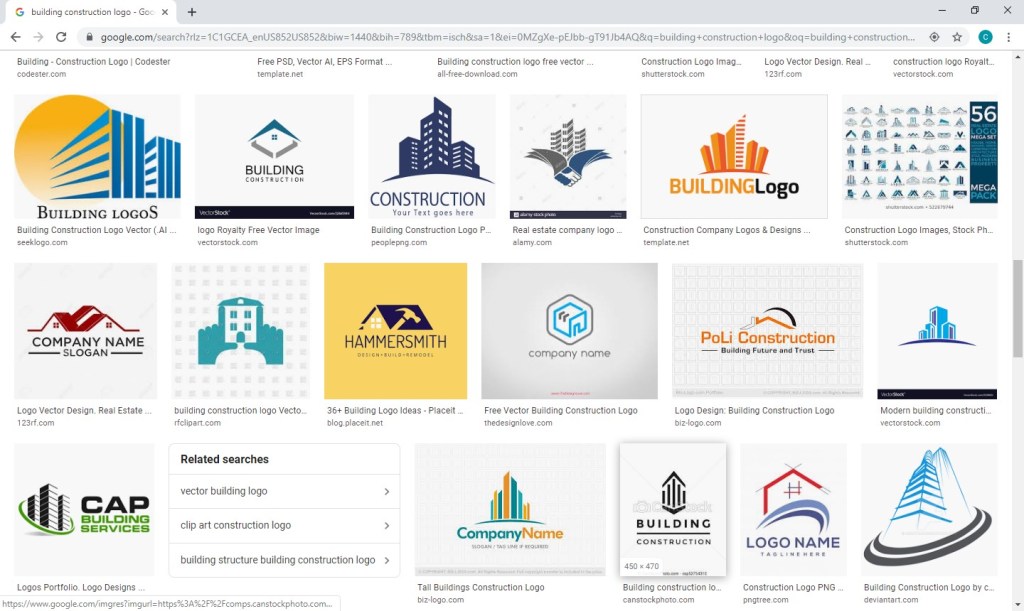
For the Brand Building for Small Business logo, I knew I wanted to try something graphical to literally represent the act of “building.” I was initially picturing letters being nailed but knew that would be tricky to execute in a clear way. So, I went to my go-to spot for inspiration: google images. I searched for “building logo,” hoping the results would be full of construction-type logos also looking to convey the literal act of “building.” But no, Carole, searching “building logos” yields lots of logos of buildings.

. . . Should have foreseen that. Instead, I searched for “building construction logos” and found more of what I had in mind.

A couple screens in, I found inspiration.

Looking at the Hammersmith logo (in navy and white on a yellow background), I love the way the hammer is a silhouette within the house and appears to be captured mid-swing. I immediately knew I wanted to try a hammer silhouette, but I wanted the graphic to appear within the company name and not as part of a separate graphical element.
A quick note on inspiration versus copyright infringement: This is an area requiring caution. Whereas you can use a silhouette of a hammer as seen in one logo in another, creating a logo for a construction company with a silhouette of a hammer in a navy house with white windows on a yellow background would most certainly earn you front-row seats to the case of them v. you. An individual idea cannot be copyrighted; however, “a collection of ideas” makes a logo (or any other original work) unique and can be protected by law. Tread carefully.
LOGO ICONS
So, where does one go for icons that could legally be used as part of a logo for minimal cost? A number of options exist, but I like https://thenounproject.com/. They have a large selection and charge nominal, one-time fees per icon. I found the hammer for our logo for $2.99.
A number of choices were available. . . .

I selected a classic and simple hammer.

I then purchased and downloaded the file in PNG (bitmap image with a transparent background) and SVG (vector) formats. (A separate article on Vector vs Bitmap file formats is planned.)
VECTOR/GRAPHICS SOFTWARE
Now what to do with your icon? We use the vector and graphics editor, CorelDraw. While the suite is powerful and much cheaper than your standard graphics package, the cost is still pretty steep in the $500 ballpark. I read a few articles on free vector-editing programs, found Inkscape (https://inkscape.org/) to be highly recommended, and gave it a go. The program seems to have the features needed to get the job done. (And, they make a number of tutorials available, including one on the basic tools: https://inkscape.org/en/doc/tutorials/basic/tutorial-basic.html.)
FONTS
An obvious first step when selecting a font to use for your logo is to scroll through the existing fonts on your computer to see whether anything catches your eye. Remember that you’re not looking for the font that necessarily looks the best to you; rather, you’re looking for the one that best represents your business’s brand. If you’ve picked out an icon at this point, you’ll also need to be mindful of the way a given font looks with your chosen icon. You can have an icon and a font that both separately represent your brand perfectly but just don’t look good together. Since I wanted to try including the hammer as a silhouette within the words for Brand Building for Small Business, I needed a really bold, thick font. I gave Arial Black a try, knowing it’s the boldest font currently available on my computer, but I wasn’t really pleased with the result.

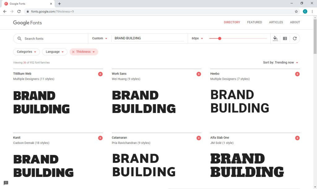
Thankfully, a source exists offering hundreds of (*free*) fonts in a searchable format that actually makes the process relatively easy. With Google Fonts (https://fonts.google.com), I was able to type in my sample text, BRAND BUILDING, the size I wanted to preview, 60 px, and my desired font characteristic(s), increased thickness.

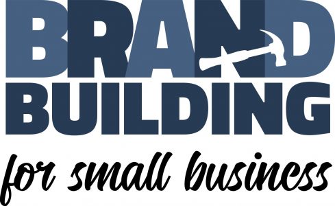
After much trial and error (downloading, installing, and trying dozens of fonts), I found Titillium Web Black and a contrasting script, Candelion Regular, to work in black and two shades of navy.

While I am VERY tempted to digress at this point and start talking about some of the many techniques that can be used to marry the fonts/words used in your logo to the images you’ve chosen . . . I keep reminding myself that level of detail is really better suited for another blog entry further down the road. For now, I will stick to my original plan to keep this message broad but nevertheless offer a few . . .
CONSIDERATIONS
At some point, you may choose to print sales materials in grayscale or advertise in a print media in black and white. You may want to have branded pens for your company (requiring a very, very small logo) or you may purchase a building on Times Square and want your logo proudly illuminated on top (requiring a very, very large logo). Before you decide your design is a done deal, you should run a few tests. Try changing your color scheme to grayscale as well as black and white and print a very small version (one half inch on its biggest side should be sufficient) and a very large version (full page). If all variations look ok, you’ve probably got a keeper.
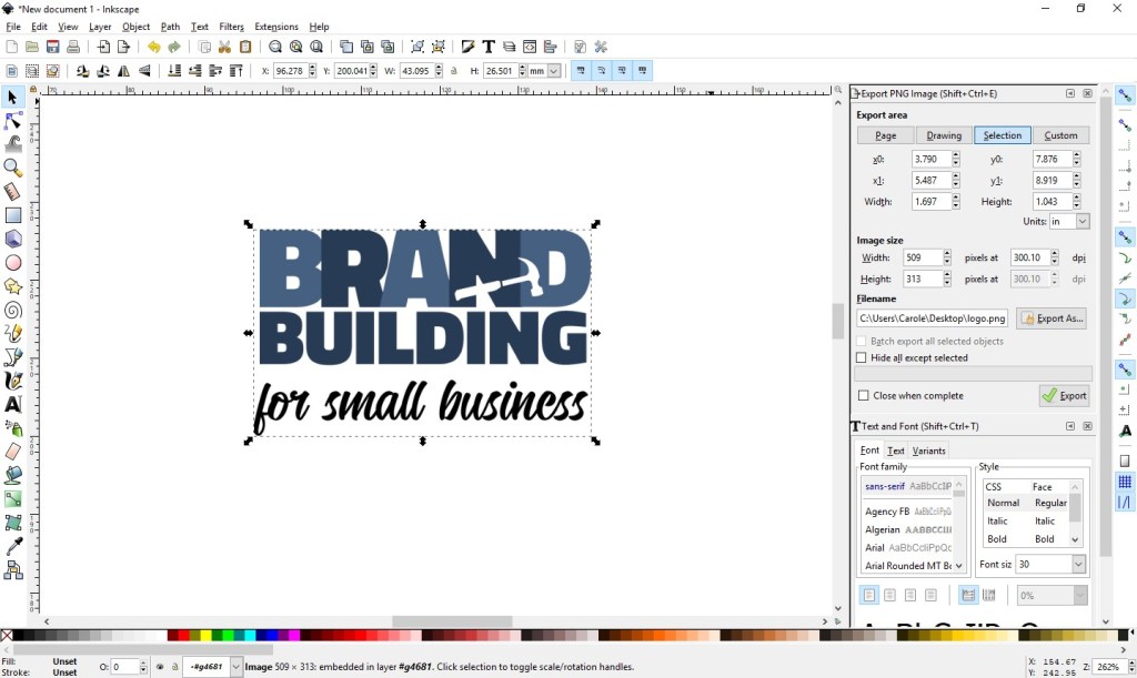
Export your new logo as a high-resolution transparent RGB PNG, which will work well in MOST (but not all) environments. (Inkscape export settings are shown at right below.)

Once you’ve managed to get this far, you’ll want to protect your work. Your logo should be registered as a trademark. If you are not of a mind to involve your lawyer in the process, consider checking out various on-line alternatives and look into the steps involved in going the DIY route (for example: https://www.wikihow.com/Register-a-Trademark-Without-an-Attorney).
Next up . . . confirm your understanding of your business’s audience; read: Know Your Audience.

6 thoughts on “Design Your Own Logo”