With the rarest of exceptions, advertising does not sell your product/service. While you can strike gold every once a millennium (think – Wendy’s “Where’s the beef?” campaign) and actually author an ad that creates a need and desire to make a particular purchase, the typical role of advertising is much more mundane (and less satisfying) –communicating the availability of your product/service to the right targeted audience via a well-chosen media vehicle at the right time (i.e., buying time).
That said, everyone who has ever created an ad dreams of producing the perfect one that entertains, sells, evokes a brand identity, and remains memorable years after the campaign is done.
As these remarks imply, good advertising involves a combination of contributions (especially at large companies) ranging from those who correctly identify an audience to those who understand the media outlets that best serve that audience to those that finalize the right cost-effective media buys that balance the often conflicting demands of size, frequency, cost, and placement. Of course, the final contributor to the process is the person or teams of people producing “the creative.”
As the typical small business owner, you will often be the party wearing all of those hats! Therefore, you may be comforted to know that most ad designs encompass a handful of typical elements, which – when known – will be helpful in creating your ad copy and deciding upon the ways in which these elements interact . . . and perhaps even enable you to determine the ones that must be eliminated on a specific occasion for a particular reason.
How does brand factor into this equation?
Well, advertising is one of the many ways in which you can promote your brand. Conversely, your brand generally provides the vast majority of the content to be included in your ad copy while also defining the visual elements that get incorporated into the design.
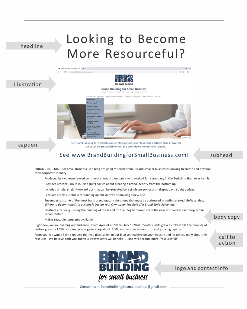
The basic parts of an ad include:
- Headline
- Illustration
- Caption (and/or Sub-Head)
- Body Copy (including the Sales Pitch)
- Contact Information, Logo, and Call to Action
That said, understand that the only real rule is that the art of creating a successful ad has no real rules, only exceptions. While 90% of the ads I created probably involve most or all of the elements mentioned above, my favorite one broke all of those rules. Specifically, I created a half page black-and-white ad done in reverse (white text on a black background) that basically included a single, huge, lowercase word (i.e., because) as a well as a logo and contact information. While I could write volumes about the reasons I like that ad, I’ll simply explain that lots was communicated very simply in a manner that captured the attention of a person leafing through the publication. While the piece did rely upon some prior brand presence to automatically communicate certain details to the reader upon seeing the company name, I also believe the ad helped define our style and attitude . . . and, therefore, became part of the brand.
The ad was (as I already mentioned) very much an exception. The vast majority included the various traditional structural elements that I will now briefly describe.
Headline
With the competition for attention very intense across all media, the first job of your ad is to be seen (not passed over), and your headline and illustration are probably the elements best suited to the job. Three quarters of all my ad designs have started with a headline I thought was capable of grabbing our share of the readers’ attention. (Yes, I’m tempted to list the top 10 headlines I’ve created that succeeded . . . but decided to spare you that exercise and move on to the next key element.)
Illustration
The photo or drawing included in your ad is obviously key to grabbing attention. Some people – particularly graphic designers – would argue that the illustration is the most important factor. That said, the artwork can be essentially descriptive and show an attractive image of your product or service in action, OR the graphic can grab attention by being clever or arrestingly different in some way – perhaps even relying upon humor (i.e., “Where’s the beef?”).
If you personally have artistic skills, this element of the ad can be great fun. If, on the other hand, you are more of a writer or pure businessperson, you can still create a successful ad on your own – using photos or artwork available from some of those free sources already discussed in earlier blog articles. (See FREE Pictures Are Also Worth a 1,000 Words (and Can Help Promote Your Brand)!
If you are going this route, be prepared to spend lots of time paging through stock images until you’ve found just the right one to make your point. (Also, don’t forget that most phones now include cameras able to produce sufficiently high-res images that can be the key to capturing your product/service in action; if you have the eye, the equipment is already in your pocket.)
Caption (and/or Sub-Head)
Your caption obviously relates to the illustration you’ve chosen and generally provides a key opportunity to introduce brand qualities most likely to result in a sale. That said, you will no doubt find times when the caption is eliminated either because the artwork is self-explanatory or does not offer the opportunity to highlight your brand. If people are shown, the caption may be the best chance to provide identification and further humanize the brand while giving a face a name that might be memorable to all or a portion of your audience.
The ability to include sub-heads is obviously dependent to a large degree upon the size of the ad. For a half page or less, chances are you will skip this element. For larger sizes, your sub-head provides an extra opportunity to grab attention. Or, perhaps the sub-head just gives you a chance to continue your major headline further down the page – pulling the reader into your content.
Body Copy (Including the Sale Pitch)
You use your body copy to describe your product or service to the audience, being sure to employ language that highlights those qualities that define your brand. Frankly, repetition of that information in circumstances like advertising is one of the ways in which brand identity is created. In selecting the words to include, you want the most sales worthy qualities of your brand and repeat them in every ad you create. Also, be sure to use this space to highlight and explain any special promotions that might be happening at the time.
How many words should you use? Frankly, long copy vs. short is one of the age-old debates in advertising among designers, business owners, experts, and amateurs. You’ll find everyone has a firmly held opinion . . . and the jury is still split even among the luminaries in the field – all of whom are recognized as the best and most reliable source of information.
Frankly, I’m a word person . . . so I tend to think “more” has a better chance of being effective than “less.” In support of this position, I’ll turn to David Ogilvy – one of the founding fathers of advertising – who was an advocate of long copy, especially for more complicated, technical, and expensive products. He stated: “All of my experiences say that for a great many products, long copy sells more than short. I have failed only twice with long copy.” (David Ogilvy – Ogilvy on Advertising.)
My preference/bias duly noted, I’ll offer the following to balance my prejudices:
- My favorite ad that I’ve created has (as already mentioned) basically one word (without further explanation) as the focus.
- My blogging partner probably has a belief that (at least in comparison to me) less is more when talking about ad copy.
- More of my ads probably ended up having less copy than I preferred because my bosses generally believed that more words than could be counted on 10 fingers were probably suffering from “wordiness.”
In the end, my advice is to include just the amount of language that seems right for a particular ad. I believe each will be a bit different, and you will inevitably have a sense of the right quantity to make your point and pitch your product or service because – in the end — sales and reinforcing brand identity are the point of this exercise.
Contact Information, Logo, and Call to Action
The final elements of your ad are very basic ones that should never be forgotten. Include your logo, address, phone, fax (WHAT’S THAT??!!??), e-mail, and/or web site. (Exception: If you are channeling all responses in a certain way, all other contact information can be excluded.)
You should also make some sort of statement that clearly tells your audience what to do next. For example:
- For more information, contact us at ____________________.
- For more information, visit our web site at _______________________ and be sure to submit a customer service request form.
- To order today, please __________________.
- To speak with a live representative, ________________________.
- Etc.
You get the idea. Worth mentioning is that the nature of responding to any advertising and promotion should be determined in advance and used in all situations. Perhaps, that process will involve setting up a special phone extension, a post-office box, or web landing page used exclusively for that purpose. The advantage in taking such a systematic approach is better collection and assessment of data resulting from your efforts and immediate recognition of an inquiry coming from a sales lead that, therefore, enables a high level of customer service to help close a potential sale.
Branding and Your Overall Design
The elements discussed above are the ones at your disposal to mix and match in creating your ad. When employing them, you must be absolutely certain to remain consistent with the rules described in your Style Guide, which will outline the fonts, colors, and perhaps even available types of illustration as well as highlighting key boilerplate language to be included. Your ad must always conform to these rules while expressing the brand qualities you want to highlight as memorable and sales worthy.
While much of the discussion in this article is applicable to both print and electronic advertising (especially electronic ads that basically mirror print equivalents), be aware that e-banner ads have typical very small sizes that create their own special challenge . . . and call for a separate future article to discuss some of the techniques to be employed and pitfalls to be remembered.
Meanwhile, good luck and have fun. Ads provide you with a great opportunity to explore your creativity and to benefit from customer responses/sales leads!

graphic logo design services in hyderabad
You’ve explained everything perfectly, and the tips are so helpful! This info is just what I was looking for. Thanks for sharing such awesome posts, they are truly great. You’ve done a fantastic job! <a rel=”dofollow” href=” https://www.ifba.in/“> advertising </a>
LikeLike