We are writing to let you know that we will be putting Brand Building for Small Business on Hiatus while we spend time developing a new project.
A short pause while we explore a new project!
We published our first article (“Build vs. Buy”) on August 28, 2019 . . . and have added 131 pieces over the past three years. We have appreciated the opportunity to interact with a growing audience, and we sincerely hope that both new and existing subscribers will continue to explore and use the content we have already made available.
When we defined our brand, we determined that our focus would be providing a useful tool to smaller businesses – the kind of largely under-appreciated entrepreneurs who form such a large portion of the American business landscape. Having worked many years for a company that targeted this same audience (a company that was – in fact – a small, underdog start-up at the time I was hired), Carole and I felt we brought some meaningful knowledge and expertise to the table. Hopefully (three years later), you agree. In establishing our brand, we also decided that we wanted to have a DIY (Do-It-Yourself) focus – believing that many small business owners would of necessity be taking on the challenges of building their own brands. Consequently, we have tried to offer a blend of the conceptual framework needed to build a successful brand as well as practical tips and instruction.
We promise to keep checking the site on an ongoing basis and will respond to any comments or special requests for new specific topics. You can use the Comment boxes below each article to get a message to us, or you are welcome to send us a private e-mail at brandbuildingforsmallbusiness@gmail.com. We promise to consider your input carefully.
While we are developing our new brainchild, you can expect us to occasionally post a new Quick Tip or two and will keep you posted about our activity. Meanwhile, good luck with your branding efforts . . . and keep checking out our content at www.brandbuildingforsmallbusiness.com.
A hand-written note in a branded birthday card goes a long way for showing your employees and your clients that your business is professional and that you care.
Thankfully, the process is easy. I’m going to take you through the steps of making a folded 5×7” branded birthday card in Microsoft Word.
1. Open Microsoft Word and create a New Blank Document. Change the margins of the page by selecting the Layout tab (at the top), clicking the Margins button, selecting Custom Margins, and changing the Top, Bottom, Left, and Right margins to .25 inches.
2. Click the Insert tab (at the top), click Text Box within the Text section, and select Simple Text Box. Click the outline of the rectangle, hover over the center handle of the bottom line, and click and drag downward to increase the size just a bit. Then, right click the rectangle, choose More Layout Options…, click the Size tab, and input a Height of 10”. Next, select Absolute within the Width section and input 7”; click the Position tab and uncheck “Move object with text” from the Options section. Right click the rectangle and select Format Shape. Format the Fill as No Fill and the Line as a Solid Line, Black, 1pt in Width, and Dashed.
3. Under the Format Shape heading, click Text Options, and select the icon to the furthest right that says Layout & Properties on mouseover. Change the Vertical Alignment to Bottom and input 0” for the Top, Bottom, Right, and Left margins. Click the content within the rectangle, which will select everything, and press delete. Then repeat step 2 except select Draw Text Box instead of Simple Text Box and make the size of this text box 6.9” in height by 4.9” in width. Within the Position tab, select Alignment within the Horizontal section and Centered from the drop down to its immediate right; change the Absolute position within the Vertical section to 5.5”. Format the Fill as No Fill and the Line as No Line.
4. Set the alignment to centered by pressing Ctrl + E; then, type “Happy Birthday”. Press the enter key to advance a couple lines spaces and insert your logo (Insert tab > Pictures > This Device > browse to the image file for your logo > Insert).
Now you’re obviously going to want to do some formatting. I added some line spaces, decreased the size of our logo to 1” in height, and changed the font of “Thank You” to Candellion in 80 pt.
5. Then, save your file, print on card stock, and cut!
Good luck!
If you have any questions or comments on this topic, we’d love to hear from you. Scroll down to the comments section at the bottom of this page.
Disclaimer: While we only recommend products we know and love, we want to note we use affiliate links and may earn a commission for purchases made through those links.
About Corel Draw: If you’re a graphic designer by trade, Corel Draw may not be your graphics editor of choice. If you’re a small business owner without a lot of graphic design experience choosing to do your branding in-house, Corel Draw is a great choice. You can pretty much address all your web and print graphics needs for a fraction of the price of the typical designer preference, Adobe. Since you’ve landed on this page in your travels, you probably already know that. If, however, buying a copy has been on your to do list for a while, there’s no time like the present. You can buy yours here and support this blog in the process.
A Quick Note About Versions: I’m using Corel Draw 18. As long as you’re using a version in that same vicinity (i.e., 16, 17, 19, or 20), your view should look pretty similar to the screenshots included throughout these directions.
You’ve created your social media pages to reinforce and promote your brand, and you regularly dedicate your time to adding content, so you want to be sure you’re taking every opportunity to properly promote your social media presence. If your small business has a physical location (office, retail store, etc.), hanging a sign in a high-traffic area is a great option and relatively quick and easy. I’ll show you the steps to create such sign in Corel Draw.
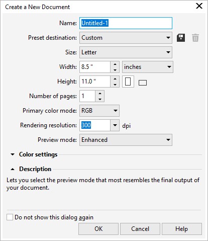
1. From within Corel Draw, go to File > New. You want an 8.5 x 11” portrait page that’s RGB and 300 dpi:
2. Select the Rectangle Tool:
Draw a rectangle in any size and then make sure the Lock Ratio is unlocked:
Then switch to the Pick tool:
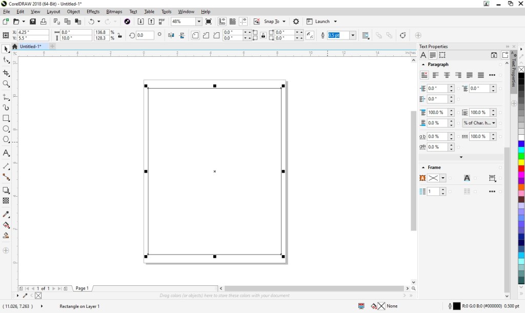
Change the size of the rectangle to 8” wide x 10” high and then press ‘p’ to center the object on the page:
Double click the Outline Pen at the bottom right of the screen and change the color to dark gray, the width to hairline, and the style to dashed:
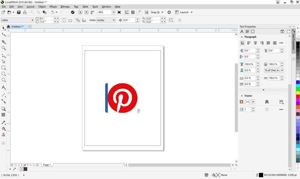
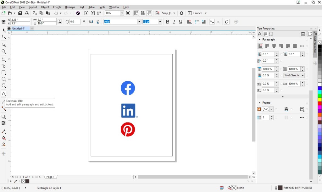
3. With the outline of your sign ready, next you can include the social media logos of your choosing. Since potential legal issues associated with using other companies’ logos can be daunting, we’ve done the legwork for you and compiled the logos that the major social media outlet wants you to use along with the rules for each. Visit our post, A “Legal-Approved” Free Collection of Social Media Icons, and simply copy a logo you would like to use from the post and paste the graphic into your Corel Draw file. Repeat the process for each logo you would like to use. I’ve selected three and each image is on top of the other at this point:
With one of the logos selected, lock the Lock Ratio and change the height of each logo to about 1.4”. You may need to move the logos around using the Pick tool so you can access each of them.
4. Next, select the Text tool so you could begin adding content:
Click anywhere on the page and type your business’s information for one of your chosen social media outlets. Then, set the alignment of the text to centered and choose your font and font size. I’m going to use Calibri in size 20:
Repeat that process for the remainder of your social media outlets:
Now let’s add the heading. I’m going to do “follow us” and “on social media” in two different fonts so I will create them as two separate text objects. Using the Text tool, click anywhere on the page and type “follow us.” I’m going to use the Candelion font at 160 pts in size and center the alignment. Repeat the process for “on social media”, which I’m going to type in all caps, add a space between each character, and set the font properties to Calibri, 25 pts, and centered.
5. You’ll see your sign is starting to come to life. Now you just need to clean it up. Press Ctrl + A, which will select all the objects in your document and then press ‘c’ to horizontally center them all:
Then, move the objects around using the Pick tool till everything seems vertically balanced. (Once you select an object, press Ctrl and continue to hold the key down while you move the object to retain its horizontal placement.)
6. Save your file, print (be sure to set your printer Print Quality to the best available option), cut (on the dotted line, which is 8×10”), and frame!
A Note About Fonts and Colors: While the instructions described above will achieve the simple and modern design pictured, you can (and should) customize the look for your business. If you’ve been brand building from the start, you already have a Style Guide in place, and everything you create for your business should reflect the guidelines you’ve set for your logo usage, fonts, and colors. If you’re new to branding, be sure to review our story on The Role of a Brand Style Guide.
In November, we published a story on the benefits of sending holiday cards to your customers (read that story here). If you haven’t had a chance to design your own yet, we figured we would make the process incredibly easy for you. Available below, you can download a free customizable template.
Disclaimer: While we only recommend products we know and love, we want to note we use affiliate links and may earn a commission for purchases made through those links.
About Corel Draw: If you’re a graphic designer by trade, Corel Draw may not be your graphics editor of choice. If you’re a small business owner without a lot of graphic design experience choosing to do your branding in-house, Corel Draw is a great choice. You can pretty much address all your web and print graphics needs for a fraction of the price of the typical designer preference, Adobe. Since you’ve landed on this page in your travels, you probably already know that. If, however, buying a copy has been on your to do list for a while, there’s no time like the present. You can buy yours here and support this blog in the process.
A Quick Note About Versions: I’m using Corel Draw 18. As long as you’re using a version in that same vicinity (i.e., 16, 17, 19, or 20), your view should look pretty similar to the screenshots included throughout these directions.
You can have yours ready to use in about ten minutes, assuming, of course, you’ve already made the hard decisions about your brand identity and:
already have a logo;
have your chosen fonts; and
have selected your color palette to use with your logo.
1. Launch Corel Draw and click the “New Document” button on the Welcome Screen. Set the document to 8.5” wide by 11” high, CMYK color mode, and 300 dpi; click “OK.”
Then, you’ll want to prepare the document a bit. First, click on the “Snap To” dropdown towards the top of the page; check Document Grid, Guidelines, Objects, and Page; then, click the “X” to close the dropdown.
Next, add Guidelines to create your margins by clicking on the ruler (just above your workspace) and dragging the cursor from the ruler towards your page. You’ll see a highlighted dotted line will appear and will continuously “snap” into certain placements while moving. (The word “grid” will appear over the line at those snap points; since you chose to “snap to” the document grid, the guideline will snap at each quarter inch on the page.) We want to set the guidelines to create a 1/2″ margin on the page, so let go of your guideline at the second snap on the page. For the bottom, let go of the guideline two snaps from the bottom of the page. Do the same for the left and right. Add one more vertical guideline to the center of the page at 4 1/4″.
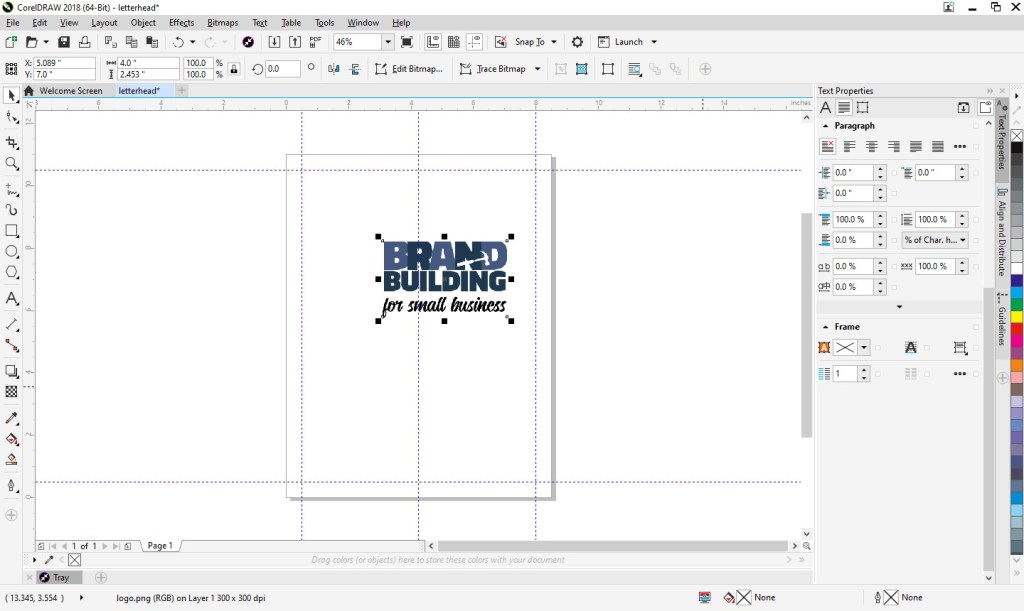
2. Then, insert your logo into the document. From the File menu, choose “Import,” navigate to your logo, select the file, press “Import,” and click within your document to place the logo file.
You’ll probably need to adjust the sizing of your logo. If so, just click on a corner of the image and drag diagonally to increase or decrease the size as needed. (If you drag other than diagonally, you’ll resize your logo disproportionately.)
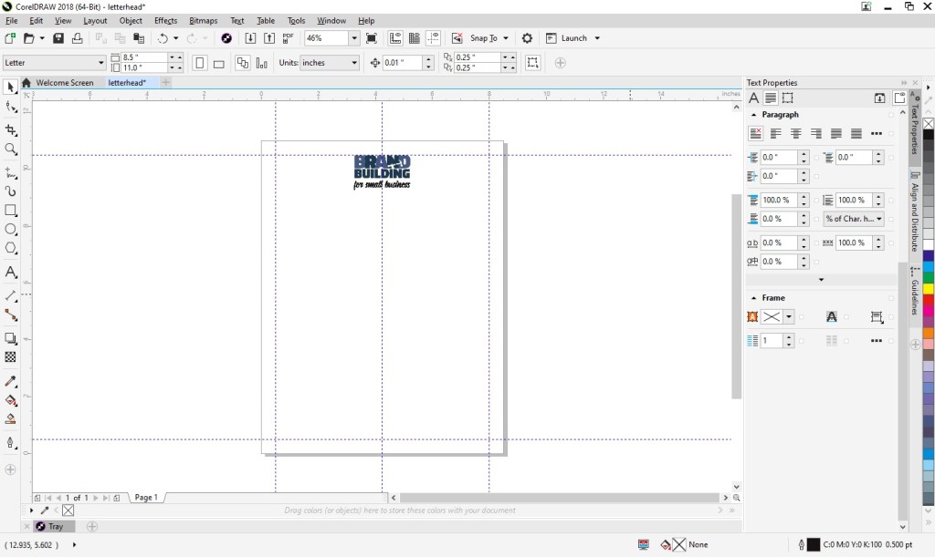
Next, move your logo so that the top of the image is aligned with your top guideline and the center of the image is aligned with the center guideline.
3. Next, you can add your footer. At left, you’ll see an A, which is the text tool. Click on that and create a square at the bottom of the page within the margins.
With the text box selected, set the font properties at the top of the page. (I went with Calibri in size 11 Centered.) At this point, zooming in on the text box is helpful. Click the magnifying glass at left (which is your zoom tool) and click on the text box.
In the footer, you can include your company name (or omit if you’d like since your company name is most likely already in your logo), your tag line (don’t waste any opportunities to educate people about your business), your web site address, email, address, phone number, etc.
You can begin typing by simply clicking into your text box. If you find you need to increase the size of your text box, click the top center handle and drag upwards as needed.
I included our business name, tag line, and web address; I also added some dashes above the web address for visual separation.
Next, zoom back out to the full page view by clicking on the magnifying glass and then selecting the “zoom to page” button at the top of the page.
Create another text box for your body copy. Click the A text tool and draw your box in between your logo and footer and within your left and right margins.
Set the font properties. (I went with Calibri Light in size 10).
And you’re done! You can now save your template future use. Go to File > “Save;” then, navigate to your desired location, name your file something that will be clear to you in the future (like “letterhead”), and click “Save.”
Feel free to download and use our letterhead as a starting point.
If you have any questions about the process, just ask us below!
The first time I attempted printing on envelopes was when I was doing Christmas cards about six months after I had started selling envelope templates as part of my invitation business. By time I designed the template for sale, the product had already been requested multiple times, and I finally caved. Something about the process intimidated me, and I was very reluctant to enter the market. And I was right . . . to an extent. I’ve been selling envelope templates for years now, and a number of them are best-sellers. That said, I encounter customers who experience issues with the process on a very consistent basis. If I am spending multiple hours assisting a customer, almost guaranteed I’m working with someone who is trying to print on envelopes.
Going back to my first time, I, too, had challenges, and printing perfection probably came after (similar to some of my customers’ experiences) about two hours of fighting frustration. I write all this not to scare you off but to properly prepare you. For most how to’s, I go on about speed and ease. This is not that kind of introduction. You will most likely be confused and annoyed at one or multiple points in this process. If you’ve got a fighting spirit, you may even be tempted to physically confront your printer. However – if you’ve got endurance, you will most likely prevail!
You could also be one of the lucky ones. Many of my customers have raved about how wonderfully easy the process was for them. I’m always a little secretly envious in those situations. Hopefully, that, too, will be your experience.
Regardless, whether or not you initially struggle and ultimately succeed or immediately win the day, you will pretty much be an envelope printing wizard going forward (until you purchase a new printer of course). Now, the process is old hat for me and is SOOO much quicker than writing out addresses and SOO much nicer looking than labels (yes, I’m an envelope snob now, sure, but we all have our faults). So . . . if you’ve decided you want to plunge forward, I commend your gumption and encourage you to read on.
1. Open Microsoft Word and select New > Blank Document. Click the Layout tab, press the Size button, and choose Envelope #10 (which is a standard business-size envelope). Then, click Orientation and select Landscape. Finally, click Margins, select Custom Margins, input .6” for Top and Bottom and .86” for Left and Right, and press OK.
2. Next, add your logo. Click the Insert tab, select Pictures, and choose This Device; then, navigate to your logo, select the file, and press the Insert button.
You’ll probably need to adjust the sizing. If so, just click on a corner of the image and drag DIAGONALLY to increase or decrease the size as needed. (If you drag other than diagonally, you could resize your logo disproportionately.)
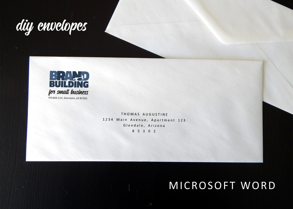
Then, click in the open space to the right of the logo, press enter to add a line space, set your font properties, and type your business address. (I went with Calibri font in size 7.5 and expanded the character spacing by .5; I fiddled a little with the options until the address lined up just so with the logo.)
3. Select the Insert tab, click the Text Box button (in the Text section at upper right), and choose the Simple Text Box.
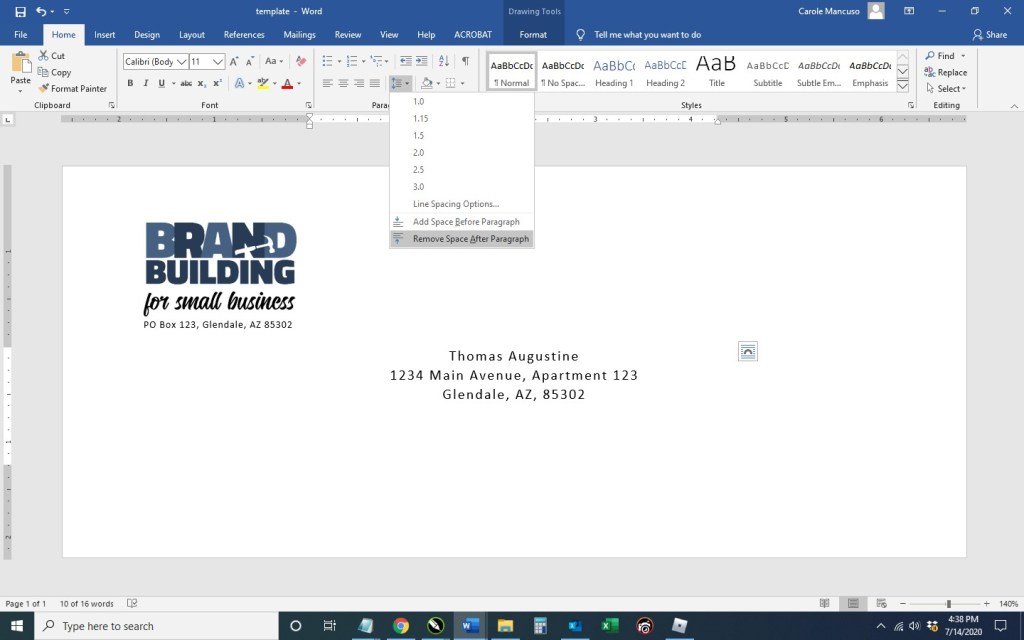
Click the Shape Outline dropdown and select No Outline. Type in your recipient’s name and address (or just input placeholder info for now). Then, select the outline of the shape and click the Home button to set the font properties of your text box. (This time, I went with Calibri in size 11 centered and expanded the character spacing by 1. I also selected Remove Space After Paragraph from the Line and Paragraph Spacing dropdown.)
At this stage, I just fiddled with the font properties a bit more. I decided to center the text, extend the character spacing by 2 pts, cap the name, put the zip code on its own line, and extend that character spacing by 5 pts. I also moved the text box move down a bit.
4. Be sure to save your file at this point to be accessible whenever you need to print an envelope.
And now, on to the tricky part. . . .
5. Go to File > Print. Once on the Print screen, be sure Envelope #10 is selected from the Page Size drop down.
Load your envelopes in your printer (according to your printer specifications). Take a picture so you remember your placement.
Print. If the addresses printed upside down, on the wrong side, not on the envelope at all, etc., adjust your envelope’s placement in the printer accordingly. Take another picture (so you can keep track of what you’ve already tried).
Once you know the proper way to line up your envelopes in your printer, be sure to take one last picture of the right placement for future reference . . . for the next time when can be an envelope printing pro.
That said, good luck . . . and try to be patient (or at least try to make it a little fun . . . maybe do a shot between each fail).
Disclaimer: An alternative route to printing envelopes in Word does exist, and I would be remiss not to at least mention that Microsoft does offer an automated set-up for Envelopes. While the functionality can be less frustrating when printing, formatting options are very limited. Feel free to check out Microsoft’s envelope how-to and see which route suits your needs best.
If you have any questions or comments, leave a reply below.
(Next up in the world of business envelopes . . . mail merge. Stay tuned!)
A seemingly infinite number of resources exist on branding, and a similarly large number of small business resources exist. Once you narrow in your search on resources for small business branding (and of course eliminate those who want to offer you that service in exchange for a fee), a much, much smaller pool exists. Well, we scoured the Internet for some of the most valuable of these resources for fellow small business brand builders and compiled the best of the best for you below . . . .
– – –
Pexels – “The world’s first inclusive free stock photo & video library”
While you need to attribute credit to the photographer (as you can see in the example pictured above), you get access to a really impressive selection of *free* high-resolution stock photography. The images can be used on your web site, in advertisements, flyers, etc. Pexels is absolutely a must-have in your bookmarks.
This blog is right up our alley! The articles discuss branding from the perspective of small businesses and even provide DIY tips in some areas. If you view the “Articles by Topic,” you’ll see they’re conveniently categorized into the following sections: “Find Your Niche,” “Dream It,” “Create It,” “Grow It,” and “Manage It.”
– – –
Google Fonts – “Making the web more beautiful, fast, and open through great typography.”
About a thousand *free* fonts are available, and they’re presented in a wonderfully searchable format (it is google after all). You’re able to type in your sample text, select the size you want to preview, and choose your desired font characteristic(s), and your search results will populate accordingly. According to google, “You can use [the fonts] freely in your products & projects – print or digital, commercial or otherwise.”
We use the vector and graphics editor, CorelDraw. While the suite is powerful and much cheaper than your standard graphics package, the cost is still pretty steep in the $500 ballpark. I read a few articles on free vector-editing programs, found Inkscape (https://inkscape.org/) to be highly recommended, and gave it a go. The free program seems to have all the features needed to get the job done. (And, they make a number of tutorials available, including one on the basic tools: https://inkscape.org/en/doc/tutorials/basic/tutorial-basic.html.)
– – –
AmEx Blog > Branding – “Hone your presence, online and off. Carve out a niche that customers and clients respond to, and help build a seamless brand, from the color of your logo to the personality of your social posts.”
AmEx has a vastly extensive blog for small businesses. While Branding is only one section within, the quantity of information could easily qualify as a blog of its own. While the section could benefit from some organization, dozens upon dozens of articles as well as videos offer valuable branding insights for small businesses.
While Microsoft dedicates the prime real estate of this page to promoting their “premium” content, hundreds of free options are available. If you browse by category, you’ll see brochures, business cards, flyers, invoices, newsletters, and more. While you’ll certainly want to customize any template with your business’s brand elements, these “off-the-shelf” options often make a great starting point and save you a lot of time and effort.
– – –
The Noun Project – “Over 2 Million curated icons, created by a global community”
Ever wondered where to go for icons that could be used as part of your brand identity or marketing materials for a very minimal cost? A number of options exist, but I like https://thenounproject.com/. They have a large selection and charge nominal, one-time fees per icon. (We obtained the hammer for our logo from this source for $2.99.)
– – –
DIY Marketers – “An Online Magazine for Overwhelmed Small Business Owners on a Budget”
The author of the blog shares her origin story:
Back in 2008 I got a call from MSNBC asking me to be a part of a pilot program they were doing for entrepreneurs. The idea was to bring a TV crew to “our offices” and see how we were able to create all this amazing content and to teach another small business owner how they can market themselves on a budget. I was sorry to tell them that the Ivana Taylor empire ran from my living room with my 3-person staff of Me, Myself and I. The first thing they asked me was how I was able to do so much on a budget — and that’s when DIYMarketers was born.
For me, this story exemplifies all we can accomplish in the world of DIY, investing money from our businesses in growth instead of hiring others to execute the tasks we can accomplish ourselves. And the blog itself doesn’t disappoint. While the design is a little overwhelming, you’ll find oodles of insight and “how-to’s.”
Disclaimer: While we only recommend products we know and love, we want to note we use affiliate links and may earn a commission for purchases made through those links.
If you’re a graphic designer by trade, Corel Draw may not be your graphics editor of choice. If you’re a small business owner without a lot of graphic design experience choosing to do your branding in-house, Corel Draw is a great choice. You can pretty much address all your web and print graphics needs for a fraction of the price of the typical designer preference, Adobe. Since you’ve landed on this page in your travels, you probably already know that. Your stumbling block may be that blank page within Corel that you’re staring at while wondering the quickest and easiest way to get professional-looking business cards designed, printed, and ready to hand out. We’ll take you step by step through the process.
A Quick Note About Versions: I’m using Corel Draw 18. As long as you’re using a version in that same vicinity (i.e., 16, 17, 19, or 20), your view should look pretty similar to the screenshots included throughout these directions.
1. From within Corel Draw, go to File > New. You want an 8.5 x 11” portrait page that’s CMYK and 300 dpi:
2. Select the Graph Paper Tool:
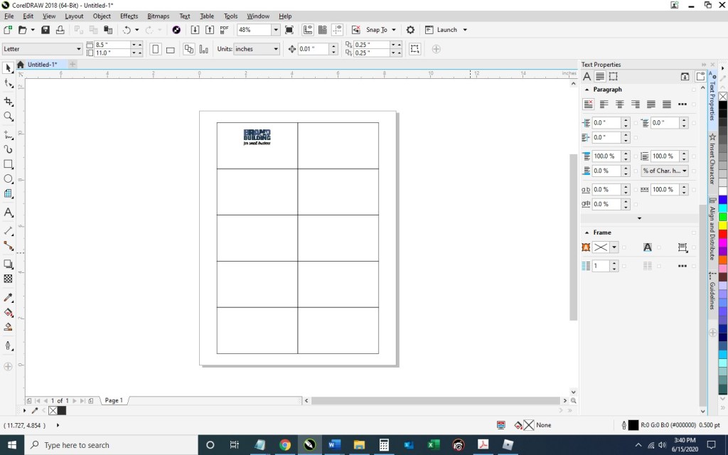
Input 2 columns by 5 rows:
Draw the graph in any size and then switch to the Pick tool:
Change the size of the graph to 7” wide x 10” high and then type “p” to center the object on the page:
Double click the Outline Pen at the bottom right of the screen and change the color to dark gray, the width to hairline, and the style to dashed:
Then press Ungroup Objects with the graph still selected:
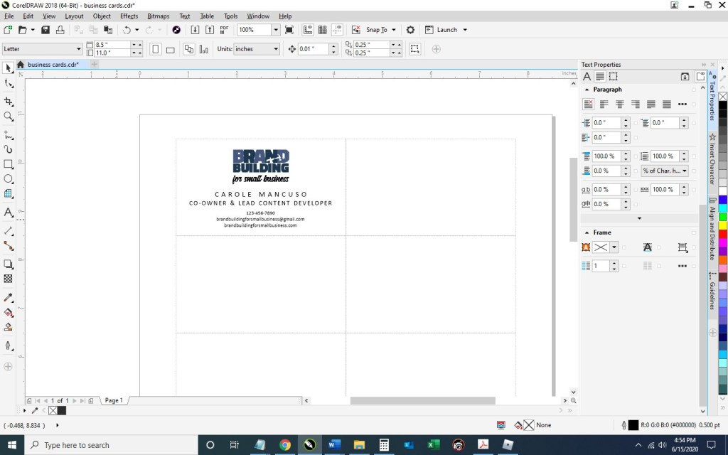
3. With the layout of your business card document ready, Go to File > Import and navigate to an image of your logo and click the Import button. Then, resize as desired and place your image within the top left rectangle. To ensure your logo is perfectly horizontally centered within the space, select the logo first, hold down the “shift” key to be able to select multiple objects, select the rectangle, at which point you can deselect shift; then, press “c” with both objects selected.
Select the Text tool so you could begin adding content:
Click anywhere on the page and type your name; press enter and add your title; then, continue adding the rest of the details you would like to show on your business card. I’m going to include my title, phone number, email address, and web site. Finally, set the alignment of the text to centered and choose your font and font size. I’m going to use Calibri, size 11 for my name; size 10 for my title; and 7.5 for the rest of the information.
Move the text to the desired spot within the rectangle and horizontally center the two (click the text, press the ”shift” key while also selecting the rectangle; then, press “c”):
Now, you’ll want to adjust the spacing a bit. With the text selected, press Ctrl + k to break each line into its own text object. Then, I’m going to stretch out the character spacing of my name from 0% to 150%. To do so, press Ctrl + t to edit the text properties.
To ensure the two words don’t run into one another with the extended character spacing, I’m going to change the Word Spacing from 100% to 450%:
For my title, I’m going to use 50% character spacing and 250% word spacing.
Next, I’m going to select the phone number, e-mail address, and web site – pressing the down arrow key a few times until I’m happy with the placement:
4. And now we’ve got one business card in place! To distribute the card design throughout the page so they can be printed ten at a time, select the rectangle you’ve been working on along with all the content inside and press Ctrl + g to group them together. Press Ctrl + d to duplicate the business card:
Keeping the newly created business card selected, press the “shift” key while selecting the top right rectangle; then, press “e” to vertically center and “c” to horizontally center:
Select your two business cards and press Ctrl + g to group the two together and then Ctrl + d to duplicate them both:
With your newly created group of two business cards selected, press shift while selecting the second rectangle in the first column, and press “t” to top align the objects and “l” to left align the objects:
Repeat that process until all the rectangles are filled with your business cards:
5. Save your file and print; be sure to set your Print Quality to the best available option.
When choosing your paper, I recommend a quality cardstock between 80 and 100 lb — any thinner, and your business card will be too flimsy; any thicker, and you risk problems using the paper in a conventional home printer. A matte versus glossy finish is really a personal preference, but you do avoid any potential for fingerprints on a matte stock.
Then, cut! For the cleanest and straightest edges, use a paper cutter.
A Note About Fonts and Colors: While the instructions described above will achieve the simple and modern design pictured, you can (and should) customize the look for your business. If you’ve been brand building from the start, you already have a Style Guide in place, and everything you create for your business should reflect the guidelines you’ve set for your logo usage, fonts, and colors. If you’re new to branding, be sure to review our story on The Role of a Brand Style Guide.
In an earlier post, we described how easy creating your own business letterhead can be in Microsoft Word. Well, they say a picture is worth a thousand words, so a video must be worth . . . a whole lot of words!
We really wanted to be able to show how easy some of our DIYs really are, and how better to do that than in live action? (The task of creating letterhead is done in about two minutes.)
So welcome to our first video . . . . Hope you enjoy it! If you have any questions or comments, we’d love to hear from you! Just scroll down to the comments section at the bottom of this page.
Every business should have a custom thank you card on file – the piece gives you the opportunity to express appreciation to your customers, employees, business partners, or anyone else deserving of thanks while reinforcing your business’s brand; also, I love gestures that have double-duty impact at minimal (almost no) cost.
So, in case you don’t already have one of these gems saved on your hard drive, I’m going to take you through the process of making a 2-on double-sided 5×7” branded Thank You card in Microsoft Word.
1. Open Microsoft Word and create a New Blank Document. Change the margins of the page by selecting the Layout tab (at the top), clicking the Margins button, selecting Custom Margins, and changing the Top, Bottom, Left, and Right margins to .25 inches.
2. Click the Insert tab (at the top), click Text Box within the Text section, and select Simple Text Box. Click the outline of the rectangle, hover over the center handle of the bottom line, and click and drag downward to increase the size just a bit. Then, right click on the rectangle, choose More Layout Options…, click the Size tab, input a Height of 5”, select Absolute within the Width section and input 7”; click the Position tab and uncheck “Move object with text” from the Options section. Next, right click the rectangle and select Format Shape. Format the Fill as No Fill and the Line as a Solid Line, Black, 1pt in Width, and Dashed. Now your text box is ready to be customized.
Click the content within the rectangle, which will select everything, and press delete. Set the alignment to centered by pressing Ctrl + E and then type “Thank You”. Press the enter key to advance a couple lines spaces and then insert your logo (Insert tab > Pictures > This Device > browse to the image file for your logo > Insert).
Now you’re obviously going to want to do some formatting. I decrease the size of our logo to 1” in height (the width automatically adjusts proportionately), change the font of “Thank You” to Candellion in 80 pt. and add some line spaces.
3. With the rectangle selected, press Ctrl + C and then Ctrl + V to make a copy. Click and drag the outline of the second rectangle to move about a quarter of an inch from the bottom of the first and horizontally centered on the page (indicated with a green guideline).
4. Duplicate the page: press Ctrl + A to select all the content on the page, press the Insert tab (towards the top), click Blank Page in the Pages section (at top left), and then Ctrl + V to paste the content from the original page onto the new page.
Next, go to the second page and delete the content of the text boxes. You’re going to want to type your message here. (I used the Calibri font in size 11.) Copy and paste the content from one text box to the next (or type different content) and then remove the border of each box. (When you print double sided, the printer will offset the reverse side some small amount and the boxes won’t line up perfectly; therefore, you can just leave the boxes on the front as your cutting guide.)
5. Save your file, print double sided on card stock, and cut!
Good luck. Stay safe.
If you have any questions or comments on this topic, we’d love to hear from you. Scroll down to the comments section at the bottom of this page.