Where to Begin? Once you’ve made the decision for your business that you are going to build your brand from the ground up, you may find yourself a bit overwhelmed. I certainly did. In this post, I reflect on the beginning of my journey as I learned to focus on branding even while in survival mode.
What’s in a Name? This piece examines some of the considerations in selecting the right name for a well-branded operation.
Design Your Own Logo This tutorial provides a very hands-on approach to building your logo. Whether you are considering a totally new design or simply looking to adjust, adapt, and tweak an existing one, these tips (including where to find needed tools) should prove useful.
Know Your Audience A very basic but essential part of any branding exercise should be to make sure you know your audience and choose branding elements that properly reflect their characteristics. This article reviews some of the basics for you to consider.
How to Create a Mission Statement Need a little inspiration for crafting that ever-so-important message? This post includes a couple dozen great examples along with an exercise that breaks down the components of a good mission statement to help you develop yours.
The Role of a Brand Style Guide Once you have completed each of the above activities BUT BEFORE YOU BEGIN BUILDING BASIC TOOLS LIKE BUSINESS CARDS OR LETTERHEAD OR INCORPORATING THE ELEMENTS INTO MARKETING OR ADVERTISING EFFORTS, take the time to create a style guide that puts into writing the most basic rules that must be observed to properly build the visual element of your new brand.
How to Set Up Simple Print-and-Cut Business Cards Start with a blank Word document and develop business cards that are print-ready in only ten steps . . . this “how to” guides the way for you. A Corel Draw tutorial is available as well.
How to Easily Create Business Letterhead As integral as business cards and even easier to develop, letterhead created in Microsoft Word is presented as Instructions with Template Included and a Video Tutorial. Instructions and a template are available for Corel Draw as well.
Note: Many helpful downloadable tools/templates are provided to add extra value to the pieces described above.
Disclaimer: While we only recommend products we know and love, we want to note we use affiliate links and may earn a commission for purchases made through those links.
In an earlier post, we described how easy creating your own business letterhead can be in Microsoft Word. Well, they say a picture is worth a thousand words, so a video must be worth . . . a whole lot of words!
We really wanted to be able to show how easy some of our DIYs really are, and how better to do that than in live action? (The task of creating letterhead is done in about two minutes.)
So welcome to our first video . . . . Hope you enjoy it!
Disclaimer: While we only recommend products we know and love, we want to note we use affiliate links and may earn a commission for purchases made through those links.
Every business should have a custom thank you card on file – the piece gives you the opportunity to express appreciation to your customers, employees, business partners, or anyone else deserving of thanks while reinforcing your business’s brand; also, I love gestures that have double-duty impact at minimal (almost no) cost.
So, in case you don’t already have one of these gems saved on your hard drive, I’m going to take you through the process of making a 2-on double-sided 5×7” branded Thank You card in Microsoft Word.
1. Open Microsoft Word and create a New Blank Document. Change the margins of the page by selecting the Layout tab (at the top), clicking the Margins button, selecting Custom Margins, and changing the Top, Bottom, Left, and Right margins to .25 inches.
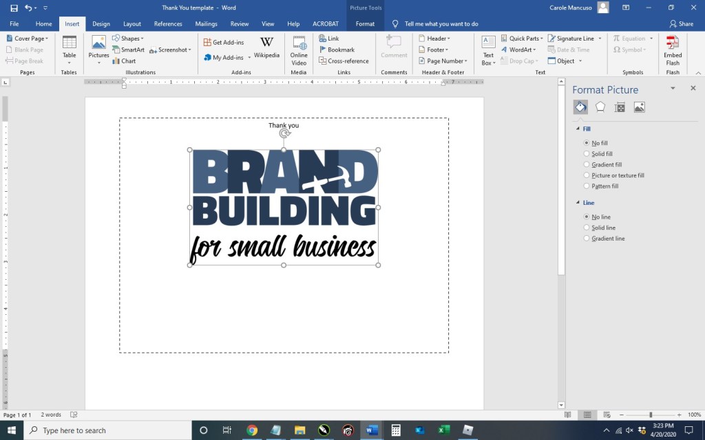
2. Click the Insert tab (at the top), click Text Box within the Text section, and select Simple Text Box. Click the outline of the rectangle, hover over the center handle of the bottom line, and click and drag downward to increase the size just a bit. Then, right click on the rectangle, choose More Layout Options…, click the Size tab, input a Height of 5”, select Absolute within the Width section and input 7”; click the Position tab and uncheck “Move object with text” from the Options section. Next, right click the rectangle and select Format Shape. Format the Fill as No Fill and the Line as a Solid Line, Black, 1pt in Width, and Dashed. Now your text box is ready to be customized.
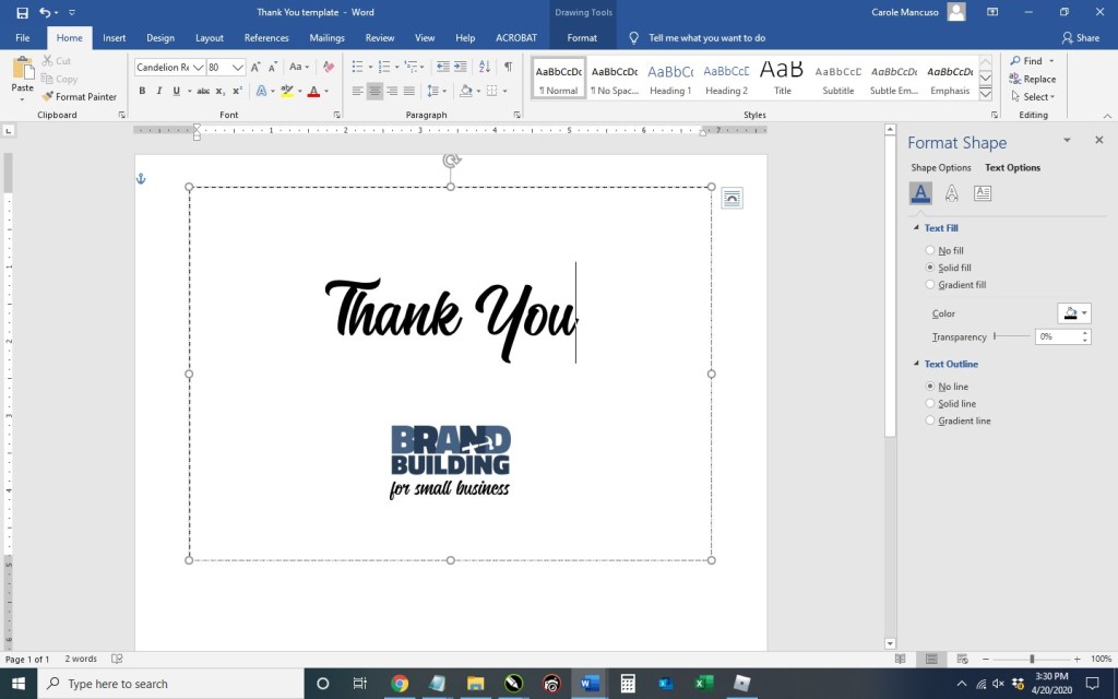
Click the content within the rectangle, which will select everything, and press delete. Set the alignment to centered by pressing Ctrl + E and then type “Thank You”. Press the enter key to advance a couple lines spaces and then insert your logo (Insert tab > Pictures > This Device > browse to the image file for your logo > Insert).
Now you’re obviously going to want to do some formatting. I decrease the size of our logo to 1” in height (the width automatically adjusts proportionately), change the font of “Thank You” to Candellion in 80 pt. and add some line spaces.
3. With the rectangle selected, press Ctrl + C and then Ctrl + V to make a copy. Click and drag the outline of the second rectangle to move about a quarter of an inch from the bottom of the first and horizontally centered on the page (indicated with a green guideline).
4. Duplicate the page: press Ctrl + A to select all the content on the page, press the Insert tab (towards the top), click Blank Page in the Pages section (at top left), and then Ctrl + V to paste the content from the original page onto the new page.
Next, go to the second page and delete the content of the text boxes. You’re going to want to type your message here. (I used the Calibri font in size 11.) Copy and paste the content from one text box to the next (or type different content) and then remove the border of each box. (When you print double sided, the printer will offset the reverse side some small amount and the boxes won’t line up perfectly; therefore, you can just leave the boxes on the front as your cutting guide.)
5. Save your file, print double sided on card stock, and cut!
People are feeling overextended, underprepared, angry, sad, stressed, and scared. Your customers, your staff (if you have one), you, and I are all likely experiencing some sense of these heightened emotions. The extent to which these feelings exist in each person vary greatly as do their specific circumstances. Generally speaking though, our “fight or flight” survival instincts (the body’s natural response to stressful stimuli) are lingering closer to the surface than usual.
During times of crisis, you see evidence of this all around you: the individual yelling at the cashier for the store’s “1 per person” limit; the beeping and yelling over that sought-after parking spot; and even an increased number of heated social media discussions that seem to have the voltage turned up a bit. The beneficiaries of my stress . . . ? These days, I find myself triggered by my children’s complaints of boredom (I suddenly channel my grandmother: “Be thankful you’ve got nothing to do, or I’ll give you something to do!”). And God bless the telemarketer that calls my phone this month.
So what does all this have to do with your business’s customer service? Chances are, your customers will have less patience than usual. The person (or people) who works with your customers (even if that person is you) will probably have less patience than usual. “The perfect storm.” Unfortunately, any intense interactions will likely not be forgotten once the storm has calmed. As illustrated by the info-graphic below, a disgruntled customer will process their feelings in one (or more) of a number of predictable and unfortunate ways.
(Not topping the list of “What Happens After Poor Customer Experience”: Customer will acknowledge that everyone is under a lot of stress and give the company the benefit of the doubt.)
How can we prevent ourselves from alienating customers during hard times? Recognition is an extremely important first step. One parenting mantra often repeated is, “Your child isn’t giving you a hard time; your child is having a hard time.” This twist on perspective can easily apply to individuals of all ages who are having a hard time. Before answering a phone call or responding to an email, take a moment to remember all the potential scenarios that people (including you) are dealing with right now: serious health issues among family or close friends, loss of income and trouble paying bills, homeschooling children – in many cases – while working from home, etc. Acknowledge all the weight that you and everyone else is carrying around. Taking that moment will make a world of difference, I promise.
Going one step further, you may even want to solidify some more relaxed (short-term) customer service policies. Formalizing a revised posture is particularly beneficial if you have employees that will be working with your customers during this time. Having finite rules (that have been relaxed) will help your staff navigate this confusing landscape.
Good luck. Stay safe.
If you have any questions or comments on this topic, we’d love to hear from you. Scroll down to the comments section at the bottom of this page.
When looking to promote your social media presence, you want to include logos for each outlet, but you don’t want to be on the receiving end of legal issues with Facebook or Instagram. So we’ve done the legwork for you and compiled the logos each social media outlet wants you to use along with the rules for each. If you had a legal department, their ‘approved’ rubber stamp would be inked up and ready!
Use the “f” logo to promote your business’s presence on Facebook.
The color of the icon can either be facebook blue or white.
Include a call to action and link with the logo.
When using along with other icons, ensure they are all equal in size with adequate space in between each and maintain the shape and proportions of the “f” logo.
Don’t change the logo in any way.
Don’t make the logo the most prominent feature of your piece.
Use the Instagram glyph (or outline) in black or white (though you can place on a pink background when showing with other social media icons in their brand colors).
Use the logo with a call to action unless including in a lineup with other social media icons.
The glyph should be surrounded with clear space – specifically 50% of the glyph’s size – on all sides.
While Twitter prefers you use their icon free of any container, they provide versions with the icon enclosed in a square, a square with rounded corners, and a circle.
When pairing the logo with an account name or hashtag, scale the text to 100% of the logo’s height.
Only use the logo in Twitter blue or white.
Don’t change the logo in any way.
Don’t surround the logo with other creatures or accessories.
The empty space around the logo should be at least 150% of the logo’s width.
TikTok’s logo can only be used with prior written permission.
Use TikTok’s name in text ONLY to refer to their platform or services
You can say things like “uploaded on TikTok” or “follow us on TikTok”
Don’t include a space between “Tik” and “Tok”.
Both Ts in TikTok are upper case, and all other letters should be lower case.
We hope this guide simplifies the use of social media logos for you. However, please keep in mind that this collection does not replace the full guidelines provided by each social media outlet, and those should be reviewed in full as well.
If you have any questions or comments, we’d love to hear from you! Post in the comments section below.
You’ve created your social media pages to reinforce and promote your brand, and you regularly dedicate your time to adding content. Now, you want to be sure you’re taking every opportunity to properly promote your social media presence. If your small business has a physical location (office, retail store, etc.), hanging a sign in a high-traffic area is a great option and relatively quick and easy.
I’ll show you the steps to create such sign in Microsoft Word.
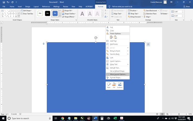
1. Open Word, create a new blank document, and insert a rectangle. (When your cursor turns into a plus sign, you’re able to draw your shape.
By default, mine is blue. Right click the rectangle and select More Layout Options.
Set the properties to . . .
Size: 10” in Height and 8” in Width
Text Wrapping: Behind Text
Position:
Horizontal – Absolute Position of .25” ‘to the right of’: Page
Vertical – Absolute Position of .5” ‘to the right of’: Page
Set the Fill to No Fill and the Line to a Solid Line, Black Color, and .5 pt Width, choosing the Dash Type selection shown below.
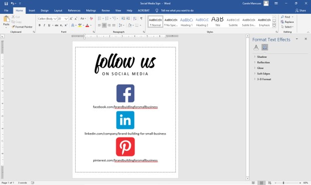
2. Click inside the rectangle and type “Follow Us on Social Media”. Set the font to one or more choices that work as your heading and size to appropriately fill the space. Set the Alignment to Centered. I went with the font Candelion Regular in all lowercase at size 160 for “follow us” and (on the next line) Calibri in all caps at size 25 and added a space between each letter.
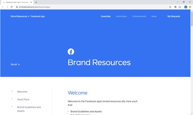
3. Next, decide which review platforms you would like to feature. We are currently active on Facebook, LinkedIn, and Pinterest and will be highlighting those. Then, go to Google to find logos. Most social media outlets will have a corporate page that makes their logo available to the public along with instructions for proper usage. For example, Facebook has a Brand Resources page easily found when searching “facebook logo” on Google.
As you find the appropriate source for each social media outlet, save the logos to your desktop.
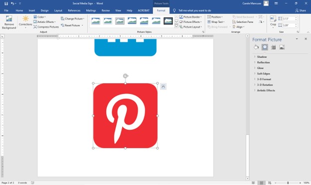
4. Press enter within your document to advance to the next line space and then insert each of your saved logos (from the menu at top, press the Insert tab, and choose Picture) in the order you want them to appear on your sign.
Inserting each of mine took me to the bottom of a second page. So, the first step in adjusting sizing is to crop any excess space from the logos. (As you can see above, the outline of the Pinterest image is directly around the icon, so no need to crop that one.) That’s not the case for LinkedIn . . .
To crop, click Picture Tools (at the very top of the screen), click the Crop icon (at top right), drag the outer edges of the box tight around the logo, and press enter. Once all the logos are cropped as needed, try to match their size to about and 1.4” in height. (This will ensure you have adequate room for text.) To do so, click Picture Tools again and enter a height at top right.
Repeat for the other icons.
5. Click in the space after your first icon, press enter to add a line space, and type your profile name/URL for that platform; repeat for your subsequent logos. This process once again took me onto a second page.
Therefore, decrease the font size as needed. I went with size 20.
And then adjust the spacing a little for each line of text (so you have additional room between each social media outlet).
And you’re done!
6. Save your file, print, cut (on the dotted line, which is 8×10”), and frame!
A Note About Fonts and Colors: While the instructions described above will achieve the simple and modern design pictured, you can (and should) customize the look for your business. If you’ve been brand building from the start, you already have a Style Guide in place, and everything you create for your business should reflect the guidelines you’ve set for your logo usage, fonts, and colors. If you’re new to branding, be sure to review our story on The Role of a Brand Style Guide.
SEO or Search Engine Optimization, in a nutshell, helps your web site be found online.
The very first step is to make sure search engines know your web site exists. Or, more specifically . . .
CHECK WHETHER YOUR WEB SITE IS INDEXED
Search engines “crawl” the internet, reviewing each web page found, and then organize the content in their “index” to provide as future search results based on the relevancy to keywords searched. If you’re not in the search engine’s index, you’re virtually invisible to searchers or, as applicable to us small businesses, potential customers.
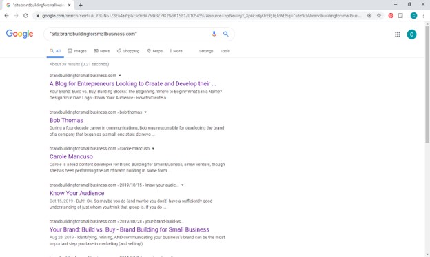
Seeing whether your web site is in their index is easy. From any search engine, search for “site:yourwebsite.com”. (In our case, we search: site:brandbuildingforsmallbusiness.com.)
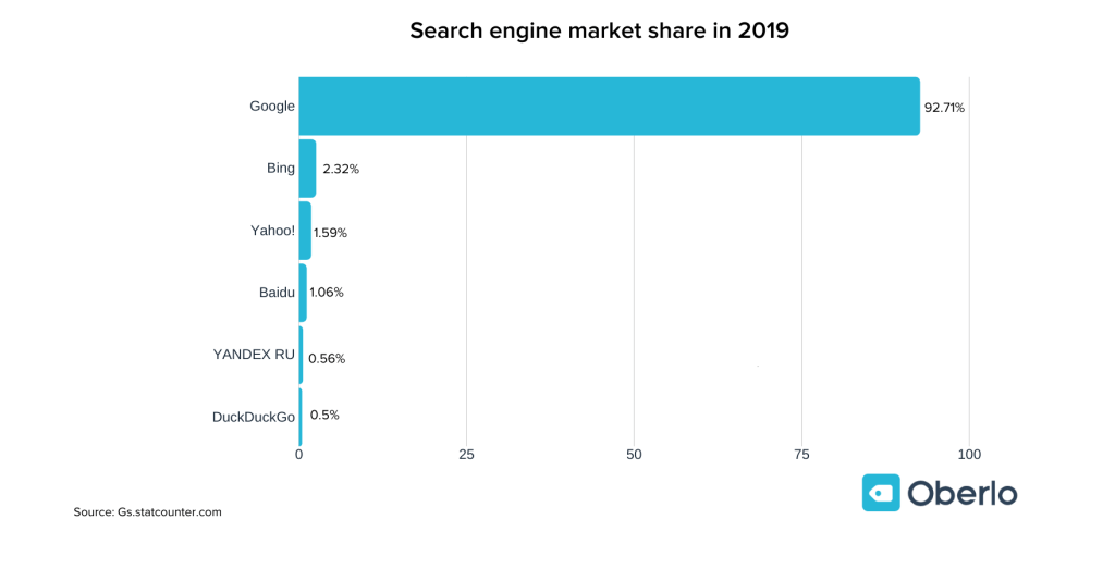
In our check, we found that most of our blog is a part of Google’s index. Since Google performs the lion’s share of searches (see below), we’re going to focus on them.
WHAT TO DO IF YOUR WEB SITE IS NOT INCLUDED IN THE INDEX?
According to Google, a few common reasons explain why a site might not appear in search results. The most popular issues and some potential solutions are listed below for you.
PROBLEM: Other web sites do not link to your site, and/or your web site is simply too new.
POSSIBLE SOLUTION: You can create pages for your business in social media venues (like Facebook, Pinterest, etc.) and include links to your web site.
POSSIBLE SOLUTION: Find popular web sites that could benefit from content on your web site. Once you’ve identified some possible targets, send an email or letter to the appropriate person (usually a contact page will have the needed information) and explain why you believe their web site would benefit from linking to yours. Be sure to follow up.
POSSIBLE SOLUTION: Get online reviews. If applicable to your products or services, create a page for your business on popular review sites (google, yelp, etc.) and seek out reviews. If you know of a particularly happy customer that has a web site or a strong social media following, ask for a plug to your business.
POSSIBLE SOLUTION: Think about business contacts that could help you promote your web site. For instance, you may use intermediaries or suppliers that have an appropriate place on their web site to link to your business.
POSSIBLE SOLUTION: And last but not least, post quality content and be patient. “If you build it, they will come.” Whether a baseball field or a web site that adds unique value to the digital world, people will eventually find you, and they will link to your web site.
PROBLEM: Google’s ability to crawl the site has been hindered by Flash, other specialized technology, or a lack of text.
POSSIBLE SOLUTION: If your web site utilizes Flash or another specialized technology, you may want to consider a redesign in HTML. While this could be a significant undertaking, you want your web site written in a language that search engines understand.
POSSIBLE SOLUTION: Review the image to text ratio on your web site. Do you have enough words for search engines to fully understand the content for each page? If not, you can either replace your images with text (try to use formatting to achieve that same visual appeal) or supplement the images with explanatory captions. Remember that you’re communicating with your web site’s audience as well as search engines.
PROBLEM: Your web site generated an error when Google tried to crawl your web site.
POSSIBLE SOLUTION: The most common reason for this problem is secured content. If your web site requires a log-in to enter the site, Google won’t be able to enter either. Consider restructuring your web site so that your more general pages are open to the public and only the pages truly requiring a log-in get that restriction.
POSSIBLE SOLUTION: You can also register your web site with Google’s Search Console, which can give you some more specific information about the errors generated.
If you have any questions or comments about getting included in Google’s index, we’ve love to hear from you. Scroll down to the comments section. . . .
The next goal of course is to improve your web site’s search ranking, which will be the focus of a future post.
Special Note: Brand Building for Small Business has been identified by Feedspot (www.Feedspot.com) as one of the Top 100 Branding Blogs. Feedspot provides “the most comprehensive list of branding blogs on the Internet” so we are pleased to be part of that group. To learn more, visit https://blog.feedspot.com/branding_blogs/.
Special Note: Brand Building for Small Business has been identified by Feedspot (www.Feedspot.com) as one of the Top 100 Branding Blogs. Feedspot provides “the most comprehensive list of branding blogs on the Internet” so we are pleased to be part of that group. To learn more, visit https://blog.feedspot.com/branding_blogs/.
Most business owners appreciate the importance of customer service, but far fewer recognize the connection between the service they provide and the brand they represent. Your customers’ experience with your business should reflect and reinforce your brand (or the personality of your company).
Let’s look at two extreme examples.
Amazon
Amazon’s customer-centric focus is a part of their mission and vision statements. They are known for free two-day shipping (now with same-day options sometimes available), one-click purchases, and their virtual assistant (i.e., Alexa; lovingly known as Lexie in our house . . . or dumba@#$!, depending on the day and how well she’s performing her virtual assistance role).
While having to wait ten minutes to speak to another company’s customer service representative may be annoying, most people probably wouldn’t be surprised. However, we have different expectations for Amazon. We expect to communicate with someone right away when we have an issue, and we expect that individual to capably handle the problem . . . and that’s only for those situations in which we can’t fix the issue ourselves (for example, “returning” a product without ever even interacting with customer service). Quick, tech-savvy, and capable are qualities associated with Amazon’s brand, so we expect their approach to customer service to embody those same characteristics.
Amazon also uses service interactions as opportunities to reinforce their brand. They thank you for shopping with Amazon over the phone or via chat. Afterwards, you’ll receive an email message from customer service, asking for feedback on your experience. In that email, you’ll see the company logo, an email layout consistent with the company’s style, and a reference to the company building “Earth’s Most Customer-Centric Company.”
Amazon’s brand is reflected and reinforced throughout the customer service experience.
On the flip side, sometimes customer service that isn’t customer focused or service focused is actually an important part of the brand, too.
Ferrari
This company’s product is associated with luxury, quality, and exclusivity. For the most elusive Ferraris with very limited production, you don’t simply order one from the new flashy and convenient car vending machines. You don’t simply order one at all. You “request” to order one, and those requests are not fulfilled in the traditionally expected “first-come, first-serve” manner. If you have money, fame, and an existing collection of Ferraris, you will probably make the cut; no guarantees though.
Robert Herjavec, the businessman turned celebrity on ABC’s Shark Tank, spoke about ordering a Ferrari in Wired magazine, “The funny thing is, you never really know if you’re getting one until you’re actually getting one.”
(Note that most of the cost is required in advance of being guaranteed your requested Ferrari!)
“. . . You wait for a while, then you kind of get a date range, then you get a closer date, then you get the actual date. Then it’s definitely Christmas,” said Herjavec.
If you happen to request a paint color for your new car that Ferrari deems to be in poor taste, you can be denied said paint color.
So, you make an order (with payment) without guarantee of getting the product, you wait an extraordinarily long time IF you are given the privilege of being promised the product, and customization choices aren’t always yours to make. All of these customer service attributes reflect the exclusivity that is Ferrari’s brand and actually add to the allure of their products.
While I am not quite Ferrari’s target demographic and haven’t been involved in this process, I would expect that their brand is reinforced at each stage of the way – indirectly and directly portraying the characteristics that define them (luxury, quality, and exclusivity), including visual brand components as well whenever possible (for example, the prancing horse).
Customer Service Characteristics that Represent Your Brand
While the two brand examples highlighted are extreme ones, all aspects of your customer service do communicate qualities about your business. Below is a list of some different customer service opportunities to consider. The way your company handles each of these items contributes to a brand experience . . . one that hopefully reflects your perception of your brand.
-The amount of time taken to answer phone calls/emails
-The way customers and potential customers are addressed in person as well as via phone/email
-The extent of information available to potential customers
-The level of assistance provided to a customer when experiencing an issue
-The way customer input and suggestions are handled
-The background information included with a product or service
-The amount of detail provided with any instructions included with a product or service
-The inclusion of contact information in promotional materials and product documentation
-The extent of customer follow-up provided post-purchase
-The inclusion of your logo and tag line in all possible service interactions (e-mail, letters, etc.) and documents
-The adherence to your company’s style guide in all possible service interactions (e-mail, letters, etc.) and documents (If you haven’t developed a style guide for your business yet, read The Role of a Brand Style Guide.)
If upon looking at this list, you feel like your customer service experience is fully in synch with your brand, pat yourself on the back! That is no small feat!
Want an even stronger evaluation? Ask a few of your customers to do the same review on your behalf.
If one or more attributes could use some tweaking to either better represent your company or to better take advantage of the branding opportunities that exist, you’re not alone. The good news is that you can make important changes over time that can have a big impact on your business and your brand.
Disclaimer: While we only recommend products we know and love, we want to note we use affiliate links and may earn a commission for purchases made through those links.
Letterhead can be one of the easiest components of your brand . . . and have a significant impact, presenting your business to the world with professionalism and credibility. Still, people are often intimidated because they don’t realize the difference between a letter on a new, blank document and one on professional-looking letterhead requires just a few simple steps (three actually). You can have yours ready to use in about ten minutes, assuming, of course, you’ve already made the hard decisions about your brand identity and:
already have a logo;
have your chosen fonts; and
have selected your color palette to use with your logo.
1. From within Microsoft Word, go to File > New > Blank document. Start by preparing the main section of your letterhead and set the font properties; no text needs to be entered or selected to do this. Just choose a font and font size (I went with Calibri in size 10).
2. Then, click the Insert tab, press Header, and choose Edit Header.
Press Ctrl + E to set your alignment to centered. Then, press the Insert tab again, click Pictures this time, navigate to a high-resolution image (PNG, JPG, etc.) of your logo, and press Insert.
You’ll probably need to adjust the sizing of your logo as this point. If so, just click on a corner of the image and drag DIAGONALLY to increase or decrease the size as needed. (If you drag other than diagonally, you could resize your logo disproportionately.) Then, click in the open space to the right of the logo and press enter to add a line space. You’re now done with your header!
3. Scroll down to the footer and click within that area. Press the Home tab to set your font properties. (I went with Calibri in size 12 Centered.) In the footer, you can include your company name (or omit if you’d like since your company name is most likely already included in your logo), your tag line (don’t waste any opportunities to educate people about your business), your web site address, email, address, phone number, etc.
I included our business name, tag line, and web address; I also added some dashes above the web address for visual separation. And, voila! Done! Double click the space above the dashed line labeled footer to exit the header and footer and return to the main document. (At this point, the header and footer content will be grayed out, showing that you are editing the main body of the document. To return to the header and footer section, simply double click in either the header or footer sections.)
Before calling it a day, be sure to save your template. Go to File > Save as; then, Browse to your desired location, name your file something that will be clear to you in the future (like “letterhead”), and save.
Feel free to download and use our letterhead as a starting point.
Disclaimer: While we only recommend products we know and love, we want to note we use affiliate links and may earn a commission for purchases made through those links.
Lots of businessowners question whether they’re creative or tech-savvy enough to create their own logo. Unfortunately, I can’t tell you neither of those qualities are needed, but I can safely say they’re not needed in the abundance you probably imagine.
Things you do need to design your own logo:
A little creativity
A little tech savvy
A vector editing program (available for free)
Lots of fonts choices (available for free)
Lots of icon choices – IFyou want a graphical component to your logo (available for very minimal cost; the icon used in our logo cost $2.99)
So where to start?
While graphic design isn’t my specific trade, I’ve been asked
to create dozens of logos throughout my career.
Every time, I start by facing that same dreaded obstacle: the blank
page. I stare at it, thinking about what
the logo should represent and the type of fonts, colors, and imagery to best
suit that message. Meanwhile, a blank page relentlessly stares back.
While a tedious process, you should set your expectations for your logo before you pick up a pencil (or the mouse).
Originally, logos were introduced as an aid to people who couldn’t read. As a result, the earliest designs tended to be very literal. (For example, a shoemaker’s logo would inevitably show a shoe.) Over time, the purpose of logos has evolved to become a broader reflection of brand but remains a key way of differentiating yourself in the marketplace.
So what’s the personality of your company? Is your business youthful and trendsetting? Conservative and financially strong? Fun and whimsical? Product-focused and straightforward? Some combination thereof? This corporate identity (or brand) needs to be communicated in your logo – through your font(s), color(s), placement of words, and any graphics.
If once you have a strong sense of your business “personality”
in mind, your page is still unyielding in its never-ending canvas of white, go
looking for some inspiration. . . .
For the Brand Building for Small Business logo, I
knew I wanted to try something graphical to literally represent the act of “building.” I was initially picturing letters being
nailed but knew that would be tricky to execute in a clear way. So, I went to my go-to spot for inspiration: google images.
I searched for “building logo,” hoping the results would be full of
construction-type logos also looking to convey the literal act of “building.” But no, Carole, searching “building logos”
yields lots of logos of buildings.
. . . Should have foreseen that. Instead, I searched for “building construction logos” and found more of what I had in mind.
A couple screens in, I found inspiration.
Looking at the Hammersmith logo (in navy and white on a
yellow background), I love the way the hammer is a silhouette within the house
and appears to be captured mid-swing. I
immediately knew I wanted to try a hammer silhouette, but I wanted the graphic to
appear within the company name and not as part of a separate graphical
element.
A quick note on inspiration versus copyright infringement: This is an area requiring caution. Whereas you can use a silhouette of a hammer as seen in one logo in another, creating a logo for a construction company with a silhouette of a hammer in a navy house with white windows on a yellow background would most certainly earn you front-row seats to the case of them v. you. An individual idea cannot be copyrighted; however, “a collection of ideas” makes a logo (or any other original work) unique and can be protected by law. Tread carefully.
LOGO ICONS
So, where does one go for icons that could legally be used as part of a logo for minimal cost? A number of options exist, but I like https://thenounproject.com/. They have a large selection and charge nominal, one-time fees per icon. I found the hammer for our logo for $2.99.
A number of choices were available. . . .
I selected a classic and simple hammer.
I then purchased and downloaded the file in PNG (bitmap
image with a transparent background) and SVG (vector) formats. (A
separate article on Vector vs Bitmap file formats is planned.)
VECTOR/GRAPHICS SOFTWARE
Now what to do with your icon? We use the vector and graphics editor, CorelDraw. While the suite is powerful and much cheaper than your standard graphics package, the cost is still pretty steep in the $500 ballpark. I read a few articles on free vector-editing programs, found Inkscape (https://inkscape.org/) to be highly recommended, and gave it a go. The program seems to have the features needed to get the job done. (And, they make a number of tutorials available, including one on the basic tools: https://inkscape.org/en/doc/tutorials/basic/tutorial-basic.html.)
FONTS
An obvious first step when selecting a font to use for your logo is to scroll through the existing fonts on your computer to see whether anything catches your eye. Remember that you’re not looking for the font that necessarily looks the best to you; rather, you’re looking for the one that best represents your business’s brand. If you’ve picked out an icon at this point, you’ll also need to be mindful of the way a given font looks with your chosen icon. You can have an icon and a font that both separately represent your brand perfectly but just don’t look good together. Since I wanted to try including the hammer as a silhouette within the words for Brand Building for Small Business, I needed a really bold, thick font. I gave Arial Black a try, knowing it’s the boldest font currently available on my computer, but I wasn’t really pleased with the result.
Thankfully, a source exists offering hundreds of (*free*) fonts in a searchable format that actually makes the process relatively easy. With Google Fonts (https://fonts.google.com), I was able to type in my sample text, BRAND BUILDING, the size I wanted to preview, 60 px, and my desired font characteristic(s), increased thickness.
After much trial and error (downloading, installing, and trying dozens of fonts), I found Titillium Web Black and a contrasting script, Candelion Regular, to work in black and two shades of navy.
While I am VERY tempted to digress at this point and start talking about some of the many techniques that can be used to marry the fonts/words used in your logo to the images you’ve chosen . . . I keep reminding myself that level of detail is really better suited for another blog entry further down the road. For now, I will stick to my original plan to keep this message broad but nevertheless offer a few . . .
CONSIDERATIONS
At some point, you may choose to print sales materials in grayscale or advertise in a print media in black and white. You may want to have branded pens for your company (requiring a very, very small logo) or you may purchase a building on Times Square and want your logo proudly illuminated on top (requiring a very, very large logo). Before you decide your design is a done deal, you should run a few tests. Try changing your color scheme to grayscale as well as black and white and print a very small version (one half inch on its biggest side should be sufficient) and a very large version (full page). If all variations look ok, you’ve probably got a keeper.
Export your new logo as a high-resolution transparent RGB PNG, which will work well in MOST (but not all) environments. (Inkscape export settings are shown at right below.)
Once you’ve managed to get this far, you’ll want to protect your work. Your logo should be registered as a trademark. If you are not of a mind to involve your lawyer in the process, consider checking out various on-line alternatives and look into the steps involved in going the DIY route (for example: https://www.wikihow.com/Register-a-Trademark-Without-an-Attorney).
Next up . . . confirm your understanding of your business’s audience; read: Know Your Audience.