How to Create a Branded Happy Birthday Card for Your Business in Microsoft Word

Disclaimer:  While we only recommend products we know and love, we want to note we use affiliate links and may earn a commission for purchases made through those links.

A hand-written note in a branded birthday card goes a long way for showing your employees and your clients that your business is professional and that you care.

Thankfully, the process is easy.  I’m going to take you through the steps of making a folded 5×7” branded birthday card in Microsoft Word.

1. Open Microsoft Word and create a New Blank Document.  Change the margins of the page by selecting the Layout tab (at the top), clicking the Margins button, selecting Custom Margins, and changing the Top, Bottom, Left, and Right margins to .25 inches.

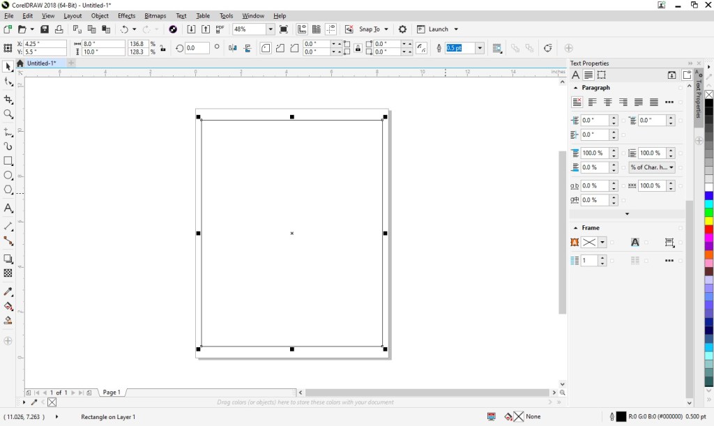
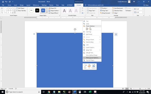
2. Click the Insert tab (at the top), click Text Box within the Text section, and select Simple Text Box.  Click the outline of the rectangle, hover over the center handle of the bottom line, and click and drag downward to increase the size just a bit. Then, right click the rectangle, choose More Layout Options…, click the Size tab, and input a Height of 10”. Next, select Absolute within the Width section and input 7”; click the Position tab and uncheck “Move object with text” from the Options section.  Right click the rectangle and select Format Shape.  Format the Fill as No Fill and the Line as a Solid Line, Black, 1pt in Width, and Dashed. 

3. Under the Format Shape heading, click Text Options, and select the icon to the furthest right that says Layout & Properties on mouseover. Change the Vertical Alignment to Bottom and input 0” for the Top, Bottom, Right, and Left margins. Click the content within the rectangle, which will select everything, and press delete.  Then repeat step 2 except select Draw Text Box instead of Simple Text Box and make the size of this text box 6.9” in height by 4.9” in width.  Within the Position tab, select Alignment within the Horizontal section and Centered from the drop down to its immediate right; change the Absolute position within the Vertical section to 5.5”.  Format the Fill as No Fill and the Line as No Line.

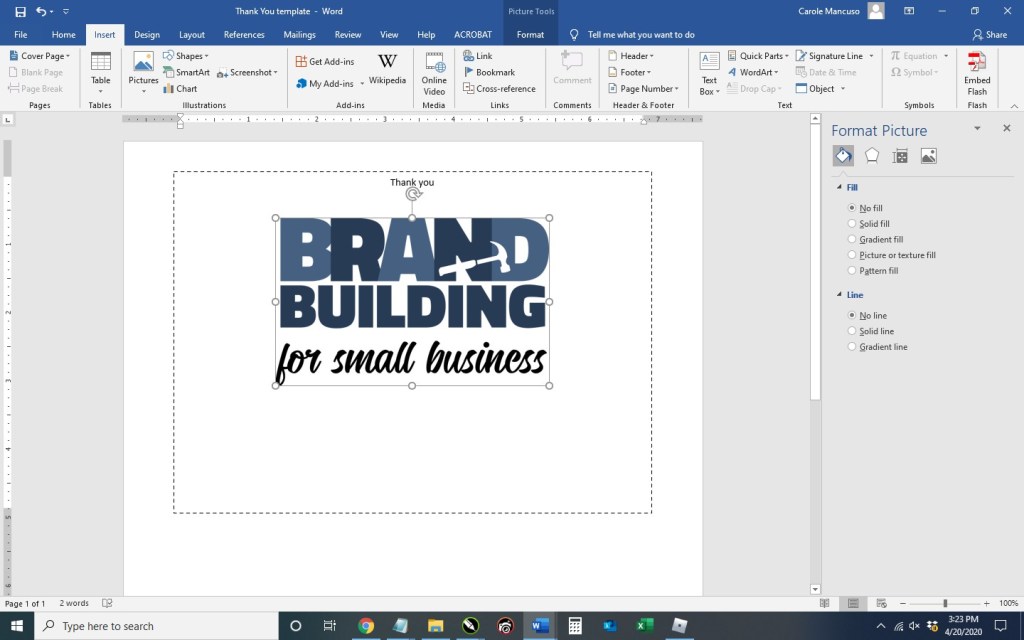
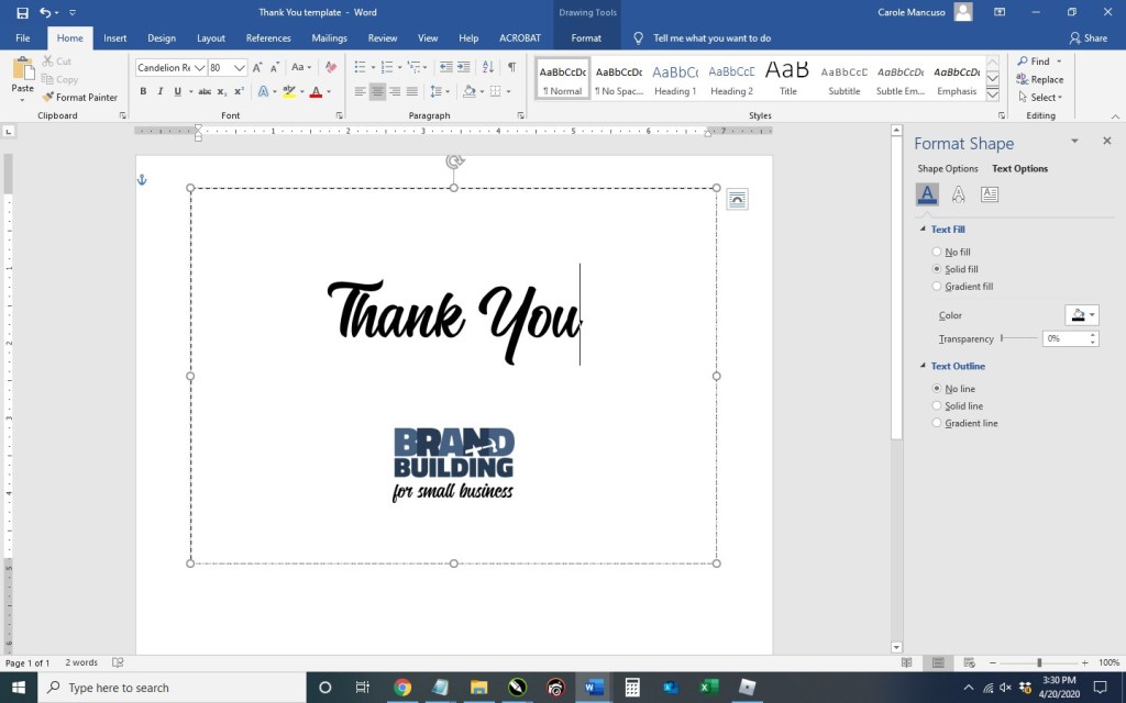
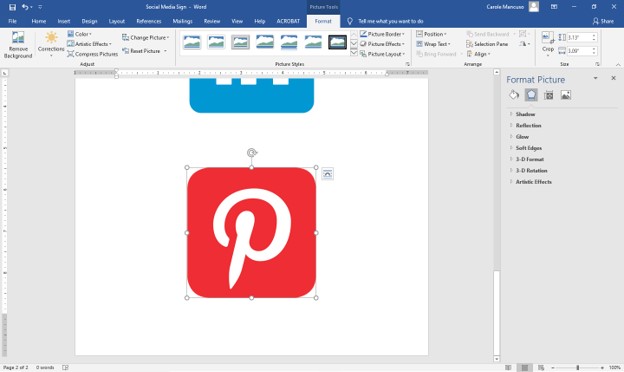
4. Set the alignment to centered by pressing Ctrl + E; then, type “Happy Birthday”.  Press the enter key to advance a couple lines spaces and insert your logo (Insert tab >  Pictures > This Device > browse to the image file for your logo > Insert).

Now you’re obviously going to want to do some formatting.  I added some line spaces, decreased the size of our logo to 1” in height, and changed the font of “Thank You” to Candellion in 80 pt.

5. Then, save your file, print on card stock, and cut!

Good luck! 

If you would prefer someone else do the creating and the printing for you (and the end product show up at your door step with envelopes included), we have a route available for you, too. Click here to personalize and purchase this Happy Birthday card on Zazzle.

If you have any questions or comments on this topic, we’d love to hear from you.  Scroll down to the comments section at the bottom of this page.

Advertisement

Creating a ‘Follow Us on Social Media’ Sign in Corel Draw

Disclaimer:  While we only recommend products we know and love, we want to note we use affiliate links and may earn a commission for purchases made through those links.

About Corel Draw: If you’re a graphic designer by trade, Corel Draw may not be your graphics editor of choice. If you’re a small business owner without a lot of graphic design experience choosing to do your branding in-house, Corel Draw is a great choice. You can pretty much address all your web and print graphics needs for a fraction of the price of the typical designer preference, Adobe. Since you’ve landed on this page in your travels, you probably already know that. If, however, buying a copy has been on your to do list for a while, there’s no time like the present. You can buy yours here and support this blog in the process.

A Quick Note About Versions: I’m using Corel Draw 18. As long as you’re using a version in that same vicinity (i.e., 16, 17, 19, or 20), your view should look pretty similar to the screenshots included throughout these directions.

You’ve created your social media pages to reinforce and promote your brand, and you regularly dedicate your time to adding content, so you want to be sure you’re taking every opportunity to properly promote your social media presence.  If your small business has a physical location (office, retail store, etc.), hanging a sign in a high-traffic area is a great option and relatively quick and easy.  I’ll show you the steps to create such sign in Corel Draw.

1.  From within Corel Draw, go to File > New.  You want an 8.5 x 11” portrait page that’s RGB and 300 dpi:

2. Select the Rectangle Tool:

Draw a rectangle in any size and then make sure the Lock Ratio is unlocked:

Then switch to the Pick tool:

Change the size of the rectangle to 8” wide x 10” high and then press ‘p’ to center the object on the page:

Double click the Outline Pen at the bottom right of the screen and change the color to dark gray, the width to hairline, and the style to dashed:

3. With the outline of your sign ready, next you can include the social media logos of your choosing.  Since potential legal issues associated with using other companies’ logos can be daunting, we’ve done the legwork for you and compiled the logos that the major social media outlet wants you to use along with the rules for each.  Visit our post, A “Legal-Approved” Free Collection of Social Media Icons, and simply copy a logo you would like to use from the post and paste the graphic into your Corel Draw file.  Repeat the process for each logo you would like to use.  I’ve selected three and each image is on top of the other at this point:

With one of the logos selected, lock the Lock Ratio and change the height of each logo to about 1.4”.  You may need to move the logos around using the Pick tool so you can access each of them.

4. Next, select the Text tool so you could begin adding content:

Click anywhere on the page and type your business’s information for one of your chosen social media outlets.  Then, set the alignment of the text to centered and choose your font and font size.  I’m going to use Calibri in size 20:

Repeat that process for the remainder of your social media outlets:

Now let’s add the heading.  I’m going to do “follow us” and “on social media” in two different fonts so I will create them as two separate text objects.  Using the Text tool, click anywhere on the page and type “follow us.”  I’m going to use the Candelion font at 160 pts in size and center the alignment.  Repeat the process for “on social media”, which I’m going to type in all caps, add a space between each character, and set the font properties to Calibri, 25 pts, and centered.

5. You’ll see your sign is starting to come to life.  Now you just need to clean it up.  Press Ctrl + A, which will select all the objects in your document and then press ‘c’ to horizontally center them all:

Then, move the objects around using the Pick tool till everything seems vertically balanced.  (Once you select an object, press Ctrl and continue to hold the key down while you move the object to retain its horizontal placement.)

6. Save your file, print (be sure to set your printer Print Quality to the best available option), cut (on the dotted line, which is 8×10”), and frame!

A Note About Fonts and Colors:
While the instructions described above will achieve the simple and modern design pictured, you can (and should) customize the look for your business. If you’ve been brand building from the start, you already have a Style Guide in place, and everything you create for your business should reflect the guidelines you’ve set for your logo usage, fonts, and colors. If you’re new to branding, be sure to review our story on The Role of a Brand Style Guide.

How to Write a Vision Statement (Including Definitions, Examples, and a Vision Statement Generator)

Your business’s vision statement communicates your ultimate goal. 

Since mission and vision statements are usually discussed in the same conversation, your mission statement is what you do, while your vision statement is the view once you’re done.

Below are a few formal definitions to elaborate on the concept.


DEFINITIONS

According to . . .

[A vision statement is] an aspirational description of what an organization would like to achieve or accomplish in the mid-term or long-term future. It is intended to serve as a clear guide for choosing current and future courses of action.

Similar to a mission statement, a vision statement provides a concrete way for stakeholders, especially employees, to understand the meaning and purpose of your business. However, unlike a mission statement – which describes the who, what and why of your business – a vision statement describes the desired long-term results of your company’s efforts. For example, an early Microsoft vision statement was “a computer on every desk and in every home.”

“A company vision statement reveals, at the highest levels, what an organization most hopes to be and achieve in the long term,” said Katie Trauth Taylor, CEO of writing consultancy Untold Content. “It serves a somewhat lofty purpose – to harness all the company’s foresight into one impactful statement.”


EXAMPLES

Want to see those conceptual definitions in action?  Below are a number of examples to scroll though to see the different ways famous companies communicate their vision.

Google: “To provide access to the world’s information in one click.”

Amazon: “To be Earth’s most customer-centric company, where customers can find and discover anything they might want to buy online.”

Target: “Guided commitments to great value, the community, diversity, and the environment.”

Ebay: “To be the world’s favorite destination for discovering great value and unique selection.”

Nordstrom: “To serve our customers better, to always be relevant in their lives and to form lifelong relationships. And while serving our customer face-to-face is the foundation and hallmark of how we’ve historically served them, today customers seek our service in new ways. Speed, convenience, innovation, and personalization have become cornerstones of the customer experience. Guided by these new needs, we continue to invest in the cross-channel experience, combining the accessibility of pure online experience with the high-touch inclusivity of our stores.”

Versace: “To make women and men feel beautiful and empowered.”

BBC: “To act in the public interest, serving all audiences through the provision of impartial, high-quality and distinctive output and services which inform, educate and entertain.”

Netflix: “Becoming the best global entertainment distribution service; licensing entertainment content around the world; creating markets that are accessible to film makers; and helping content creators around the world to find a global audience.”

The Bank of New York: “Improving lives through inclusion, innovation and investing.”

  J.P. Morgan: “Aspire to be the best; execute superbly; build a great team and a winning culture.”

 Walgreens: “To be America’s most-loved pharmacy-led health, well-being and beauty company.”

CVS: “We strive to improve the quality of human life.”

United Way:  “United Way envisions a community where all individuals and families achieve their human potential through education, financial stability and healthy lives.”

Make-a-Wish: “To be able to make every eligible child’s wish come true.”

General Motors: “To create a future of zero crashes, zero emissions, and zero congestion, and we have committed ourselves to leading the way toward this future.”

Tesla: “To create the most compelling car company of the 21st century by driving the world’s transition to electric vehicles.”

Apple:  “We believe that we are on the face of the earth to make great products and that’s not changing.”

IBM: “To be the world’s most successful and important information technology company.”

Starbucks: “To establish Starbucks as the premier purveyor of the finest coffee in the world while maintaining our uncompromising principles while we grow.”

Taco Bell: “To grow into the largest fast-food provider of Mexican style cuisine in emerging markets.”

Burger King: “To be the most profitable QSR business, through a strong franchise system and great people, serving the best burgers in the world.”

McDonalds: “To move with velocity to drive profitable growth and become an even better McDonald’s serving more customers delicious food each day around the world.”


ANATOMY OF A VISION STATEMENT

As you may have noticed, most vision statements are comprised of the same basic components.  I’ll use our vision statement here at Brand Building for Small Business as an example:

While I have the different parts listed numerically for clarity, the order isn’t important.  As you’ve seen throughout the dozens of examples, these components can look very different from one company to the next.  All that matters is that you’ve clearly and fully communicated the vision of your company.


VISION STATEMENT GENERATOR

Now it’s your turn.  Try creating a vision statement for your business based on the structure below.

Here’s another example for good measure . . .

Have any questions?  As always, we’d love to hear from you.  Scroll below to the “Leave a Reply” section.  Happy vision statement drafting!

How to Set Up Simple Print-and-Cut Business Cards in Corel Draw

Disclaimer:  While we only recommend products we know and love, we want to note we use affiliate links and may earn a commission for purchases made through those links.

If you’re a graphic designer by trade, Corel Draw may not be your graphics editor of choice.  If you’re a small business owner without a lot of graphic design experience choosing to do your branding in-house, Corel Draw is a great choice.  You can pretty much address all your web and print graphics needs for a fraction of the price of the typical designer preference, Adobe. Since you’ve landed on this page in your travels, you probably already know that.  Your stumbling block may be that blank page within Corel that you’re staring at while wondering the quickest and easiest way to get professional-looking business cards designed, printed, and ready to hand out.  We’ll take you step by step through the process.

A Quick Note About Versions: I’m using Corel Draw 18. As long as you’re using a version in that same vicinity (i.e., 16, 17, 19, or 20), your view should look pretty similar to the screenshots included throughout these directions.

1.  From within Corel Draw, go to File > New.  You want an 8.5 x 11” portrait page that’s CMYK and 300 dpi:

2. Select the Graph Paper Tool:

Input 2 columns by 5 rows:

Draw the graph in any size and then switch to the Pick tool:

Change the size of the graph to 7” wide x 10” high and then type “p” to center the object on the page:

Double click the Outline Pen at the bottom right of the screen and change the color to dark gray, the width to hairline, and the style to dashed:

Then press Ungroup Objects with the graph still selected:

3. With the layout of your business card document ready, Go to File > Import and navigate to an image of your logo and click the Import button.  Then, resize as desired and place your image within the top left rectangle.  To ensure your logo is perfectly horizontally centered within the space, select the logo first, hold down the “shift” key to be able to select multiple objects, select the rectangle, at which point you can deselect shift; then, press “c” with both objects selected.

Select the Text tool so you could begin adding content:

Click anywhere on the page and type your name; press enter and add your title; then, continue adding the rest of the details you would like to show on your business card.  I’m going to include my title, phone number, email address, and web site.  Finally, set the alignment of the text to centered and choose your font and font size.  I’m going to use Calibri, size 11 for my name; size 10 for my title; and 7.5 for the rest of the information.

Move the text to the desired spot within the rectangle and horizontally center the two (click the text, press the ”shift” key while also selecting the rectangle; then, press “c”):

Now, you’ll want to adjust the spacing a bit.  With the text selected, press Ctrl + k to break each line into its own text object.  Then, I’m going to stretch out the character spacing of my name from 0% to 150%.  To do so, press Ctrl + t to edit the text properties. 

To ensure the two words don’t run into one another with the extended character spacing, I’m going to change the Word Spacing from 100% to 450%:

For my title, I’m going to use 50% character spacing and 250% word spacing.

Next, I’m going to select the phone number, e-mail address, and web site – pressing the down arrow key a few times until I’m happy with the placement:

4. And now we’ve got one business card in place!  To distribute the card design throughout the page so they can be printed ten at a time, select the rectangle you’ve been working on along with all the content inside and press Ctrl + g to group them together.  Press Ctrl + d to duplicate the business card:

Keeping the newly created business card selected, press the “shift” key while selecting the top right rectangle; then, press “e” to vertically center and “c” to horizontally center:

Select your two business cards and press Ctrl + g to group the two together and then Ctrl + d to duplicate them both:

With your newly created group of two business cards selected, press shift while selecting the second rectangle in the first column, and press “t” to top align the objects and “l” to left align the objects:

Repeat that process until all the rectangles are filled with your business cards:

5. Save your file and print; be sure to set your Print Quality to the best available option.

When choosing your paper, I recommend a quality cardstock between 80 and 100 lb — any thinner, and your business card will be too flimsy; any thicker, and you risk problems using the paper in a conventional home printer. A matte versus glossy finish is really a personal preference, but you do avoid any potential for fingerprints on a matte stock.

Then, cut!  For the cleanest and straightest edges, use a paper cutter.  

IF you would prefer someone else do the creating and the printing for you (and the end product show up at your door step), we have a route available for you, too. Click here to personalize and purchase these business cards on Zazzle.

A Note About Fonts and Colors:
While the instructions described above will achieve the simple and modern design pictured, you can (and should) customize the look for your business. If you’ve been brand building from the start, you already have a Style Guide in place, and everything you create for your business should reflect the guidelines you’ve set for your logo usage, fonts, and colors. If you’re new to branding, be sure to review our story on The Role of a Brand Style Guide.

How to Easily Create Business Letterhead in Microsoft Word (Video Tutorial)

Disclaimer:  While we only recommend products we know and love, we want to note we use affiliate links and may earn a commission for purchases made through those links.

In an earlier post, we described how easy creating your own business letterhead can be in Microsoft Word.  Well, they say a picture is worth a thousand words, so a video must be worth . . . a whole lot of words!

We really wanted to be able to show how easy some of our DIYs really are, and how better to do that than in live action?  (The task of creating letterhead is done in about two minutes.) 

So welcome to our first video . . . .  Hope you enjoy it! 

IF you would prefer someone else do the creating and the printing for you (and the end product show up at your door step), we have a route available for you, too. Click here to personalize and purchase this letterhead on Zazzle.

If you have any questions or comments, we’d love to hear from you!  Just scroll down to the comments section at the bottom of this page.

Creating a ‘Follow Us on Social Media’ Sign in Microsoft Word

You’ve created your social media pages to reinforce and promote your brand, and you regularly dedicate your time to adding content.  Now, you want to be sure you’re taking every opportunity to properly promote your social media presence.  If your small business has a physical location (office, retail store, etc.), hanging a sign in a high-traffic area is a great option and relatively quick and easy.

I’ll show you the steps to create such sign in Microsoft Word.

1. Open Word, create a new blank document, and insert a rectangle.  (When your cursor turns into a plus sign, you’re able to draw your shape.

By default, mine is blue.  Right click the rectangle and select More Layout Options. 

Set the properties to . . .

  • Size: 10” in Height and 8” in Width
  • Text Wrapping: Behind Text
  • Position:
    • Horizontal – Absolute Position of .25” ‘to the right of’: Page
    • Vertical – Absolute Position of .5” ‘to the right of’: Page

Set the Fill to No Fill and the Line to a Solid Line, Black Color, and .5 pt Width, choosing the Dash Type selection shown below.

2. Click inside the rectangle and type “Follow Us on Social Media”.  Set the font to one or more choices that work as your heading and size to appropriately fill the space.  Set the Alignment to Centered.  I went with the font Candelion Regular in all lowercase at size 160 for “follow us” and (on the next line) Calibri in all caps at size 25 and added a space between each letter.

3. Next, decide which review platforms you would like to feature.  We are currently active on Facebook, LinkedIn, and Pinterest and will be highlighting those.  Then, go to Google to find logos.  Most social media outlets will have a corporate page that makes their logo available to the public along with instructions for proper usage.  For example, Facebook has a Brand Resources page easily found when searching “facebook logo” on Google.

As you find the appropriate source for each social media outlet, save the logos to your desktop.

4. Press enter within your document to advance to the next line space and then insert each of your saved logos (from the menu at top, press the Insert tab, and choose Picture) in the order you want them to appear on your sign. 

Inserting each of mine took me to the bottom of a second page.  So, the first step in adjusting sizing is to crop any excess space from the logos.  (As you can see above, the outline of the Pinterest image is directly around the icon, so no need to crop that one.)  That’s not the case for LinkedIn . . .

To crop, click Picture Tools (at the very top of the screen), click the Crop icon (at top right), drag the outer edges of the box tight around the logo, and press enter.  Once all the logos are cropped as needed, try to match their size to about and 1.4” in height.  (This will ensure you have adequate room for text.)  To do so, click Picture Tools again and enter a height at top right.

Repeat for the other icons.

5.  Click in the space after your first icon, press enter to add a line space, and type your profile name/URL for that platform; repeat for your subsequent logos.  This process once again took me onto a second page.

Therefore, decrease the font size as needed.  I went with size 20.

And then adjust the spacing a little for each line of text (so you have additional room between each social media outlet).

And you’re done!

6. Save your file, print, cut (on the dotted line, which is 8×10”), and frame!

A Note About Fonts and Colors:
While the instructions described above will achieve the simple and modern design pictured, you can (and should) customize the look for your business. If you’ve been brand building from the start, you already have a Style Guide in place, and everything you create for your business should reflect the guidelines you’ve set for your logo usage, fonts, and colors. If you’re new to branding, be sure to review our story on The Role of a Brand Style Guide.

Happy designing!

How to Create a Facebook Page for Your Business

Your first step to your business’s social media presence on facebook is quick and easy.  In the five steps below, you’ll see how to create a page for your business.

1.  Log in to your personal account on facebook.  Go to Create > Page.

Select Business or Brand when asked to choose a category.

2. You’ll then be prompted to input an address, or you can click “Don’t show my address.  Only show that this business is in the City, State region.”

3.  Next, you’ll need to add a profile photo.  You’ll want to use one that can be squared, the corners rounded/cropped, and at least 170 x 170 pixels in size (which is pretty small).  We would ideally like to use our logo, but it’s not one that would work well in facebook’s profile frame:

If uploaded as is (as I did above), portions would be cropped.  If I added white space to the top and bottom so the sides wouldn’t be cropped, the logo would be very hard to see when displayed at 170 x 170 pixels and smaller.  As a result, I went with an icon version of our logo, created for purposes such as these.  White space has been added all around to accommodate the round frame. 

If your logo doesn’t work for your profile picture or you’d prefer to use a photo of yourself or some other image representative of your business, just be sure to regularly include your logo in your posts (preferably as an overlay on pictures related to the post).

4.  Next up is your cover photo, which displays at 820 pixels wide x 312 pixels tall on computers and 640 pixels wide x 360 pixels tall on smartphones.  The minimum size is 400 pixels wide x 150 pixels tall.  Since the dimensions of your cover photo will vary somewhat in different environments, a simple landscape photo is your surest best – as opposed to including your logo or other text.  (If you do go the route of including your logo or other text, be sure to include lots of white space, so the text does not get cropped regardless of the environment.) 

A Quick Note About Graphics Software:  If you’re not quite sure how to go about creating a cover photo that includes text or how to add white space to your logo, you may want to check out Inkscape (https://inkscape.org/), which is a free graphics editor that also makes a number of tutorials available:  https://inkscape.org/learn/tutorials/.

For our facebook cover, I just used the main image included on our home page for continuity purposes.

You can “drag to reposition” if desired.

5.  Finally, you’ll be asked whether you want to “invite friends to like your page,” which is recommended since pages with 10 or more likes get more engagement.  If you want to wait until you’ve been regularly posting for some time before inviting a lot of people, you can start off with a small group of your close family and friends until you get better established.

And you are done!  You have a facebook page for your business.  Unfortunately, that was the easy part.  The challenge is creating a regular posting schedule and sticking to that plan.  How often . . . ?  A number of sources cite one facebook post per day as optimal.  If you can commit to that, great.  If you feel like twice a day is better for you, just pay attention to your engagement.  If those posts aren’t getting sufficient attention, facebook may decrease your visibility and put your posts into a “spamming” category.  If you’re like us, once a week is a much more reasonable goal.  Do what works for you and your business, experimenting a little to find your optimal posting schedule.

Good luck!  Stay tuned for more posts about facebook.  If you have any questions, feel free to leave a reply below.