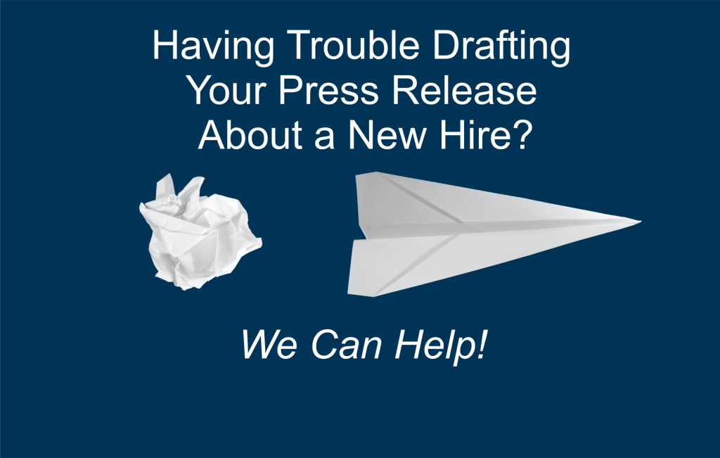
In an earlier article, we discussed Press Releases as Another Opportunity for Branding. Specifically, we addressed some of the basic criteria needed to produce a successful PR piece, including discussions about: Topics, Voice, Audience, Outlets, Format, Quotes and Photos, and Post-Submission Follow-up. In a second article, we wrote a Press Release to Introduce Ourselves as Part of National Small Business Week (in 2020). In yet another article, we provided a general Press Release Generator – Identifying Your Content. At that time, we promised to begin providing examples of the specific kinds of press releases we have mentioned just in case anyone happens to still be sitting staring at a blank page after having crumpled up a dozen failed efforts.
In getting started, the rule of the 5 W’s still applies, so we encourage you to review our earlier articles. We also want to remind you that voice matters – you must write as though you were a totally objective journalist preparing the story. Similarly, the content must be of interest to the audience of the intended publications.
That said, the announcement of new employee hires and/or promotions are among the most common press releases and the easiest to place – assuming the publication has a section for including such pieces. (Many do – particularly trade magazines and papers.) However, be aware that some outlets might be willing to include all or most of the information you provide . . . but many will reduce your words to a skeletal, bare-minimum sentence or two. If that is the standard practice, a quick glance at past issues will let you know whether new hires and promotions are featured and the kind of space devoted to each one.
To make sure the same press release works for most circumstances, you just need to be sure the essence of your PR article is in the opening sentences with all other less critical information following (realizing that much could be cut by certain targets). Also, plan to include a head-and-shoulder photo of the featured employee.
Below is a fill-in-the-blanks-template:
_________________
PRESS RELEASE – For Immediate Release
CONTACT INFORMATION:
[Company Name]
[Contact Name]
[Phone Number]
[E-mail Address]
[Date]
[HEADLINE ex. NAME (of the New Hire) JOINS COMPANY NAME]
[CITY, STATE, MONTH DATE] — [COMPANY] has announced the addition of [EMPLOYEE FULL NAME] as the new [TITLE]. In this new capacity, [EMPLOYEE LAST NAME ONLY] will be responsible for [BRIEF DESCRIPTION OF DUTIES].
Note: Body paragraphs then follow this opening (i.e., background information, quotes, company description, etc.)
Before joining [COMPANY], [EMPLOYEE LAST NAME ONLY] served as the [TITLE OF OLD JOB] for [NAME OF OLD COMPANY] from [START DATE OF MOST RECENT OLD JOB] to [END DATE OF MOST RECENT OLD JOB]. Specifically, [he/she] handled [MENTION DUTIES].
Note: Add the next paragraph when the past history of employee includes multiple jobs. Repeat as needed to encompass complete work history, incorporating the most relevant and recent positions. (Typically, no need to go back to part-time jobs while in school!!) You can also choose to insert any education and/or licensing credentials that might be useful once past jobs are addressed.
Prior to that position, [EMPLOYEE LAST NAME ONLY] was also employed by [SECOND OLD COMPANY] as a [TITLE] from [DATE] to [DATE].
According to [NAME OF NEW SUPERVISOR OR OTHER HIGHLY PLACED OFFICIAL WILLING TO BE QUOTED], “[COMPANY] is very pleased to be adding an individual with the skill and experience needed to successfully enhance our operations and meet our goals for growth and customer satisfaction. We fully expect [EMPLOYEE FULL NAME] will be an asset in the years to come that allows us to provide our customers with the high-quality products and services they deserve.”
Note: Optionally add contact information.
“While[EMPLOYEE LAST NAME ONLY] will be reaching out to constituents soon, [he/she] can be contacted before then at [PHONE AND EXTENTION] or [E-MAIL].”
Note: Your “boiler plate” company description that outlines the products, services, history, location, hours, etc. then gets added. See our Style Guide for further information.
Also, please be aware that this “new employee” template can be easily adapted to address employee promotions. We plan to provide an example of that kind of press release soon.
_________________
As always, we welcome any thoughts or feedback, and we encourage you to comment by using the space provided below. While we intend to provide other sample press releases in the coming weeks, we would be happy to receive special requests.
Whenever you are conducting a sales campaign, you are certain to have a “pitch” about the differentiating qualities of your product or service that results in a call to action such as a request to buy from you. In our experience, a simple, well-executed, Internet landing page can be the most effective vehicle for accomplishing that task . . . and your landing page can provide an important opportunity to reinforce (and capitalize upon) your brand.
What Is a Landing Page?
According to “Unbounce” (a developer in the field):
“In digital marketing, a landing page is a standalone web page, created specifically for a marketing or advertising campaign. It’s where a visitor ‘lands’ after they click on a link in an email, or ads from Google, Bing, YouTube, Facebook, Instagram, Twitter, or similar places on the web.” (https://unbounce.com/landing-page-articles/what-is-a-landing-page/)
Getting Started
That said, landing pages are of course web pages . . . but unlike home pages or other content pages on your site, these have a very dedicated function and are constructed differently. Whereas home pages – for instance – are created to communicate lots of information and encourage exploration, landing pages basically:
Reinforce your sales pitch as concisely as possible.
Offer supporting evidence (such as testimonials or research data) to help clinch the sale.
Provide a simple form to complete the transaction.
Include a logo that links to your home page (but just that) for those who need more information to finalize the sale.
Reflect the branding of the company to take advantage of past efforts to establish a readily recognizable identity that adds value to the product and/or service being sold. (IMPORTANT: Be sure your web site/homepage, sales vehicles, and landing pages all reflect the branding elements decided upon in your Style Guide to gain maximum value from each of them.)
Whether you are building your landing page from scratch . . . or are simply customizing one of the many templates now available, we have found a few key points worth remembering during your development:
Your goal is to be as simple, direct, and concise as possible.
Your headline and any body copy should reflect your sales pitch (i.e., differentiating sales qualities) being used at that time in ads, direct mail pieces, social media, mass e-mails, etc. (Remember: Landing pages are for TRANSACTIONS so keep copy and content short. If a bullet point or two will suffice, use them. Save your long, persuasively written copy for your web site and sales tools.)
Include art/graphic elements but limit the quantity to one or two mirroring the images of your sales pieces and consistent with the elements of your branding Style Guide.
Typically, a form will be used to complete the sale or other transaction. Keep your requests as lean as possible with the absolute minimum number of fields required to accomplish your mission. For example: If your ultimate goal is to collect e-mail addresses to build a data base, just get that piece of information and use that at a later date to gather other details. Your goal is to enable the interested party to complete the transaction as quickly and easily as possible, guarding against losing them along the way.
As part of incorporating your brand, plan (as previously mentioned) to include a copy of your logo that links back to your home page. However, other navigation that does not fulfill the call to action should be excluded. (Why risk the distraction?)
Sales campaigns usually use multiple media such as ads, direct mail, social media, etc. Employing the same landing page for each of them can facilitate tracking efforts . . . but you want to be sure you can identify the source that generated the lead. While a number of alternative strategies exist, one way to accomplish this objective is to use multiple copies of the same page with an identification such as “1” for ads, “2” for mass e-mails, “3” for snail mail, etc. With all of your results arriving via your landing page, you get a very clear picture of your most successful sales vehicles AND have a bit more control over the closing of the sale, including any necessary follow up of now qualified leads that might be required. Since so much time, effort, and expense is invested in developing a warm lead, you can’t afford to have any fall between the cracks. (In my past life, we felt so strongly about this issue that our landing page was the only contact information provided on our sales vehicles; we did not include a phone number because we wanted to make sure all telephone contact was as timely and structured as possible.)
A Word About Testing
Like other sales materials, landing pages can be constructed in a number of different ways. In our experience, running a controlled test of multiple versions before a limited audience should reveal which elements work best and which version should ultimately become part of your sales campaign.
Land on Your Brand!
Just for emphasis, we will close this article by repeating the importance of making your landing page reflect both the branding elements and the design and pitches used in the corresponding campaign. Since your landing pages are designed to “seal the deal,” failure to fully reflect your branding wastes the time, effort, and resources spent shaping your identity and misses the last opportunity to have a positive impact upon the sales process.
Note: To further develop this theme, a future article will be devoted to creating a landing page for our blog that further illustrates these principles in action. For now, those interested in learning more can check out the writings of Neil Patel: https://neilpatel.com/blog/beginners-guide-to-landing-pages/.
These days, every small business needs to find a suitable spot to launch an Internet site on the web. You may think you are exempt because you:
Are already well-known in your community.
Deal exclusively in walk-in sales.
Have a procedure in place for responding quickly and effectively to customer needs.
Are very satisfied with your amount of year-over-year growth.
Have established a very hands-on identity as a brand that emphasizes personal service.
If this description fits you, I can understand that you might feel the web is unnecessary, but you are wrong.
NOT!! DIY Small Business Owners do not have to become expert programmers or web site designers (i.e., masters of the content shown in the books above). Lots of user-friendly WYSIWYG (what you see is what you get) tools exist that can help you launch a simple site for your business.
Web Sites Come in a Variety of Sizes . . . and Can Be Complex or Simple
First, let me point out that contemporary web sites encompass a broad spectrum from the highly sophisticated ones that allow you to accomplish all aspects of a sale from presentation of the product/service to payment and follow-up . . . to the simplest variations that exist primarily to establish an on-line presence.
Recently, the WordPress Newsletter published a story about “Building Single-Page Web Sites on WordPress.com.” Frankly, seeing this article got me thinking that the time had come to post an entry on web sites for our blog because the development of your on-line presence creates an important vehicle for branding . . . while positioning you (should you someday choose) to consider taking advantage of Internet Sales.
As the pandemic of 2020 has taught us, small businesses must be prepared to adapt to changing circumstances, and on-line operations can provide a very useful alternative. Assuming you are not ready to (or do not need to) take that plunge, having the beginnings of a web site can only help create that flexibility if and when the day arrives . . . and you’ll already be establishing some history that can be helpful at a later date.
Convinced . . . ? Not Yet . . . ?
Frankly, most consumers fully expect every small business to have at least a basic Internet presence . . . and become suspicious about the solvency and reputation of a company that does not. At a minimum, you can simply put together a small web site that could have your:
Name plus a photo of your operations.
A brief bio of you and your staff to attach a face to a name and a voice.
Contact information, including physical address (needed for people looking to ship items to you or customers looking to use a GPS); phone number; e-mail; and (preferably) an on-line form to submit questions/comments and collect e-mail addresses.
Directions to your physical location (ideally tying into existing mapping services).
Days and hours of operation.
A clear statement and reflection of your brand and those qualities you want associated with your business – being sure to stay within the parameters you established in your Style Guide. (Click to access our article on that subject.)
Remember, this first on-line impression will start to set the tone for your brand in people’s minds . . . so choose meaningful content indicative of whom you are!
How Do I Get Started?
WordPress can actually provide many tools for developing web sites of all kinds and degrees of complexity. If you are just starting out, you really should check out that article mentioned earlier. However, lots of alternatives exist.
Consider using an existing simple template. Many web hosting services and software packages provide a wide variety of perfectly acceptable ones that are easy to use and appear fairly customized once your content and images have been added and fonts, colors, etc. have been adjusted to reflect those already chosen for your brand. Also, those same sources frequently provide widgets (i.e., application programs that can be easily incorporated to handle basic tasks like forms or searches) that you might want to include on your simple site.
Still a bit too hands-on for your taste and comfort zone (even though the camera on your cell phone can be used to generate all of the artwork needed)?
Consider hiring a local vendor or even a college student to give you a hand . . . but don’t allow yourself to accept any excuse for inaction!
In building a basic web site that incorporates the items mentioned earlier in this article, you:
Provide a service to your existing and potential customers who search for you on the web. (You’d be surprised by the web traffic your brick-and-mortar operation will generate.)
Have created a valuable opportunity to further define and promote your brand.
Gain a potentially useful tool for sales prospecting.
Feature a new method of interacting with your clients.
Get access to a platform that can be used to experiment with expanding your operation to encompass on-line sales. (In 2020, many small business – including restaurants — displayed impressive agility in shifting focus – of necessity – in this direction. “Take-Out anyone?”)
Can help customers engage in self-service 24/7, which can increase their satisfaction . . . while reducing your expenses.
Don’t Be Intimidated!
I was involved in building my first web site over 30 years go. The world wide web was a relatively new phenomenon, and the Internet was just graduating from the world of Archie and Gopher servers at colleges used to give users a way of communicating.
Frankly, I was too dumb and the process was too new to me to be as intimidated as I should have been though – over time – I learned better . . . and grew suitably threatened by the task of developing a good, highly visible web presence. (Besides, getting intimidated is always much easier as demands and expectations grow more sophisticated.)
While our early efforts were just “brochureware” and were hardly an important source for sales or the delivery of services, we accomplished some very important goals that served us well over time. We positioned our company as one of the first to embrace the Internet, helping to create a brand that incorporated technical sophistication as part of our calling card. As more and more operations embraced technology, became involved in web-based sales, began featuring on-line processing and service, and adopted paperless operations, this branding was extremely useful in defining our company as an innovative leader across several decades.
Remember, all beginnings lack polish so don’t be intimidated. Regardless, your early efforts are sure to embarrass you at a later date. (Need proof? Just take a trip via the Internet Archive “Wayback Machine” in about five or ten years to see some of your early versions and compare them to the current.
So, take a chance and take a plunge into the web but be sure to always keep your eyes focused ahead when defining your brand. Try to incorporate who you are now but also who you want and expect to be tomorrow. Your dreams and aspirations are as much a part of whom you are today as any current limitations that you plan to overcome along the way.
Note: We plan to address higher-end, more complicated web sites in future articles.
As I write this article, a New Year has just begun . . . bringing a much-welcomed fresh start.
We all hope (and optimistically expect) that 2021 will be a much better, more normal year for all of us – including small businesses that suffered such hardships during 2020. For them (our primary audience), I offer my best wishes for a strong start as well as a suggestion for an additional New Year’s resolution: performance of a simple “annual brand checkup” to identify and make any needed adjustments.
Please note that I have chosen the word “checkup” very carefully to suggest a simple self-help exercise – not a complete “brand audit” that can be highly structured, very time consuming, and quite expensive when third parties are utilized. As a quick DIY alternative that can, therefore, be accomplished much more frequently, the 5 Steps of a Brand Wellness Checkup include the following:
Examine all of your advertising, web site, and collateral sales and instructional material to make sure the documents conform to your Style Guide. If they do not, you need to determine whether the materials or the guide need updating.
Determine whether the qualities used to define yourself and, therefore, your brand are still the right ones and are practiced daily by your staff and operations. To do this, talk to your employees and check in with a few of your regular customers. (Since we are talking about a checkup – not an audit – a number of informal conversations might be all that is needed . . . as opposed to surveys, telemarketing efforts, research focus groups etc.)
Look at your logo and branding statements with a fresh eye to determine whether they still reflect who you are and want to be. If not, incorporate a gradual revision into your plans – allowing sufficient time and resources to do the job well.
Revisit your customer service protocols to make sure they are delivering the level of excellence you seek, making any needed adjustments to your practices.
Reinforce your branding message with your staff to make sure your identity is getting communicated to customers in the intended way.
Remember, the point of this exercise is to make sure that at least once a year you stop and revisit your most basic branding decisions and their implementation. By doing so annually, you can make sure you do not unwittingly drift off course . . . and can make minor adjustments to right yourself before a major, potentially difficult, and expensive overhaul is required. (To learn more about activities associated with the items mentioned above, visit our menu item labeled “Your Brand: The Beginning” or visit this page.)
While most New Year’s Resolutions are abandoned by February, this goal is one that can and should be done as early as possible at the start of the year.
Good luck . . . and keep thinking positive thoughts about 2021 and beyond.
Where to Begin? Once you’ve made the decision for your business that you are going to build your brand from the ground up, you may find yourself a bit overwhelmed. I certainly did. In this post, I reflect on the beginning of my journey as I learned to focus on branding even while in survival mode.
What’s in a Name? This piece examines some of the considerations in selecting the right name for a well-branded operation.
Design Your Own Logo This tutorial provides a very hands-on approach to building your logo. Whether you are considering a totally new design or simply looking to adjust, adapt, and tweak an existing one, these tips (including where to find needed tools) should prove useful.
Know Your Audience A very basic but essential part of any branding exercise should be to make sure you know your audience and choose branding elements that properly reflect their characteristics. This article reviews some of the basics for you to consider.
How to Create a Mission Statement Need a little inspiration for crafting that ever-so-important message? This post includes a couple dozen great examples along with an exercise that breaks down the components of a good mission statement to help you develop yours.
The Role of a Brand Style Guide Once you have completed each of the above activities BUT BEFORE YOU BEGIN BUILDING BASIC TOOLS LIKE BUSINESS CARDS OR LETTERHEAD OR INCORPORATING THE ELEMENTS INTO MARKETING OR ADVERTISING EFFORTS, take the time to create a style guide that puts into writing the most basic rules that must be observed to properly build the visual element of your new brand.
How to Set Up Simple Print-and-Cut Business Cards Start with a blank Word document and develop business cards that are print-ready in only ten steps . . . this “how to” guides the way for you. A Corel Draw tutorial is available as well.
How to Easily Create Business Letterhead As integral as business cards and even easier to develop, letterhead created in Microsoft Word is presented as Instructions with Template Included and a Video Tutorial. Instructions and a template are available for Corel Draw as well.
Note: Many helpful downloadable tools/templates are provided to add extra value to the pieces described above.
With many small businesses of necessity reinventing themselves, we thought the most useful approach for us to take at this time in helping small businesses reboot was to highlight certain articles that – when read together – would provide a branding tutorial. (For those readers just getting started rather than restarted, this collection should provide a helpful shortcut, too.)
The Role of a Brand Style Guide https://brandbuildingforsmallbusiness.com/2019/09/17/brand-basics-part-3-the-role-of-a-brand-style-guide/ Once you have completed each of the above activities BUT BEFORE YOU BEGIN BUILDING BASIC TOOLS LIKE BUSINESS CARDS OR LETTERHEAD OR INCORPORATING THE ELEMENTS INTO MARKETING OR ADVERTISING EFFORTS (we’ll provide a refresher on those soon), take the time to create a style guide that puts into writing the most basic rules that must be observed to properly build the visual element of your new brand/rebrand.
Note: Helpful downloadable tools/templates are provided to add extra value to the pieces described above.
As a small businessowner, I suspect many of you saw this headline
and asked, “What is a Brand Style Guide, and why bother when I have more
immediate needs that might generate income?”
“Stop!”
I can see you are about to close this page . . . and I want a shot
at keeping you reading. I’ll start by
answering those two questions.
A Brand Style Guide is a written statement that defines and
describes the way in which you present your business to the world. Typically, both the message and key elements
of the visual treatment are encompassed.
Many large companies have invested millions of dollars perfecting the brand image and the message that gets presented. Therefore, no one should be surprised that THEIR style guides are VERY detailed and address a wide variety of circumstances. For example, MacDonald’s is quite protective of their golden arches (see https://news.mcdonalds.com/press/multimedia-library/logos). For 50 more examples, check out https://www.canva.com/learn/50-meticulous-style-guides-every-startup-see-launching/. That said, many smaller businesses want the benefits of having a standardized message but do not see a need for a document that does more than address key elements of branding and style.
For our blog, we fall into that latter category. We recognize that we could benefit from articulating a few basic rules but don’t require a more elaborate guide. Perhaps in time, that other approach might be warranted . . . but not yet. Since we suspect many of you fall into this category, we’ll be devoting this blog entry to the creation of a small manual – our own! (Feel free to download and review a copy . . . and use ours as a template/starting point for your own.)
We began
by identifying the issues we wanted to cover:
Our mission and differentiating qualities (i.e., the synopsis of “Our Story”).
Our brand voice.
Our guidelines for use of our logo – attempting to make that icon our unique brand signature.
Our color palette.
The fonts used with our logo.
The types of photos and images selected.
Mission/Differentiating
Qualities
When Carole and I decided to start our blog on
marketing/communication strategies, we were determined to pass along useful
how-to information and instruction that might enable a small business owner to
have a highly evolved and very professional brand . . . while doing all of the
required work inhouse. Having been
practitioners in this field for decades, we knew the difficulties that could be
encountered in going DIY . . . as well as the very high cost of hiring third
parties to perform these tasks. For
example . . . just a few years ago, a company affiliated with my employer paid
$25,000 to have a style guide prepared for a new start up. Frankly, the product delivered did not
justify the cost.
So . . . think about the characteristics that set you apart. Those features are the heart and soul of your business plan and provide the critical backdrop needed to create your Brand Style Guide.
Page 4 of our Style Guide
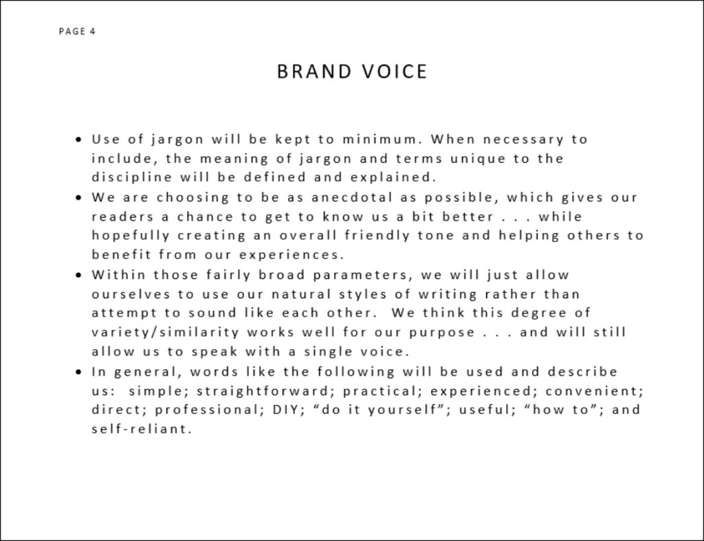
Brand Voice
Are you traditional or avant garde? Friendly and very personal . . . or somewhat
distant and formal? When you are
expressing yourself, are you picturing an audience of fellow professionals . .
. or the general pubic? The way in which
you answer questions such as these determines the voice that will be identified
with your brand.
Carole and I naturally write with different styles. And yet, we did set some basic parameters
that will, we hope, create a single voice unique to our blog. Specifically, we determined that we would
keep our use of jargon to minimum OR (when necessary) be sure to define and
explain the meaning of terms. Similarly,
we are choosing to be as anecdotal as possible, which gives our readers a
chance to get to know us a bit better . . . while hopefully creating an overall
friendly tone and helping others to benefit from our experiences.
Within those fairly broad parameters, we figure we will just allow
ourselves to use our natural styles of writing rather than attempt to sound
like each other. We think this degree of
variety/similarity works well for our purpose . . . and hope you agree.
In general, words like the following speak with our voice: simple; straightforward; practical;
experienced; convenient; direct; professional; DIY; “do it yourself”; useful; “how to”; and self-reliant.
Use of Logo
Every logo creator hopes and intends for the graphic to become an
immediately identifiable symbol. Toward
that end, consistent and frequent use of the exact image is necessary. Our basic logo for this blog is pictured to
the left. The primary variation to be
used both in print and online/onscreen is the three-color version shown at the
top. When only a single color is
available (either due to the medium used or cost-saving economics) the black
and gray version is permissible. A
single-color, black alternative has also been created for those select
occasions when the method used to reproduce the image will not handle gray
successfully. (Example – some
photocopying of forms.)
While we believe our logo is sufficiently scalable to become signage atop a building or an imprint on a golf ball . . . and all sizes in between, you need to always be sure the logo you are using has sufficient resolution (i.e., image data or tightly placed Dots Per Inch – DPI) and is being passed along in a file type suitable to the task.
Technical Note . . .
For onscreen use such as web pages, you typically want a resolution of 72 dpi in a file type such as a .jpg, .png, or .gif with an RGB (red-green-blue) color mode. While each of these file types can be successful, only the latter two support a transparent background (jpg’s add white in null spaces rather than allowing no color).
For print purposes (including most print advertisements), you typically want a resolution of 300 dpi rendered in a CMYK (cyan-magenta-yellow-black) color mode. While high resolution .jpg and .png files can also be used for print, other options become available, including more easily scalable .eps (Encapsulated PostScript) or pdf (Portable Document Format) files. If you are printing in one-color black (including the black/gray variation), you will want to use a grayscale color mode. (The logo can be reversed to feature white when used on a dark background.)
Too technical? Perhaps. However, the key to keeping your logo looking good at all times is to make sure the right kind of file has been used . . . and we wanted to acquaint you with some of the basic considerations that will be explored further in future blog entries – including preparation of a logo download page that can provide any third party the kind of source material needed to handle your logo correctly.
Interestingly, style guide pages on logos typically spend more
time and space enumerating “Don’ts” rather than spelling out the “Dos.” For Example:
DO NOT add, move, remove, replace, or
reposition any portion of the logo!! (With
one of our past corporate logos in particular that was very horizonal, vendors were
constantly trying to break the whole into pieces that got restacked vertically.)
DO NOT change any colors or fonts.
DO NOT stretch or distort the logo. Remember, you can never change just the horizontal
or just the vertical dimension without changing both. Doing so creates distortion. (Note: That’s the reason quick resizing in
graphic programs always uses diagonal motions.)
DO NOT remove elements of the logo.
(Example: We like our hammer; don’t fill
in the color!)
DO NOT place the logo on a busy or distracting
background.
DO NOT apply a logo or logotype color
variation to a background with insufficient contrast.
DO NOT create your own variations.
Every logo is custom designed; no other combinations are permitted. In those cases in which a logo has been trademarked, failure to use the exact versions registered can weaken or negate a legal position.
Note: We wanted to mention that our final logo also incorporates a clear box around the icon. We take this step to avoid any image material getting cut off during file handling, especially the rounded bottoms of letters or those with descenders.
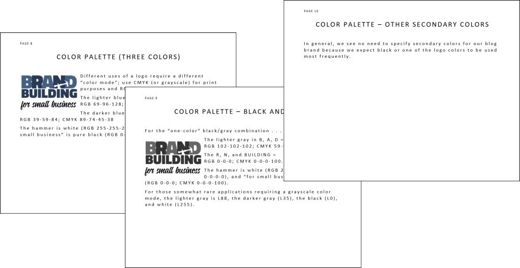
Color Palette
As previously noted, different uses of a logo require a different “color mode” – a very tricky subject involving lots or esoteric technical information. Bottom line: use CMYK (or grayscale) for print and RGB for web use. Most graphic arts programs will give you the ability to switch back and forth between these modes. However, you will note that print and onscreen versions of the same color can vary somewhat, which is the reason these programs include elaborate methods of color correction. Rule of thumb – a CMYK color viewed on your computer will seldom reproduce in exactly the same way when printed. Getting these two to match is as much an art (tempered by experience) as a science. Nevertheless, use of the right color modes will almost always produce a result that is at least acceptable.
For example . . .
The lighter blue in our logo’s B, A, D = RGB 69-96-128; CMYK 81-60-31-10.
The darker blue in R, N, and BUILDING = RGB 39-59-84; CMYK 89-74-45-38.
The hammer is white (RGB 255-255-255; CMYK 0-0-0-0), and “for small business” is pure black (RGB 0-0-0; CMYK 0-0-0-100).
For those somewhat rare applications requiring a grayscale color mode, the lighter gray is L88, the darker gray is L35, the black is L0, and white is L255.
Once you
become familiar with expressing colors as formulas, you will be able to
communicate successfully with vendors such as commercial printers, graphic
artists, and other professionals. Until
then, we wanted you to be aware that these color systems exist (as well as a
variety of others such as Pantone/PMS, HEX, LAB, etc.) so you’ll be able to act
appropriately upon being told 0-0-0-0, and you’ll understand that 51-51-51 is
not a code for an “Area” in Roswell, New Mexico.
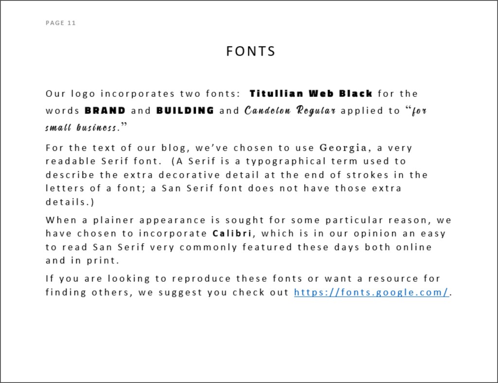
Fonts
Our logo incorporates two fonts: Titullian Web Black for the words BRAND and
BUILDING and Candelon Regular applied to “for small business.”
For the text of our blog, we’ve chosen to use Georgia.
If you are looking to reproduce these fonts or want a resource for finding others, we suggest you check out https://fonts.google.com/. Other alternatives exist, but we’ve found this one to be good and useful.
Photos/Other
Iconography
For our
blog, you’ve probably noticed that we elected to highlight our logo as the primary
imagery on the page – hopefully calling added attention to that item. Since we needed some other photo just to
properly balance the page, we selected neutral content that would recede into
the background and not compete.
Nevertheless,
we do anticipate periodically using a photo or other graphic element to enhance
the point being made and to add some visual interest. When making such choices, the following will
be some of our considerations:
Use
of people; generally speaking, faces make an image more interesting.
Demographic
diversity.
Positive
energy (Are the people smiling and happy?
Excited?).
Contemporary
(not necessarily young but avoiding elements, such as old cars or computers,
that date a picture).
Simplicity
(not too many elements and generally tending to closer focal points).
Compatible
colors.
Narrative
relevance; humor when possible.
By-lines/Tag
Lines
Many companies successfully incorporated a tag line into their brand identity. Ever hear the phrase “Breakfast of Champions” or perhaps “Betcha can’t eat just one”?
When building your brand, consider your options, remembering that a good tag line reflects a differentiating quality, reminds us about a key benefit, and imparts a positive feeling. If you do have or develop a tag line, be sure to specify any rules for usage in relation to your logo. (Very often, tag lines become part of the graphic.)
While we have not adopted a fixed
position or graphic treatment for our tag line, we have chosen the
language: “A Blog for Entrepreneurs
Looking to Create and Develop their Corporate Identity.”
Boilerplate
A short description of your product
or service will often be needed when sending out press releases, producing
sales literature, creating marketing ads, and even filling out forms. To ensure a consistent, properly branded
message, you should develop one or more variations of such a description. For us, one short paragraph seemed adequate
to get started:
“Produced by two experienced communication professionals, Brand Building for Small Business is a blog that aims to provide practical, do-it-yourself advice about creating a brand identity from the bottom up . . . and using that vehicle to help generate income streams. Expect simple, straightforward tips that can be executed by a single person or a small group on a very tight budget.”
Your Brand
Probably the
single most important rule for a Brand Style Guide is to use the rules
regularly, to incorporate the elements into your decision-making process, and
to not allow yourself too many exceptions . . . though some necessities will
certainly turn up.
Companies
that spend thousands of dollars getting a guide prepared for them have a
built-in incentive to dictate their use . . . while your motivation as a small
business for creating and sticking to your guide is less immediate – more of an
act of faith.
However,
your efforts can pay off. Successful
brands are those with elements that resonate with the audience . . . those that
are based in reality and communicate a truthful message in both spoken and
unspoken ways. So, be honest with
yourself in making your underlying branding decisions, and you’ll stand a very
good chance at building a great brand identity.
BTW . . .
Changing a brand is another story for the future. Whether small refinements are being introduced
or a more basic overhaul is underway, this task is a daunting one and is
another good reason for being careful in determining your initial brand
building efforts.