Recently, my blog partner did a post urging any small business owners holding out on creating a web site to take the plunge (read that story here). He assured anyone feeling intimated that every “first try” typically lacks polish and suggested going to the Wayback Machine (a digital archive of the World Wide Web) if in need of evidence. I thought that sounded like a super fun experiment. So in the name of confidence building, let’s look at some big companies and their humble on-line beginnings. . . .
LEGO
Certainly not without charm (because who doesn’t love minifigures?!), but I’m guessing the individuals in charge of this design can’t look back now without cringing.
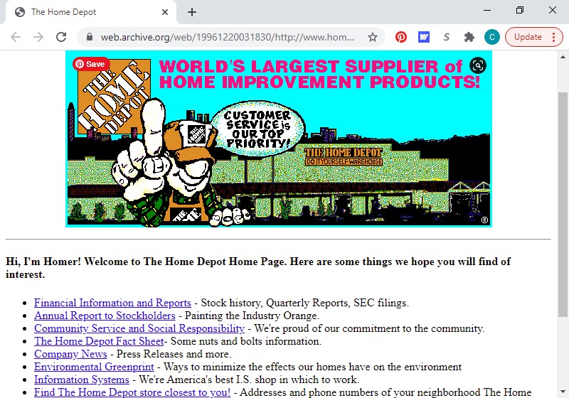
HOME DEPOT
I love a web site with a cartoon mascot that introduces himself before presenting the content of his page. Homer from Home Depot. Priceless.
MACY’S
Where pink, purple, and red and a dash of stars meet function.
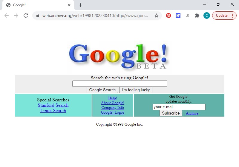
GOOGLE
I rememberd Google always being just a logo and a search box, so I was amused to see this early weightier version.
MCDONALD’S
More cartoons. I’m lovin’ it.
PEPSI
This one may be my favorite. And I’m not going to lie, I wish I had the Shockwave plug-in.
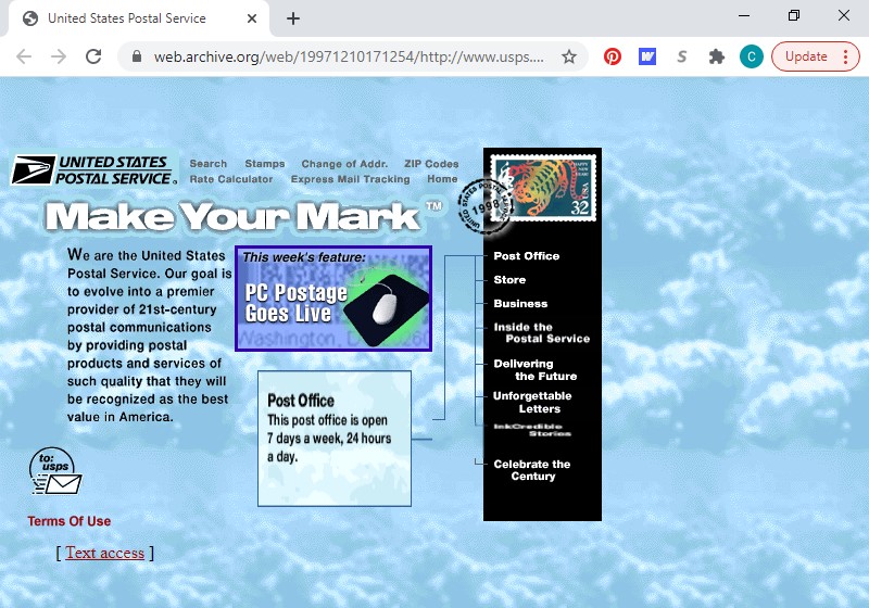
UNITED STATES POSTAL SERVICE
Look at all them clouds!
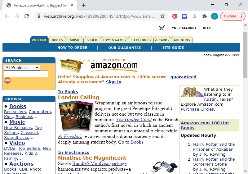
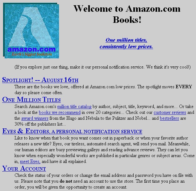
AMAZON
Not too shabby, right? I even kinda remember this design. I knew I needed to keep looking. . . .
Here’s the gold! This relic wasn’t available on the Wayback Machine. Their earliest functional crawl of Amazon was 1999, and I had a feeling that an older, humbler version existed somewhere. Thank you, versionmuseum.com. (In amazon’s defense, this design was among the oldest within this collection with a July 1995 release date.)
FACEBOOK
Welcome to “the Facebook.”
In conclusion, I restate: everyone has to start somewhere.
I hope one day your business grows so big that someone like me searches its origins to see the beginning of your journey.
Fonts. Oh, how I love fonts. They can make the simplest design unique and elegant. With the right font, your company name can transform from mere words to a professional and striking logo. So, how does a small business owner make best use of their branding budget (mine is usually $0/mo) to obtain the fonts that are perfect for the job?
The obvious answer . . . you can search “free fonts” on google and see the results. Unfortunately, the majority of the fonts in those search results are “free for personal use,” meaning you can use the font for a decoration for your son’s birthday party but not to create your business’s logo. However, “free for commercial use” fonts do exist, you just need to dig a little deeper for these gems . . . or simply view the list below, because I’ve already done the digging.
A favored resource, I’ve recommended this site many times. About a thousand *free* fonts are available, and they’re presented in a wonderfully searchable format (it is google after all). You’re able to type in your sample text, select the size you want to preview, and choose your desired font characteristic(s); then, your search results populate accordingly. According to google, “You can use [the fonts] freely in your products & projects – print or digital, commercial or otherwise.”
While this web site does have fonts for sale, hundreds are also available free for commercial use (as they promote right in their company tagline). Fonts are organized by category (i.e., san serif, serif, display, etc.) as well as by other useful attributes (i.e., language, number of font styles included in font family, etc.).
The majority of fonts available on this site are free for personal use; so, be sure to select “commercial use” as a filter in your search, and you’ll still have thousands of results to peruse.
Another site in which most of the free fonts are for personal use, you have to look a little closer to find the free commercial fonts. Click the “Font Categories” at top and within the “Special” section, you’ll find “Free Fonts for Commercial Use.” At the time of this writing, the count of free commercial fonts was over 12,000, so the choices are still plentiful.
I will provide a disclaimer that web sites from this point down are probably only recommended for true font enthusiasts (like myself). The casual font appreciator will probably not appreciate needing to create an account (albeit free) for access to the free font selection . . . or the regular emails that result (though you can unsubscribe to those; I personally enjoy seeing what’s new in the world of fonts from week to week, but that may just be me). Now that I’ve mentioned the inconveniences, the benefit is that these types of sites usually have nicer options available. If you decide to go this route, Font Bundles gives you access to everything in their “free fonts” section, including a new font added every week.
Another site requiring a free account for access, this source is actually one of my favorites. They have a “Freebies” section of their web site, in which you’ll find a rotating selection of hundreds of free fonts. However, my favorite membership perk is their daily emails, each linking to a free font – only available that day. I enjoy having a free digital treasure delivered to my inbox each morning. Well, sometimes, the freebie isn’t a treasure, but I can just delete those; no hard feelings.
Similar to Creative Fabrica described above, you need an account for freebies, and they are regularly emailed to you. At Creative Market, however, you get one email per week letting you know about six available free goods, which can include fonts, graphics, stock photography, templates, etc. I would say in general half of the six free goods are fonts. One nice aspect of this site is that every time you download one of their free goods, its saved for you in your “Purchases.” If you download your free goods every week like I do, hundreds of fonts will be available in that section – all with a nice sort feature and large, graphic preview.
– – –
Do you have a favorite source for free fonts (for commercial use) that I missed? Let us know in the comments section below!
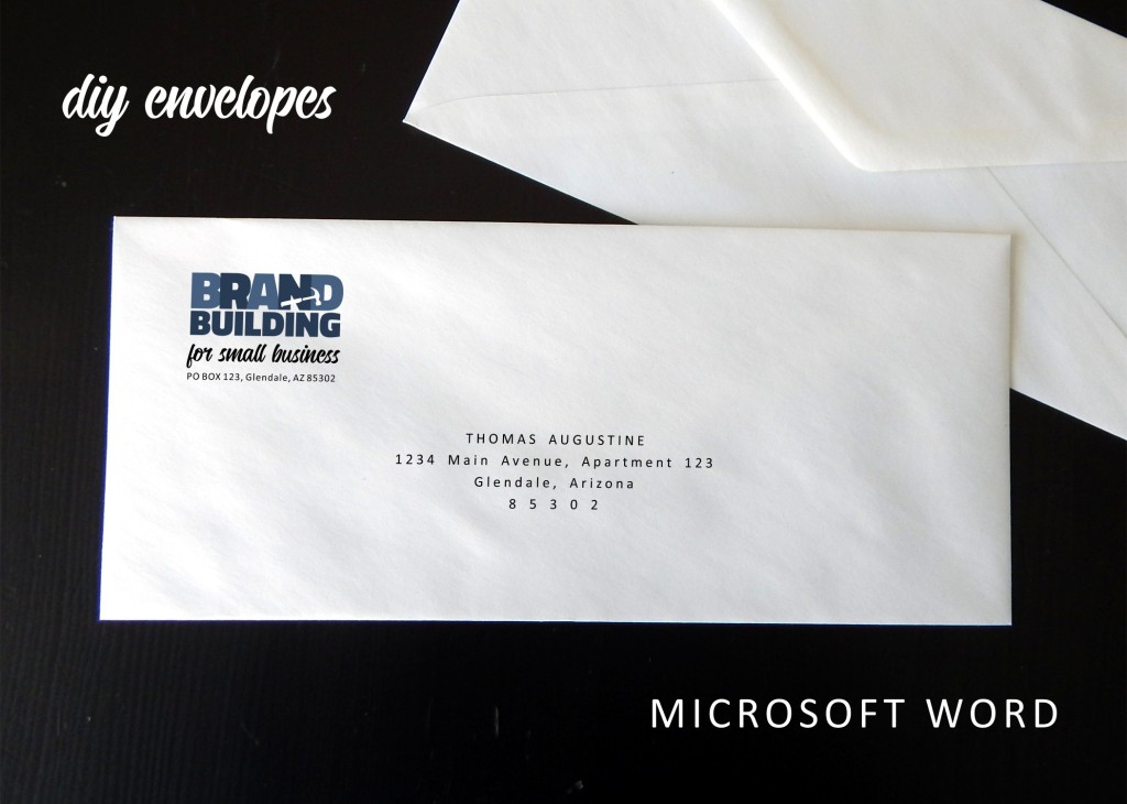
The first time I attempted printing on envelopes was when I was doing Christmas cards about six months after I had started selling envelope templates as part of my invitation business. By time I designed the template for sale, the product had already been requested multiple times, and I finally caved. Something about the process intimidated me, and I was very reluctant to enter the market. And I was right . . . to an extent. I’ve been selling envelope templates for years now, and a number of them are best-sellers. That said, I encounter customers who experience issues with the process on a very consistent basis. If I am spending multiple hours assisting a customer, almost guaranteed I’m working with someone who is trying to print on envelopes.
Going back to my first time, I, too, had challenges, and printing perfection probably came after (similar to some of my customers’ experiences) about two hours of fighting frustration. I write all this not to scare you off but to properly prepare you. For most how to’s, I go on about speed and ease. This is not that kind of introduction. You will most likely be confused and annoyed at one or multiple points in this process. If you’ve got a fighting spirit, you may even be tempted to physically confront your printer. However – if you’ve got endurance, you will most likely prevail!
You could also be one of the lucky ones. Many of my customers have raved about how wonderfully easy the process was for them. I’m always a little secretly envious in those situations. Hopefully, that, too, will be your experience.
Regardless, whether or not you initially struggle and ultimately succeed or immediately win the day, you will pretty much be an envelope printing wizard going forward (until you purchase a new printer of course). Now, the process is old hat for me and is SOOO much quicker than writing out addresses and SOO much nicer looking than labels (yes, I’m an envelope snob now, sure, but we all have our faults). So . . . if you’ve decided you want to plunge forward, I commend your gumption and encourage you to read on.
1. Open Microsoft Word and select New > Blank Document. Click the Layout tab, press the Size button, and choose Envelope #10 (which is a standard business-size envelope). Then, click Orientation and select Landscape. Finally, click Margins, select Custom Margins, input .6” for Top and Bottom and .86” for Left and Right, and press OK.
2. Next, add your logo. Click the Insert tab, select Pictures, and choose This Device; then, navigate to your logo, select the file, and press the Insert button.
You’ll probably need to adjust the sizing. If so, just click on a corner of the image and drag DIAGONALLY to increase or decrease the size as needed. (If you drag other than diagonally, you could resize your logo disproportionately.)
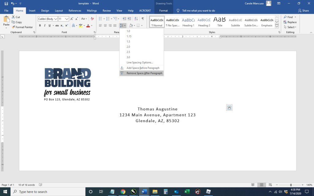
Then, click in the open space to the right of the logo, press enter to add a line space, set your font properties, and type your business address. (I went with Calibri font in size 7.5 and expanded the character spacing by .5; I fiddled a little with the options until the address lined up just so with the logo.)
3. Select the Insert tab, click the Text Box button (in the Text section at upper right), and choose the Simple Text Box.
Click the Shape Outline dropdown and select No Outline. Type in your recipient’s name and address (or just input placeholder info for now). Then, select the outline of the shape and click the Home button to set the font properties of your text box. (This time, I went with Calibri in size 11 centered and expanded the character spacing by 1. I also selected Remove Space After Paragraph from the Line and Paragraph Spacing dropdown.)
At this stage, I just fiddled with the font properties a bit more. I decided to center the text, extend the character spacing by 2 pts, cap the name, put the zip code on its own line, and extend that character spacing by 5 pts. I also moved the text box move down a bit.
4. Be sure to save your file at this point to be accessible whenever you need to print an envelope.
And now, on to the tricky part. . . .
5. Go to File > Print. Once on the Print screen, be sure Envelope #10 is selected from the Page Size drop down.
Load your envelopes in your printer (according to your printer specifications). Take a picture so you remember your placement.
Print. If the addresses printed upside down, on the wrong side, not on the envelope at all, etc., adjust your envelope’s placement in the printer accordingly. Take another picture (so you can keep track of what you’ve already tried).
Once you know the proper way to line up your envelopes in your printer, be sure to take one last picture of the right placement for future reference . . . for the next time when can be an envelope printing pro.
That said, good luck . . . and try to be patient (or at least try to make it a little fun . . . maybe do a shot between each fail).
Disclaimer: An alternative route to printing envelopes in Word does exist, and I would be remiss not to at least mention that Microsoft does offer an automated set-up for Envelopes. While the functionality can be less frustrating when printing, formatting options are very limited. Feel free to check out Microsoft’s envelope how-to and see which route suits your needs best.
If you have any questions or comments, leave a reply below.
(Next up in the world of business envelopes . . . mail merge. Stay tuned!)
Disclaimer: While we only recommend products we know and love, we want to note we use affiliate links and may earn a commission for purchases made through those links.
If you’re a graphic designer by trade, Corel Draw may not be your graphics editor of choice. If you’re a small business owner without a lot of graphic design experience choosing to do your branding in-house, Corel Draw is a great choice. You can pretty much address all your web and print graphics needs for a fraction of the price of the typical designer preference, Adobe. Since you’ve landed on this page in your travels, you probably already know that. Your stumbling block may be that blank page within Corel that you’re staring at while wondering the quickest and easiest way to get professional-looking business cards designed, printed, and ready to hand out. We’ll take you step by step through the process.
A Quick Note About Versions: I’m using Corel Draw 18. As long as you’re using a version in that same vicinity (i.e., 16, 17, 19, or 20), your view should look pretty similar to the screenshots included throughout these directions.
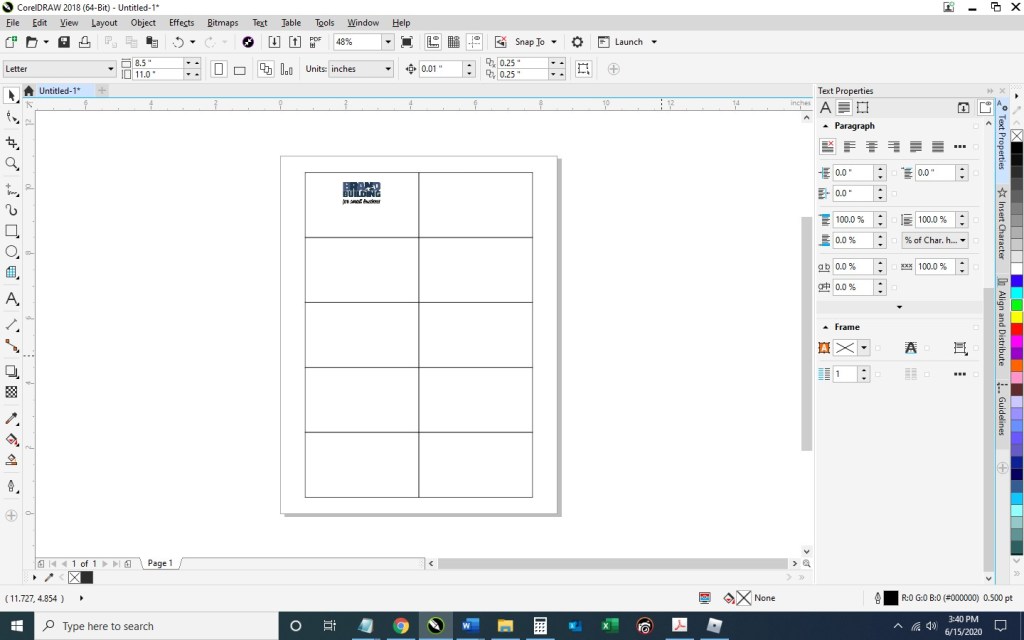
1. From within Corel Draw, go to File > New. You want an 8.5 x 11” portrait page that’s CMYK and 300 dpi:
2. Select the Graph Paper Tool:
Input 2 columns by 5 rows:
Draw the graph in any size and then switch to the Pick tool:
Change the size of the graph to 7” wide x 10” high and then type “p” to center the object on the page:
Double click the Outline Pen at the bottom right of the screen and change the color to dark gray, the width to hairline, and the style to dashed:
Then press Ungroup Objects with the graph still selected:
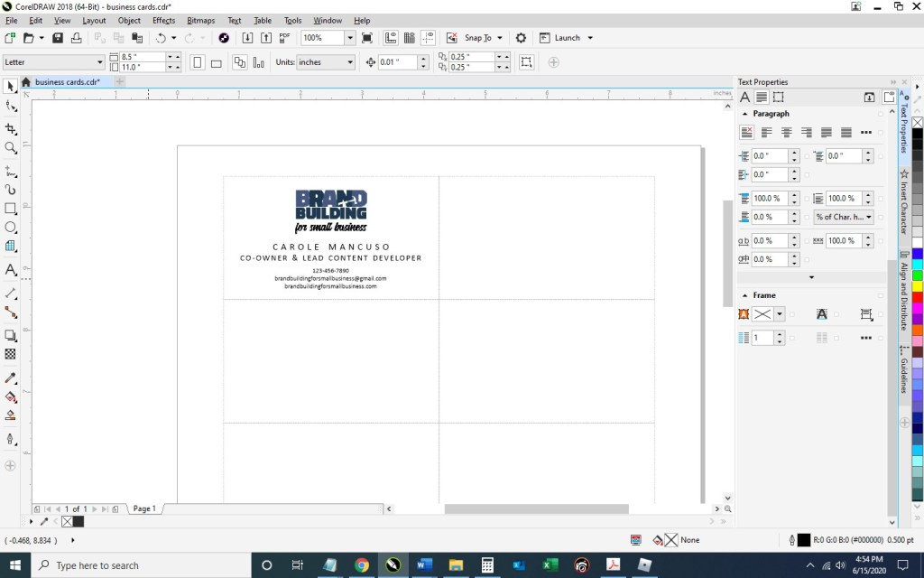
3. With the layout of your business card document ready, Go to File > Import and navigate to an image of your logo and click the Import button. Then, resize as desired and place your image within the top left rectangle. To ensure your logo is perfectly horizontally centered within the space, select the logo first, hold down the “shift” key to be able to select multiple objects, select the rectangle, at which point you can deselect shift; then, press “c” with both objects selected.
Select the Text tool so you could begin adding content:
Click anywhere on the page and type your name; press enter and add your title; then, continue adding the rest of the details you would like to show on your business card. I’m going to include my title, phone number, email address, and web site. Finally, set the alignment of the text to centered and choose your font and font size. I’m going to use Calibri, size 11 for my name; size 10 for my title; and 7.5 for the rest of the information.
Move the text to the desired spot within the rectangle and horizontally center the two (click the text, press the ”shift” key while also selecting the rectangle; then, press “c”):
Now, you’ll want to adjust the spacing a bit. With the text selected, press Ctrl + k to break each line into its own text object. Then, I’m going to stretch out the character spacing of my name from 0% to 150%. To do so, press Ctrl + t to edit the text properties.
To ensure the two words don’t run into one another with the extended character spacing, I’m going to change the Word Spacing from 100% to 450%:
For my title, I’m going to use 50% character spacing and 250% word spacing.
Next, I’m going to select the phone number, e-mail address, and web site – pressing the down arrow key a few times until I’m happy with the placement:
4. And now we’ve got one business card in place! To distribute the card design throughout the page so they can be printed ten at a time, select the rectangle you’ve been working on along with all the content inside and press Ctrl + g to group them together. Press Ctrl + d to duplicate the business card:
Keeping the newly created business card selected, press the “shift” key while selecting the top right rectangle; then, press “e” to vertically center and “c” to horizontally center:
Select your two business cards and press Ctrl + g to group the two together and then Ctrl + d to duplicate them both:
With your newly created group of two business cards selected, press shift while selecting the second rectangle in the first column, and press “t” to top align the objects and “l” to left align the objects:
Repeat that process until all the rectangles are filled with your business cards:
5. Save your file and print; be sure to set your Print Quality to the best available option.
When choosing your paper, I recommend a quality cardstock between 80 and 100 lb — any thinner, and your business card will be too flimsy; any thicker, and you risk problems using the paper in a conventional home printer. A matte versus glossy finish is really a personal preference, but you do avoid any potential for fingerprints on a matte stock.
Then, cut! For the cleanest and straightest edges, use a paper cutter.
A Note About Fonts and Colors: While the instructions described above will achieve the simple and modern design pictured, you can (and should) customize the look for your business. If you’ve been brand building from the start, you already have a Style Guide in place, and everything you create for your business should reflect the guidelines you’ve set for your logo usage, fonts, and colors. If you’re new to branding, be sure to review our story on The Role of a Brand Style Guide.
Where to Begin? Once you’ve made the decision for your business that you are going to build your brand from the ground up, you may find yourself a bit overwhelmed. I certainly did. In this post, I reflect on the beginning of my journey as I learned to focus on branding even while in survival mode.
What’s in a Name? This piece examines some of the considerations in selecting the right name for a well-branded operation.
Design Your Own Logo This tutorial provides a very hands-on approach to building your logo. Whether you are considering a totally new design or simply looking to adjust, adapt, and tweak an existing one, these tips (including where to find needed tools) should prove useful.
Know Your Audience A very basic but essential part of any branding exercise should be to make sure you know your audience and choose branding elements that properly reflect their characteristics. This article reviews some of the basics for you to consider.
How to Create a Mission Statement Need a little inspiration for crafting that ever-so-important message? This post includes a couple dozen great examples along with an exercise that breaks down the components of a good mission statement to help you develop yours.
The Role of a Brand Style Guide Once you have completed each of the above activities BUT BEFORE YOU BEGIN BUILDING BASIC TOOLS LIKE BUSINESS CARDS OR LETTERHEAD OR INCORPORATING THE ELEMENTS INTO MARKETING OR ADVERTISING EFFORTS, take the time to create a style guide that puts into writing the most basic rules that must be observed to properly build the visual element of your new brand.
How to Set Up Simple Print-and-Cut Business Cards Start with a blank Word document and develop business cards that are print-ready in only ten steps . . . this “how to” guides the way for you. A Corel Draw tutorial is available as well.
How to Easily Create Business Letterhead As integral as business cards and even easier to develop, letterhead created in Microsoft Word is presented as Instructions with Template Included and a Video Tutorial. Instructions and a template are available for Corel Draw as well.
Note: Many helpful downloadable tools/templates are provided to add extra value to the pieces described above.
Disclaimer: While we only recommend products we know and love, we want to note we use affiliate links and may earn a commission for purchases made through those links.
Lots of businessowners question whether they’re creative or tech-savvy enough to create their own logo. Unfortunately, I can’t tell you neither of those qualities are needed, but I can safely say they’re not needed in the abundance you probably imagine.
Things you do need to design your own logo:
A little creativity
A little tech savvy
A vector editing program (available for free)
Lots of fonts choices (available for free)
Lots of icon choices – IFyou want a graphical component to your logo (available for very minimal cost; the icon used in our logo cost $2.99)
So where to start?
While graphic design isn’t my specific trade, I’ve been asked
to create dozens of logos throughout my career.
Every time, I start by facing that same dreaded obstacle: the blank
page. I stare at it, thinking about what
the logo should represent and the type of fonts, colors, and imagery to best
suit that message. Meanwhile, a blank page relentlessly stares back.
While a tedious process, you should set your expectations for your logo before you pick up a pencil (or the mouse).
Originally, logos were introduced as an aid to people who couldn’t read. As a result, the earliest designs tended to be very literal. (For example, a shoemaker’s logo would inevitably show a shoe.) Over time, the purpose of logos has evolved to become a broader reflection of brand but remains a key way of differentiating yourself in the marketplace.
So what’s the personality of your company? Is your business youthful and trendsetting? Conservative and financially strong? Fun and whimsical? Product-focused and straightforward? Some combination thereof? This corporate identity (or brand) needs to be communicated in your logo – through your font(s), color(s), placement of words, and any graphics.
If once you have a strong sense of your business “personality”
in mind, your page is still unyielding in its never-ending canvas of white, go
looking for some inspiration. . . .
For the Brand Building for Small Business logo, I
knew I wanted to try something graphical to literally represent the act of “building.” I was initially picturing letters being
nailed but knew that would be tricky to execute in a clear way. So, I went to my go-to spot for inspiration: google images.
I searched for “building logo,” hoping the results would be full of
construction-type logos also looking to convey the literal act of “building.” But no, Carole, searching “building logos”
yields lots of logos of buildings.
. . . Should have foreseen that. Instead, I searched for “building construction logos” and found more of what I had in mind.
A couple screens in, I found inspiration.
Looking at the Hammersmith logo (in navy and white on a
yellow background), I love the way the hammer is a silhouette within the house
and appears to be captured mid-swing. I
immediately knew I wanted to try a hammer silhouette, but I wanted the graphic to
appear within the company name and not as part of a separate graphical
element.
A quick note on inspiration versus copyright infringement: This is an area requiring caution. Whereas you can use a silhouette of a hammer as seen in one logo in another, creating a logo for a construction company with a silhouette of a hammer in a navy house with white windows on a yellow background would most certainly earn you front-row seats to the case of them v. you. An individual idea cannot be copyrighted; however, “a collection of ideas” makes a logo (or any other original work) unique and can be protected by law. Tread carefully.
LOGO ICONS
So, where does one go for icons that could legally be used as part of a logo for minimal cost? A number of options exist, but I like https://thenounproject.com/. They have a large selection and charge nominal, one-time fees per icon. I found the hammer for our logo for $2.99.
A number of choices were available. . . .
I selected a classic and simple hammer.
I then purchased and downloaded the file in PNG (bitmap
image with a transparent background) and SVG (vector) formats. (A
separate article on Vector vs Bitmap file formats is planned.)
VECTOR/GRAPHICS SOFTWARE
Now what to do with your icon? We use the vector and graphics editor, CorelDraw. While the suite is powerful and much cheaper than your standard graphics package, the cost is still pretty steep in the $500 ballpark. I read a few articles on free vector-editing programs, found Inkscape (https://inkscape.org/) to be highly recommended, and gave it a go. The program seems to have the features needed to get the job done. (And, they make a number of tutorials available, including one on the basic tools: https://inkscape.org/en/doc/tutorials/basic/tutorial-basic.html.)
FONTS
An obvious first step when selecting a font to use for your logo is to scroll through the existing fonts on your computer to see whether anything catches your eye. Remember that you’re not looking for the font that necessarily looks the best to you; rather, you’re looking for the one that best represents your business’s brand. If you’ve picked out an icon at this point, you’ll also need to be mindful of the way a given font looks with your chosen icon. You can have an icon and a font that both separately represent your brand perfectly but just don’t look good together. Since I wanted to try including the hammer as a silhouette within the words for Brand Building for Small Business, I needed a really bold, thick font. I gave Arial Black a try, knowing it’s the boldest font currently available on my computer, but I wasn’t really pleased with the result.
Thankfully, a source exists offering hundreds of (*free*) fonts in a searchable format that actually makes the process relatively easy. With Google Fonts (https://fonts.google.com), I was able to type in my sample text, BRAND BUILDING, the size I wanted to preview, 60 px, and my desired font characteristic(s), increased thickness.
After much trial and error (downloading, installing, and trying dozens of fonts), I found Titillium Web Black and a contrasting script, Candelion Regular, to work in black and two shades of navy.
While I am VERY tempted to digress at this point and start talking about some of the many techniques that can be used to marry the fonts/words used in your logo to the images you’ve chosen . . . I keep reminding myself that level of detail is really better suited for another blog entry further down the road. For now, I will stick to my original plan to keep this message broad but nevertheless offer a few . . .
CONSIDERATIONS
At some point, you may choose to print sales materials in grayscale or advertise in a print media in black and white. You may want to have branded pens for your company (requiring a very, very small logo) or you may purchase a building on Times Square and want your logo proudly illuminated on top (requiring a very, very large logo). Before you decide your design is a done deal, you should run a few tests. Try changing your color scheme to grayscale as well as black and white and print a very small version (one half inch on its biggest side should be sufficient) and a very large version (full page). If all variations look ok, you’ve probably got a keeper.
Export your new logo as a high-resolution transparent RGB PNG, which will work well in MOST (but not all) environments. (Inkscape export settings are shown at right below.)
Once you’ve managed to get this far, you’ll want to protect your work. Your logo should be registered as a trademark. If you are not of a mind to involve your lawyer in the process, consider checking out various on-line alternatives and look into the steps involved in going the DIY route (for example: https://www.wikihow.com/Register-a-Trademark-Without-an-Attorney).
Next up . . . confirm your understanding of your business’s audience; read: Know Your Audience.