Role of Branding in Direct Mail/E-mail

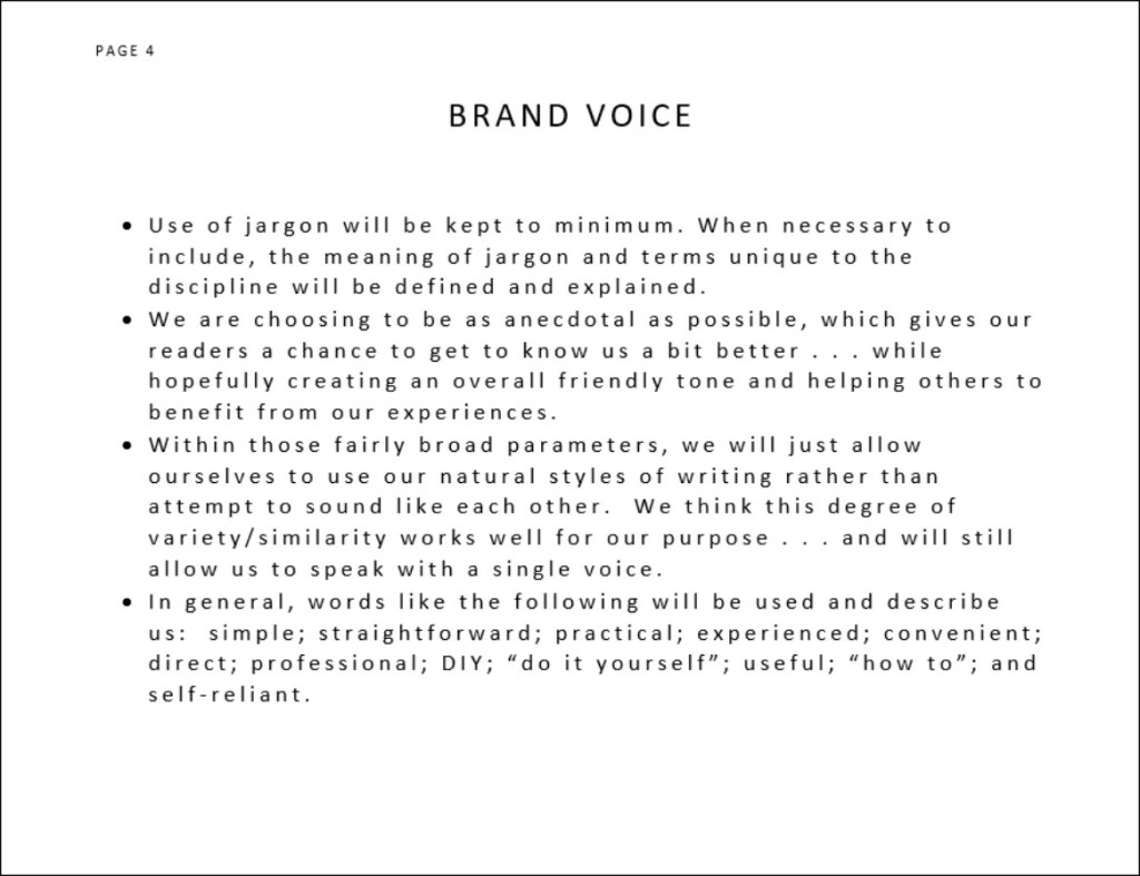
Direct mail/e-mail is not for the faint-of-heart . . . OR for the impatient.  When a campaign is working well, results tend to be measured in single digits with the difference between success and failure often just tenths of a point.  (Try explaining that to someone and justifying the value of the effort.)

Despite the negative sound of my opening remarks, I am, indeed, a strong proponent of direct response tools.

Why?

  • You have a blank page just waiting to be filled with a refined, well-branded message that can include a sales pitch as well as a reminder about who you are and plan to be – providing a glimpse into your culture.
  • Direct mail and e-mail are extremely inexpensive and can be repeated many times without a loss of effectiveness, which aids branding through repetition; in fact, by sending your message over and over again to the same list, you ensure your message is heard at the right time – buying time . . . which, in turn, can occur as often as every day or so . . . or as infrequently as once or twice a year.
  • While the numbers measuring results tend to be low for any single mailing, the cumulative impact can be great as you produce small gains on a very regular basis and retain those new customers over time.

Note:  According to the Direct Marketing Association, the average response rate for direct mail house lists is 9% and 5% for prospect lists. However, if your direct mail piece is advertising an expensive or complicated product, a response rate that is less than one percent is not unusual.  (Responses / Pieces Sent = Response Rate)

While the quality of your “creative” (i.e., text, art, branding, etc.) DOES matter as well as the quality of your mailing list, timing may be the single most important factor in determining your success.

More About the Message

Direct marketing provides an excellent blank tableau for you to communicate who you are, what you sell, and the company you hope to become.  Furthermore, you can express this information in a manner consistent with your culture and the image you want to project.  Beyond that, your self-portrayal needs to reflect reality to resonate with your audience and, therefore, be more memorable.

The Headline – Headlines matter and create your first (and often only) chance to grab the attention of your audience.  Short, memorable, and descriptive works best . . . but ain’t easy to accomplish!

I developed my first appreciation for the potential impact of the headline many, many years ago.  The company I worked for had bought an old furniture store and was disposing of the contents via flash sales conducted by their small group of employees, most with non-sales jobs.   

The first two weekends went great and all of the big, expensive, and nicer items were sold pretty quickly.  Clearly, we had gotten the word out.  By week three, however, only lots and lots of odd accent items were left . . . and we weren’t having much luck selling them out.

Our solution:  we took out a large full-page ad in the newspaper (which people actually read back then) that ran under the headline “Adopt an End Table or Be a Foster Family to a Few Good Lamps and Chairs!”

Something about the line struck a chord because the crowds returned the very next weekend, and the majority of the remaining merchandise was moved.  Since then, I always pay close attention to the headline, very often using that as my starting point when creating an ad, flyer, or direct mail letter.

Copy (The Message and Offer) –   This point raises one of the great disputes of all time.  What sells best?  Long copy or short.  If you can conclusively answer that question, your name will be entered into the annals of the direct marketing hall of fame.

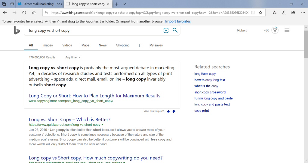
Just search long copy vs. short copy, and you’ll get the general idea:

Frankly, I’ve used both successfully.  Cop-out?  No.  My personal preference has always been long copy . . . and I have identified substantial amounts of expert opinion in support of the long-copy case (ex:  David Ogilvy in Ogilvy on Advertising – an industry standard).  However, my professional career has mostly involved parties who believe “no one reads anymore!” . . . so “bulletize” (another way of saying “dumb-down the content”), though the words used to express the sentiment are generally more like “keep the wordiness to a minimum.” (Just writing this paragraph has kicked up my stress level a notch or two.)  In the end . . .

If you are preparing a direct mail piece and answering only to yourself, I suggest using as many (or few) words as are necessary to make your point persuasively, remembering that one or two pieces of carefully chosen and cited data can be the key to establishing credibility and making your point in the most convincing possible way.

Artwork/Graphical Visual and Format – Your need for (and selection of) artwork will depend upon whether you are sending just a letter, just a flyer, or both.  Traditionally, multiple pieces were recommended (though current conventional wisdom is far more flexible).  Personally, I’ve used all of those approaches in format and have not noticed a significant difference in the outcome.  Other factors – such as the quality of the list, effectiveness of the message/offer, and timing – seem to be the determining factors.

That said, artwork – when included – can be an attention-grabbing element.  As a result, choose the most compelling OR familiar image available.  If you have some well-known quality with a high degree of recognizability (perhaps your physical location), use that to your advantage and stick to a picture that capitalizes on a good address.  Humor can be successful as well as art that in some form presents the unexpected.

To state the obvious, always be sure your logo and any byline are prominently displayed as part of your basic branding of the piece.

Note:  While the choice of traditional mail vs. e-mail will affect your selection and use of some of the items discussed in this article, your choices can be easily tweaked to work in either environment.  In fact, these elements should be similar to ensure consistency across various media.

Snail Mail vs. e-Mail – So . . . which works better?

The answer may ultimately depend upon the nature of your mailing list (with the first question being whether or not e-mail addresses have been included).

Needless to say, e-mail solicitations are faster, less expensive, and very immediate – all very attractive qualities.  You can:

  • Link to large volumes of supplemental materials.
  • Create custom “landing pages” that provide an easy (and very trackable) opportunity for immediate response expressing an interest.
  • Repeat the process many times.
  • Get immediate feedback about mailing list names that are no longer valid and are now undeliverable.

However . . .

  • In this era characterized by inundations of electronic messaging and spam e-mail, you can be easily ignored AND DELETED UNREAD! 
  • Spam and junk mail filters can keep your messages from being seen by the intended party.

While one might logically guess that the cost, time, and immediacy of e-mail would doom snail mail to extinction, I have found that certain (often demographically older) audiences pay more attention to physical mailings.  Interestingly, the traditional approach also has the added benefit of a longer shelf life with parties interested but not currently at “buying time,” causing them to set aside the printed letter or flyer for a quick review at a later date closer to the actual time of need, which gives you the best possible chance of success.

My proof?  I’ve had mailings that produced a response that could be absolutely traced back to a physical mailing occurring six months before.  While an electronic equivalent to setting a piece of paper aside clearly exists, I’ve seldom seen evidence of that occurring.

A Direct Response Project for Our Own Blog

Huh?

Well . . . one of our goals for this blog is to build an audience.  As a result, we searched for (and found) a list of associations, agencies, and affinity groups that appear to have a connection to small businesses (https://smallbiztrends.com/2018/05/small-business-associations.html).  As a result, we are planning to systematically approach at least some of them via e-mail and/or mail with a request to link our blog from their web sites.  Unlike some mailings, our intention is to do just a few at a time to properly manage the kind of follow-up required. 

Since our blog is still in the early stages of development, we will wait until we feel we have accumulated a sufficient amount of content.  (Perhaps 20 or so articles?)  Also, we realize we do not yet have any meaningful performance data (i.e., visitors, followers, likes, etc.).  So, the letters will initially have to be created without those key elements that will be added upon becoming available.

Nevertheless, we have drafted the text of a message and included an offer with the intention of sending out the first few inquiries in the upcoming weeks with plans to revise our message as time passes based on new feedback, performance results, and early results.  (We’ll keep you posted.  Until then, feel free to comment upon our draft.)

Looking for More Concrete DIY-Type Information?

At least two more direct response articles are planned for the upcoming weeks.

  • Detailed instructions on preparation of a Word Mail Merge document that can be linked to an Excel address spreadsheet to generate your own mailing.
  • An article explaining the various alternatives that exist for generating a mass e-mailing, including the use of vendors vs. your own word processing and e-mail programs.

Until then, good luck moving forward with your campaigns.

Other Resources

 For information about the typical elements of a direct mail package, see:

FitSmallBusiness.com

Accurate Mailing Services

Create a Branding Activity Calendar (Template Included)

At some point after initial development of your branding elements, sales and service activities begin to overlap and incorporate brand management.  To ensure ongoing progress toward the goal of building an established, identifiable brand, a “Branding Calendar” can be a very useful tool that helps to add structure to an amorphous task.

The following is a list of activities that can and should occur within a month to promote consistent progress . . . and results.

  • Explore opportunities for charitable contributions/community involvement.  (Could involve a monetary contribution, a give-away item with a logo, OR the gift of time and can be used to develop promotional materials.)
  • Prepare and submit press releases (could be personnel or product/service-related or more geared to civic involvement as outlined above).
  • Send direct mail/e-mail to sell product/service but simultaneously support brand awareness. 
  • Perform Social Media postings for product or community-related news (as mentioned above); every press release, ad, charitable gesture, mailing etc. can potentially benefit from a social media followup.
  • Perform a customer care activity to try to make sure you know who they are and that they are well served.  Remember, your branding will only ever be effective when the customer’s experience is being reflected.
  • Address SEO (search engine optimization) activities, evaluating current search results and exploring possible ways to improve such as running campaigns to increase backlinks, adding content to site, channeling contact and sales information through the web site to build traffic, etc.

All of these activities represent opportunities to promote your brand, circulate your logo, incorporate any slogans/by-lines, reuse standard boilerplate language etc.  We suggest utilizing our Branding Calendar as a guide to monitor and structure your progress and make sure your sales activity incorporates the branding elements you’ve decided upon. 

Obviously, we encourage you to use our calendar as a starting point for you to customize to your specific operations.  For instance . . .

  • Perhaps telemarketing has proven to be a successful sales and service strategy for you.  Then, include that item and make sure your telemarketing staff has scripts that reflect your branding. 
  • Perhaps advertising is a key for you.  If so, be sure to add several days to create ad copy, build web landing pages, submit your creative, etc.
  • Tradeshows important to your operation?  Then, use them as an opportunity to promote your brand and deliver your message both verbally and in print, including the content of your trade show booth.

Our intention over time is to create separate articles about each of these potential vehicles for building your brand so we can explore the topic in greater detail and hopefully offer some very specific, concrete tips related to the activity.  Till then, hope you find our calendar a useful starting point in customizing your own. (Download our Branding Calendar template and activity worksheets.)

Know Your Audience

Duh!!

Ok.  So maybe you do (and maybe you don’t) have a sufficiently good understanding of just whom you think that group is.  If you do, consider this posting a chance to quiz yourself to be sure.

A brand becomes memorable when the values being communicated resonate with people.  In other words, the product, service, or company you present match the personal perception and experiences of your customers.  Otherwise, your message becomes suspect and easily dismissed as just another example of “sales hype(rbole).”  Therefore, an honest, clear-eyed self-awareness is critical.  However, equally important is an understanding of whom your audience really is.

In some cases, that group might be your customers.  In others (such as this blog), your audience is your readers.

Why does this matter?  Why do you really need a clear perception of the people on the receiving end of your branding efforts?

  • The clearer your understanding, the more directly you can speak to their concerns.  (Ex:  If your audience is small businesses, you don’t offer branded sales strategies costing millions and millions of dollars; this group won’t have GEICO’s advertising budget!!)
  • You’ll pick language that identifies you as a peer and colleague, enhancing your credibility.  (Ex:  If your audience is other small businesses, then use of jargon is acceptable and perhaps even useful.  Conversely, such words would be lost on a general retail audience.)
  • Demographic details help you present your message in the most meaningful possible way.  (Ex:  If your know your audience is young, you don’t expect them to remember circumstances from 40 years ago;  if you know your audience likes sports, don‘t waste time drawing analogies to opera!)

In figuring out whom you are trying to reach, develop quick profiles that you can keep handy as a reminder.  For instance, prepare a description that addresses items like the following:

  • Age
  • Interests
  • Geographical location
  • Occupation or industry
  • Affiliations/affinity groups
  • Marital status
  • Income/earnings
  • Education
  • Hobbies
  • Gender
  • Etc.

Examining characteristics such as these can often yield a clearer picture (feeling free to add or subtract categories to match your specific circumstances).  Then, you must begin incorporating this understanding into your branding efforts.  However, a word of caution.  Be sure to ask yourself whether you are being sufficiently honest with yourself to create an accurate portrait.  In other words, are you right?   Sometimes, forcing yourself to look beyond your immediate assumptions can lead you to consider other targeted niches that might expand the scope of your audience AND sales.

For instance, Carole and I went through such an exercise.   While some obvious qualities kind of slap you in the face (i.e., our audience most certainly does include small businesses with an entrepreneurial bent!), we had to guess a bit about other qualities that might apply (such as sales savviness, technological literacy, size staff, etc.).   However, most interesting to us was the realization that we had a whole other potential audience not originally targeted when we began this blog.  Specifically, we realized that certain communications professionals (especially those young and inexperienced or perhaps still in college) might benefit most from our experience in learning how to get needed tasks accomplished. 

Both of us could remember receiving requests on deadline that we had absolutely no clue how to get started (much less completed).  We can remember turning to the Internet and asking, “Where can I find a free source for photos of giraffes to use in an ad campaign?” or “What items are included in a survey used to determine the audience of a product?”

(BTW—That later question – much to my surprise – just yielded a remarkably well-aligned answer:  “Using Web Surveys to Determine Audience Characteristics . . . ; https://files.eric.ed.gov/fulltext/EJ1060290.pdf .)

In closing, never underestimate the value of very specifically targeting your message to your audience.  However, intellectual honesty is critical.  Make sure you know who your audience is . . . and are not wishfully imagining that group is who you WANT your audience to be.  For instance, you may think your product or service is perfectly aligned to those with unlimited funds and discriminating taste when – in reality – you speak more clearly to those on a very tight budget.

Toward that end, performing simple surveys, meeting with formal or informal focus groups, and implementing other forms of research can only help get a clear understanding while simultaneously being a reality check on yourself.

Good Luck!

Have a couple extra minutes? Read the next story in our “The Beginning” series: How to Create a Mission Statement (Including Definitions, Examples, and a Mission Statement Generator).

The Role of a Brand Style Guide

As a small businessowner, I suspect many of you saw this headline and asked, “What is a Brand Style Guide, and why bother when I have more immediate needs that might generate income?”

“Stop!”

I can see you are about to close this page . . . and I want a shot at keeping you reading.  I’ll start by answering those two questions.

A Brand Style Guide is a written statement that defines and describes the way in which you present your business to the world.  Typically, both the message and key elements of the visual treatment are encompassed.  

Many large companies have invested millions of dollars perfecting the brand image and the message that gets presented.  Therefore, no one should be surprised that THEIR style guides are VERY detailed and address a wide variety of circumstances.  For example, MacDonald’s is quite protective of their golden arches (see https://news.mcdonalds.com/press/multimedia-library/logos).  For 50 more examples, check out https://www.canva.com/learn/50-meticulous-style-guides-every-startup-see-launching/.   That said, many smaller businesses want the benefits of having a standardized message but do not see a need for a document that does more than address key elements of branding and style.

For our blog, we fall into that latter category.  We recognize that we could benefit from articulating a few basic rules but don’t require a more elaborate guide.  Perhaps in time, that other approach might be warranted . . . but not yet.  Since we suspect many of you fall into this category, we’ll be devoting this blog entry to the creation of a small manual – our own!  (Feel free to download and review a copy . . . and use ours as a template/starting point for your own.)

We began by identifying the issues we wanted to cover:

  • Our mission and differentiating qualities (i.e., the synopsis of “Our Story”).
  • Our brand voice.
  • Our guidelines for use of our logo – attempting to make that icon our unique brand signature.
  • Our color palette.
  • The fonts used with our logo.
  • The types of photos and images selected.

Mission/Differentiating Qualities

When Carole and I decided to start our blog on marketing/communication strategies, we were determined to pass along useful how-to information and instruction that might enable a small business owner to have a highly evolved and very professional brand . . . while doing all of the required work inhouse.  Having been practitioners in this field for decades, we knew the difficulties that could be encountered in going DIY . . . as well as the very high cost of hiring third parties to perform these tasks.  For example . . . just a few years ago, a company affiliated with my employer paid $25,000 to have a style guide prepared for a new start up.  Frankly, the product delivered did not justify the cost. 

So . . . think about the characteristics that set you apart.   Those features are the heart and soul of your business plan and provide the critical backdrop needed to create your Brand Style Guide.

Page 4 of our Style Guide

Brand Voice

Are you traditional or avant garde?  Friendly and very personal . . . or somewhat distant and formal?  When you are expressing yourself, are you picturing an audience of fellow professionals . . . or the general pubic?  The way in which you answer questions such as these determines the voice that will be identified with your brand.

Carole and I naturally write with different styles.  And yet, we did set some basic parameters that will, we hope, create a single voice unique to our blog.  Specifically, we determined that we would keep our use of jargon to minimum OR (when necessary) be sure to define and explain the meaning of terms.  Similarly, we are choosing to be as anecdotal as possible, which gives our readers a chance to get to know us a bit better . . . while hopefully creating an overall friendly tone and helping others to benefit from our experiences.

Within those fairly broad parameters, we figure we will just allow ourselves to use our natural styles of writing rather than attempt to sound like each other.  We think this degree of variety/similarity works well for our purpose . . . and hope you agree.

In general, words like the following speak with our voice:  simple; straightforward; practical; experienced; convenient; direct; professional; DIY; “do it yourself”;  useful; “how to”; and self-reliant.

Use of Logo

Every logo creator hopes and intends for the graphic to become an immediately identifiable symbol.  Toward that end, consistent and frequent use of the exact image is necessary.  Our basic logo for this blog is pictured to the left.  The primary variation to be used both in print and online/onscreen is the three-color version shown at the top.  When only a single color is available (either due to the medium used or cost-saving economics) the black and gray version is permissible.  A single-color, black alternative has also been created for those select occasions when the method used to reproduce the image will not handle gray successfully.  (Example – some photocopying of forms.)

While we believe our logo is sufficiently scalable to become signage atop a building or an imprint on a golf ball . . . and all sizes in between, you need to always be sure the logo you are using has sufficient resolution (i.e., image data or tightly placed Dots Per Inch – DPI) and is being passed along in a file type suitable to the task.

Technical Note . . .

For onscreen use such as web pages, you typically want a resolution of 72 dpi in a file type such as a .jpg, .png, or .gif with an RGB (red-green-blue) color mode.  While each of these file types can be successful, only the latter two support a transparent background (jpg’s add white in null spaces rather than allowing no color).

For print purposes (including most print advertisements), you typically want a resolution of 300 dpi rendered in a CMYK (cyan-magenta-yellow-black) color mode.  While high resolution .jpg and .png files can also be used for print, other options become available, including more easily scalable .eps (Encapsulated PostScript) or pdf (Portable Document Format) files. If you are printing in one-color black (including the black/gray variation), you will want to use a grayscale color mode.  (The logo can be reversed to feature white when used on a dark background.)

Too technical?  Perhaps.  However, the key to keeping your logo looking good at all times is to make sure the right kind of file has been used . . . and we wanted to acquaint you with some of the basic considerations that will be explored further in future blog entries – including preparation of a logo download page that can provide any third party the kind of source material needed to handle your logo correctly.

Interestingly, style guide pages on logos typically spend more time and space enumerating “Don’ts” rather than spelling out the “Dos.”  For Example:

  • DO NOT add, move, remove, replace, or reposition any portion of the logo!!  (With one of our past corporate logos in particular that was very horizonal, vendors were constantly trying to break the whole into pieces that got restacked vertically.)
  • DO NOT change any colors or fonts.
  • DO NOT stretch or distort the logo.  Remember, you can never change just the horizontal or just the vertical dimension without changing both.  Doing so creates distortion.  (Note: That’s the reason quick resizing in graphic programs always uses diagonal motions.)
  • DO NOT remove elements of the logo. (Example:  We like our hammer; don’t fill in the color!)
  • DO NOT place the logo on a busy or distracting background.
  • DO NOT apply a logo or logotype color variation to a background with insufficient contrast.
  • DO NOT create your own variations.

Every logo is custom designed;  no other combinations are permitted.  In those cases in which a logo has been trademarked, failure to use the exact versions registered can weaken or negate a legal position.

Note:  We wanted to mention that our final logo also incorporates a clear box around the icon.  We take this step to avoid any image material getting cut off during file handling, especially the rounded bottoms of letters or those with descenders.

Color Palette

As previously noted, different uses of a logo require a different “color mode” – a very tricky subject involving lots or esoteric technical information.  Bottom line:  use CMYK (or grayscale) for print and RGB for web use.  Most graphic arts programs will give you the ability to switch back and forth between these modes.  However, you will note that print and onscreen versions of the same color can vary somewhat, which is the reason these programs include elaborate methods of color correction.  Rule of thumb – a CMYK color viewed on your computer will seldom reproduce in exactly the same way when printed.  Getting these two to match is as much an art (tempered by experience) as a science.  Nevertheless, use of the right color modes will almost always produce a result that is at least acceptable.

For example . . .

  • The lighter blue in our logo’s B, A, D = RGB 69-96-128; CMYK 81-60-31-10.
  • The darker blue in R, N, and BUILDING = RGB 39-59-84; CMYK 89-74-45-38.
  • The hammer is white (RGB 255-255-255; CMYK 0-0-0-0), and “for small business” is pure black (RGB 0-0-0; CMYK 0-0-0-100).
  • For those somewhat rare applications requiring a grayscale color mode, the lighter gray is L88, the darker gray is L35, the black is L0, and white is L255.

Once you become familiar with expressing colors as formulas, you will be able to communicate successfully with vendors such as commercial printers, graphic artists, and other professionals.  Until then, we wanted you to be aware that these color systems exist (as well as a variety of others such as Pantone/PMS, HEX, LAB, etc.) so you’ll be able to act appropriately upon being told 0-0-0-0, and you’ll understand that 51-51-51 is not a code for an “Area” in Roswell, New Mexico.

Fonts

Our logo incorporates two fonts:  Titullian Web Black for the words BRAND and BUILDING and Candelon Regular applied to “for small business.”

For the text of our blog, we’ve chosen to use Georgia. 

If you are looking to reproduce these fonts or want a resource for finding others, we suggest you check out https://fonts.google.com/.  Other alternatives exist, but we’ve found this one to be good and useful.

Photos/Other Iconography

For our blog, you’ve probably noticed that we elected to highlight our logo as the primary imagery on the page – hopefully calling added attention to that item.  Since we needed some other photo just to properly balance the page, we selected neutral content that would recede into the background and not compete.

Nevertheless, we do anticipate periodically using a photo or other graphic element to enhance the point being made and to add some visual interest.  When making such choices, the following will be some of our considerations:

  • Use of people; generally speaking, faces make an image more interesting. 
  • Demographic diversity.
  • Positive energy (Are the people smiling and happy?  Excited?).
  • Contemporary (not necessarily young but avoiding elements, such as old cars or computers, that date a picture).
  • Simplicity (not too many elements and generally tending to closer focal points).
  • Compatible colors.
  • Narrative relevance; humor when possible.

By-lines/Tag Lines

Many companies successfully incorporated a tag line into their brand identity. Ever hear the phrase “Breakfast of Champions” or perhaps “Betcha can’t eat just one”?

(See https://www.thebalancecareers.com/best-advertising-taglines-ever-39208.)

When building your brand, consider your options, remembering that a good tag line reflects a differentiating quality, reminds us about a key benefit, and imparts a positive feeling.  If you do have or develop a tag line, be sure to specify any rules for usage in relation to your logo.  (Very often, tag lines become part of the graphic.)

While we have not adopted a fixed position or graphic treatment for our tag line, we have chosen the language:  “A Blog for Entrepreneurs Looking to Create and Develop their Corporate Identity.”

Boilerplate

A short description of your product or service will often be needed when sending out press releases, producing sales literature, creating marketing ads, and even filling out forms.  To ensure a consistent, properly branded message, you should develop one or more variations of such a description.   For us, one short paragraph seemed adequate to get started:

“Produced by two experienced communication professionals, Brand Building for Small Business is a blog that aims to provide practical, do-it-yourself advice about creating a brand identity from the bottom up . . . and using that vehicle to help generate income streams.  Expect simple, straightforward tips that can be executed by a single person or a small group on a very tight budget.”

Your Brand

Probably the single most important rule for a Brand Style Guide is to use the rules regularly, to incorporate the elements into your decision-making process, and to not allow yourself too many exceptions . . . though some necessities will certainly turn up.

Companies that spend thousands of dollars getting a guide prepared for them have a built-in incentive to dictate their use . . . while your motivation as a small business for creating and sticking to your guide is less immediate – more of an act of faith.

However, your efforts can pay off.  Successful brands are those with elements that resonate with the audience . . . those that are based in reality and communicate a truthful message in both spoken and unspoken ways.  So, be honest with yourself in making your underlying branding decisions, and you’ll stand a very good chance at building a great brand identity.

BTW . . . Changing a brand is another story for the future.  Whether small refinements are being introduced or a more basic overhaul is underway, this task is a daunting one and is another good reason for being careful in determining your initial brand building efforts.

Once again, feel free to download a complete copy of our Brand Style Guide for use as a starting point in developing your own.  Save some time that can be devoted to other sales strategies!

What’s in a Name?

Picking a name is the easiest task you face when starting a new business and developing your brand, right?

Wrong!!

While you might expect this step to be a “no brainer,” the path to success is fraught with countless obstacles standing in your way – a lack of creativity being the least of your worries.

During our years in the corporate world, Carole and I had numerous opportunities to name companies and products . . . and over time were asked to use a variety of strategies from the hire of a highly paid consultant to a company-wide naming contest.  When you have 500 employees allowed to make multiple submissions, you quickly get a pool of 2,500 alternatives to choose among. So, you’d assume that at least one of those entrants would be a winner.  Sadly, such was not our experience.

Ultimately, we have learned to keep the task as simple as possible AND to avoid the confusion caused by tooooo many opinions.  Since we recently went through such an exercise in naming our blog, I will offer this very fresh example to illustrate some of the hard-earned lessons (AND SHORTCUTS) we have learned.

Aside:  BTW, do you like the name?  (We’d love to hear from you.)

Three Criteria that Must Be Met

  1. Be memorable and preferably short.  (Some people, including me, believe the best names reflect the content or value of the product or service in a self-explanatory way.)
  2. Be available.  (Sound too basic to list?   After playing this game a few times, you’ll be shocked at the number of names already taken – especially the good ones!)  When another party has already planted their intellectual-properties stake in the ground by starting the registration process, might as well give up and turn your attention elsewhere.
  3. Has an accompanying Internet domain name/address that’s easy to use and even easier to remember.

While a number of other matters certainly need to be considered in picking a name (reproducibility, color, flexibility in size, etc., etc., etc. – including the visual potential of the words chosen in developing a logo and other supporting materials), these items will more appropriately be discussed in Parts 2 and 3 of Branding Basics, which address logo design and the creation of a style sheet.

Brainstorming (Developing an Initial Pool of Names)

With these three criteria providing a VERY basic framework for the process, Carole and I gave ourselves the assignment of each coming up with five suggested names.  To get started on my end . . . I wrote down EVERY name imaginable – good/bad/indifferent – ranging from such selections as “Spread the Word” to “Communicate – A Practical Guide.”  When developing this first list, you need to force yourself to be uninhibited and must be willing to be “Dumb” because that’s all part of the process.  However, you and your team usually get a few good laughs in return.

Next, I narrowed my list down to the required five and sent them off to Carole.  She did likewise, and we voted on our favorites.  One name that didn’t make the cut was “Brand Building . . . to Help Sell DIY.”  While neither of us selected that option, Carole said, “What about just Brand Building?”

Liking the short version and both of us being suckers for alliteration, we decided to take that option through the next steps.

Domain Name/Internet Address

Sooooo . . . we had a candidate, but would we be able to secure a name that would help us transact business?  

To check, go to a site like www.godaddy.com.  Upon searching the availability of our name, we learned that www.brandbuilding.com was not available . . . but we also saw that the name could be purchased for $19,000! 

To us, that meant we were on the right track – the name was popular enough to command a steep price (a good sign).  However, unwilling (or psychologically incapable) of investing that much money, we began considering different variations and ultimately landed on “Brand Building for Small Business.”  Since we had already determined that we’d use WordPress to host our blog, we did spend the very reasonable amount of money to secure that platform.

Is our chosen name perfect?  Being a little longer than the ideal, probably not.  However, we believe the strengths outweigh the weaknesses.  In our experience, many perfectly acceptable product and/or company names can’t be used because a reasonable accompanying Internet name/address is not available.  We think our choice passes a number of key tests. 

However, one avenue that can always be considered is a unique but generic name that has no obvious ties to your product or service  . . . but sounds neat and is memorable.  EX:  Apple or Google.  The benefits of this approach are minimal competition for domains (potentially), very small likelihood of copyright issues arising, and a name that will “fit” whatever your company grows up to be.

Intellectual Property Rights

For a quick preliminary test of intellectual property rights, go to the web site of the U.S. Patents and Trademark Office:  https://www.uspto.gov/.  This official government app allows you to enter a name and see all of the possible similar variations that are (or have been) in use.

USPTO

In our case, we found no exact matches but a few that had some similarity.  In such cases, you have to determine whether the address owner operates within the same industry and whether our use of the name could cause any confusion within the marketplace. (For a more exact and reliable explanation of the legal ramifications, consult your attorney.)

In the end, we felt we were seeing a fairly common use of Brand Building as a conceptual term . . . but not necessarily a name for a competing product.  Therefore, we decided to move forward.  However, be aware that names and other intellectual properties have significant value, so challenges can occur – Carole and I have experienced them ourselves in the corporate world – on both the giving and receiving end.

Next Up

Having gone through these exercises, we have our name and a key building block for our brand.

What comes next?

Time to build (and perhaps trademark) a logo (See: Design your Own Logo).

BTW—some form of testing of your chosen name is always a good idea.  Such a process can be as simple as informally asking the opinions of friends and colleagues . . . or can be a formal study involving a demographically correct group of participants.  In the end, a good name will ultimately resonate with the experience of the audience – making the name easier to remember.

Your Brand: Build vs. Buy

Identifying, refining, AND communicating your business’s brand can be the most important step you take in marketing (and selling!) your product and/or services.  Whether you are picking a name or color to represent you or creating a web site, sales literature, ads, letterhead, packaging, etc. (this list goes on and on), each decision you make and action you take will help build your brand (i.e., fix an impression in people’s minds about who you are and what you do — hopefully in a memorable and desirable way).

All too often, small businesses neglect this opportunity to send a strong message to the public and view each of these communications as separate and distinct (rather than as opportunities to reinforce an overarching brand).

The first lesson that must be learned and practiced by a small business is to treat branding as a set of golden rules applied to all activities.  Once you accept this basic premise (which extends to operational decisions as well as those of sales), you must decide whether to build your brand yourself . . . or buy that expertise from a professional such as an advertising agency.

Build vs. Buy

Before venturing further, you need to understand the bias of the author of this blog. 

When my son was in elementary school, the Teenage Mutant Ninja Turtles ruled the day via a television show, movies, comic books, extensive lines of merchandise, etc.  Consequently, turtle costumes were huge style setters for Halloween . . . and sure to create a strong impression among the child’s peers.  While dozens of variations could be purchased inexpensively, I chose to personally transform my son to become the 5th turtle (aka Caravaggio) – with a shell made out of cardboard and all!  Similarly, I’ve spackled walls and gotten rid of computer viruses myself rather than automatically turning to an expert practitioner.  This instinct has sometimes proven cost effective and (as in the case of the turtle) sometimes not.  However, I’ve always ended up acquiring a useful skill that later paid dividends and inevitably end up with a more original product, which is generally useful in branding.  By building, you get to control your own fate and the timing of each activity . . .  and often DO end up saving a lot of money!

10 Good Reasons to Consider Building, Not Buying

  1. Better control – You know your product and customers better than anyone as well as the image you want to communicate.  You can spend many expensive hours trying to transfer that knowledge to a vendor . . . and never quite get to where you need to be. 
  2. Faster response to opportunity – Sometimes, opportunities disappear quickly.  You can miss the boat while waiting for a third party to be ready, to fully understand the moment, and to craft the right message tailored to the right audience.
  3. No language barrier – Every industry has an accompanying unique language and jargon.  Teaching this language to the uninitiated can be a slow, imperfect process. If a task is executed without full command of the industry’s verbiage, your customer will immediately sense a fraud . . . and not trust the information being communicated.
  4. More flexible strategic planning – You control the schedule and the range of activities that seem most likely to be effective . . . rather than having someone create a campaign around THEIR areas of expertise and resources.
  5. Trial and error – Since you are in control, you can quickly abandon unsuccessful strategies and try new ones rather than seeing a losing campaign through to the bitter end.  Very often, you can tell early whether or not an activity is resonating with your audience.
  6. Cost savings – Third-party expertise does not come cheaply . . . and you pay for their learning curve as well as their finished product.  When you take a DIY approach, your time is your major investment.
  7. Better use of data – The effectiveness of every brand-based activity should be measured.  You are in the best position to implement the systematic collection of data and ensure that your operations are adjusted as needed to reflect the insights you gain.
  8. You develop expertise – While you may not be an expert at every activity you try, you will eventually become one (much like the process of building equity in your house). Whenever you develop a new core competency, spin-off business opportunities might present themselves.
  9. You stay abreast of technology – Brand building always involves some degree of mastery over technology (at least as an end user).  While this benefit might also seem scary to some people, we all know that we must have a reasonable grasp of current technology to survive . . . and this venue offers a fairly low-risk chance to learn more.
  10. You can have fun – Making that ninja turtle costume was a whole lot more enjoyable (and yielded a whole lot more laughs) than running to the local store . . . and ended up creating a more memorable experience.

5 Reasons to Consider Buying  (Rem: I already disclosed my bias)

  1. Third Parties (ad agencies; web site developers; etc.) DO Provide Expertise Even if you elect to become a DIY builder, you might require third-party expertise for specific tasks until you can learn how to do those tasks yourself.
  2. Objectivity Sometimes, you can be too close to your product and audience to see them clearly; third parties offer a fresh point of view.
  3. Completeness Vendors provide a level of assurance that you will not overlook a very basic and necessary consideration.
  4. Uniformity of Quality Use of a practitioner that regularly delivers certain activities to the world assures a basic level of quality is maintained.
  5. You Learn When you hire a third party, you always learn some valuable lessons from them.

While “Build” and “Buy” have been presented as mostly separate either/or options, DO know that a mix-and-match approach is possible (and sometimes even advisable) as you acquire the necessary skills and knowledge to DIY.

That said, this blog is generally devoted to practical tips addressing a wide variety of common activities that help end users who want to be hands-on in Brand Building for their Small Business

Next up – Where to Begin?