You’ve designed the perfect flyer (or letterhead or business card, etc.) and now just need to get your design from program to paper. Which do you choose? A lot of different types exist and knowing the right choice can be a little overwhelming. Here’s a quick and easy guide for you. . . .
Weight/Type of Paper:
Business Cards: 80-100 lb cardstock
Letterhead, Newsletters: 24 lb paper
Presentations, Flyers, Brochures: 28-32 lb paper
Postcards: 75-100 lb cardstock (post office requires a minimum of 75 lb)
Trifold Mailer: 40 lb (post office requirement)
Event Invitations: 80-100 lb cardstock
A few other considerations . . .
Finish: The most common finishes are matte, gloss, and silk, and the choice is mostly a matter of taste. You won’t have glare or fingerprints with matte paper, but the colors won’t appear as rich or vibrant as on gloss. Silk is a middle ground between the two.
Brightness: Brighter paper creates more contrast. Standard brightness is 92; if you’re using a lot of full-color images, a minimum of 96 is preferable.
Whiteness: Balanced white, warm white, and blue white are the most common types of paper whiteness. You can use balanced white for the vast majority of your projects. Warm white can enhance the look of photography while blue white can enrich product images and black and white pictures.
Hope that helps! Let us know of any questions or comments in the “Leave a Reply” section below.
Disclaimer: While we only recommend products we know and love, we want to note we use affiliate links and may earn a commission for purchases made through those links.
About Corel Draw: If you’re a graphic designer by trade, Corel Draw may not be your graphics editor of choice. If you’re a small business owner without a lot of graphic design experience choosing to do your branding in-house, Corel Draw is a great choice. You can pretty much address all your web and print graphics needs for a fraction of the price of the typical designer preference, Adobe. Since you’ve landed on this page in your travels, you probably already know that. If, however, buying a copy has been on your to do list for a while, there’s no time like the present. You can buy yours here and support this blog in the process.
A Quick Note About Versions: I’m using Corel Draw 18. As long as you’re using a version in that same vicinity (i.e., 16, 17, 19, or 20), your view should look pretty similar to the screenshots included throughout these directions.
You can have yours ready to use in about ten minutes, assuming, of course, you’ve already made the hard decisions about your brand identity and:
already have a logo;
have your chosen fonts; and
have selected your color palette to use with your logo.
1. Launch Corel Draw and click the “New Document” button on the Welcome Screen. Set the document to 8.5” wide by 11” high, CMYK color mode, and 300 dpi; click “OK.”
Then, you’ll want to prepare the document a bit. First, click on the “Snap To” dropdown towards the top of the page; check Document Grid, Guidelines, Objects, and Page; then, click the “X” to close the dropdown.
Next, add Guidelines to create your margins by clicking on the ruler (just above your workspace) and dragging the cursor from the ruler towards your page. You’ll see a highlighted dotted line will appear and will continuously “snap” into certain placements while moving. (The word “grid” will appear over the line at those snap points; since you chose to “snap to” the document grid, the guideline will snap at each quarter inch on the page.) We want to set the guidelines to create a 1/2″ margin on the page, so let go of your guideline at the second snap on the page. For the bottom, let go of the guideline two snaps from the bottom of the page. Do the same for the left and right. Add one more vertical guideline to the center of the page at 4 1/4″.
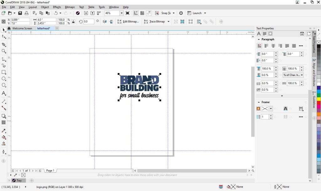
2. Then, insert your logo into the document. From the File menu, choose “Import,” navigate to your logo, select the file, press “Import,” and click within your document to place the logo file.
You’ll probably need to adjust the sizing of your logo. If so, just click on a corner of the image and drag diagonally to increase or decrease the size as needed. (If you drag other than diagonally, you’ll resize your logo disproportionately.)
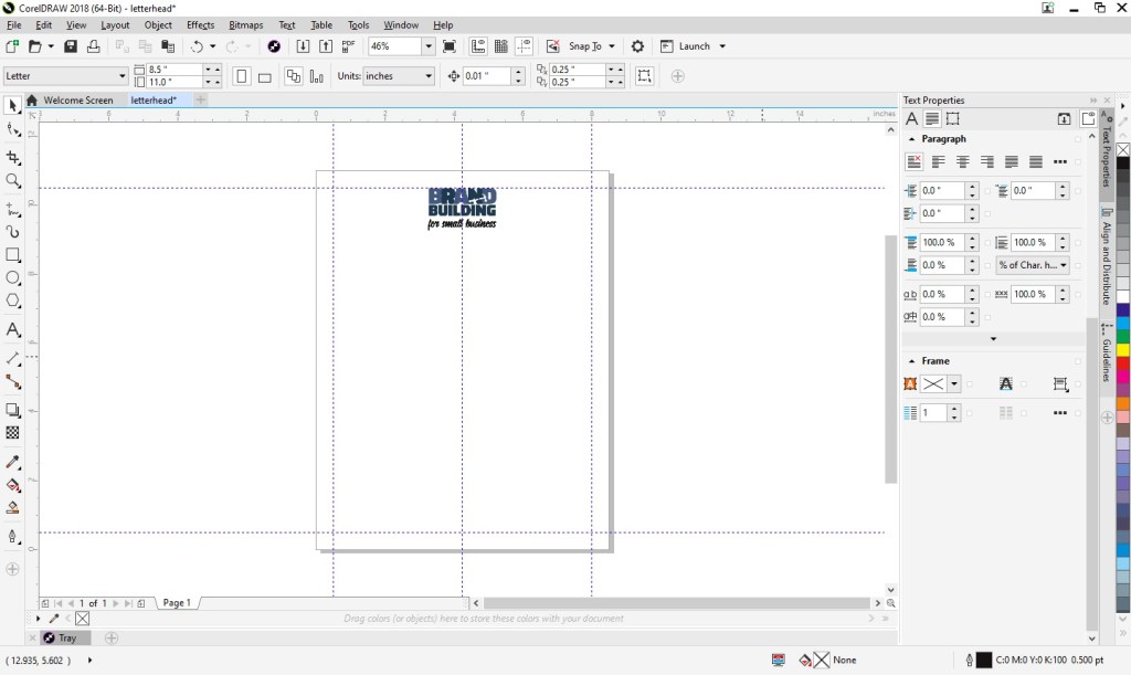
Next, move your logo so that the top of the image is aligned with your top guideline and the center of the image is aligned with the center guideline.
3. Next, you can add your footer. At left, you’ll see an A, which is the text tool. Click on that and create a square at the bottom of the page within the margins.
With the text box selected, set the font properties at the top of the page. (I went with Calibri in size 11 Centered.) At this point, zooming in on the text box is helpful. Click the magnifying glass at left (which is your zoom tool) and click on the text box.
In the footer, you can include your company name (or omit if you’d like since your company name is most likely already in your logo), your tag line (don’t waste any opportunities to educate people about your business), your web site address, email, address, phone number, etc.
You can begin typing by simply clicking into your text box. If you find you need to increase the size of your text box, click the top center handle and drag upwards as needed.
I included our business name, tag line, and web address; I also added some dashes above the web address for visual separation.
Next, zoom back out to the full page view by clicking on the magnifying glass and then selecting the “zoom to page” button at the top of the page.
Create another text box for your body copy. Click the A text tool and draw your box in between your logo and footer and within your left and right margins.
Set the font properties. (I went with Calibri Light in size 10).
And you’re done! You can now save your template future use. Go to File > “Save;” then, navigate to your desired location, name your file something that will be clear to you in the future (like “letterhead”), and click “Save.”
Feel free to download and use our letterhead as a starting point.
Where to Begin? Once you’ve made the decision for your business that you are going to build your brand from the ground up, you may find yourself a bit overwhelmed. I certainly did. In this post, I reflect on the beginning of my journey as I learned to focus on branding even while in survival mode.
What’s in a Name? This piece examines some of the considerations in selecting the right name for a well-branded operation.
Design Your Own Logo This tutorial provides a very hands-on approach to building your logo. Whether you are considering a totally new design or simply looking to adjust, adapt, and tweak an existing one, these tips (including where to find needed tools) should prove useful.
Know Your Audience A very basic but essential part of any branding exercise should be to make sure you know your audience and choose branding elements that properly reflect their characteristics. This article reviews some of the basics for you to consider.
How to Create a Mission Statement Need a little inspiration for crafting that ever-so-important message? This post includes a couple dozen great examples along with an exercise that breaks down the components of a good mission statement to help you develop yours.
The Role of a Brand Style Guide Once you have completed each of the above activities BUT BEFORE YOU BEGIN BUILDING BASIC TOOLS LIKE BUSINESS CARDS OR LETTERHEAD OR INCORPORATING THE ELEMENTS INTO MARKETING OR ADVERTISING EFFORTS, take the time to create a style guide that puts into writing the most basic rules that must be observed to properly build the visual element of your new brand.
How to Set Up Simple Print-and-Cut Business Cards Start with a blank Word document and develop business cards that are print-ready in only ten steps . . . this “how to” guides the way for you. A Corel Draw tutorial is available as well.
How to Easily Create Business Letterhead As integral as business cards and even easier to develop, letterhead created in Microsoft Word is presented as Instructions with Template Included and a Video Tutorial. Instructions and a template are available for Corel Draw as well.
Note: Many helpful downloadable tools/templates are provided to add extra value to the pieces described above.
Disclaimer: While we only recommend products we know and love, we want to note we use affiliate links and may earn a commission for purchases made through those links.
In an earlier post, we described how easy creating your own business letterhead can be in Microsoft Word. Well, they say a picture is worth a thousand words, so a video must be worth . . . a whole lot of words!
We really wanted to be able to show how easy some of our DIYs really are, and how better to do that than in live action? (The task of creating letterhead is done in about two minutes.)
So welcome to our first video . . . . Hope you enjoy it!
Disclaimer: While we only recommend products we know and love, we want to note we use affiliate links and may earn a commission for purchases made through those links.
Letterhead can be one of the easiest components of your brand . . . and have a significant impact, presenting your business to the world with professionalism and credibility. Still, people are often intimidated because they don’t realize the difference between a letter on a new, blank document and one on professional-looking letterhead requires just a few simple steps (three actually). You can have yours ready to use in about ten minutes, assuming, of course, you’ve already made the hard decisions about your brand identity and:
already have a logo;
have your chosen fonts; and
have selected your color palette to use with your logo.
1. From within Microsoft Word, go to File > New > Blank document. Start by preparing the main section of your letterhead and set the font properties; no text needs to be entered or selected to do this. Just choose a font and font size (I went with Calibri in size 10).
2. Then, click the Insert tab, press Header, and choose Edit Header.
Press Ctrl + E to set your alignment to centered. Then, press the Insert tab again, click Pictures this time, navigate to a high-resolution image (PNG, JPG, etc.) of your logo, and press Insert.
You’ll probably need to adjust the sizing of your logo as this point. If so, just click on a corner of the image and drag DIAGONALLY to increase or decrease the size as needed. (If you drag other than diagonally, you could resize your logo disproportionately.) Then, click in the open space to the right of the logo and press enter to add a line space. You’re now done with your header!
3. Scroll down to the footer and click within that area. Press the Home tab to set your font properties. (I went with Calibri in size 12 Centered.) In the footer, you can include your company name (or omit if you’d like since your company name is most likely already included in your logo), your tag line (don’t waste any opportunities to educate people about your business), your web site address, email, address, phone number, etc.
I included our business name, tag line, and web address; I also added some dashes above the web address for visual separation. And, voila! Done! Double click the space above the dashed line labeled footer to exit the header and footer and return to the main document. (At this point, the header and footer content will be grayed out, showing that you are editing the main body of the document. To return to the header and footer section, simply double click in either the header or footer sections.)
Before calling it a day, be sure to save your template. Go to File > Save as; then, Browse to your desired location, name your file something that will be clear to you in the future (like “letterhead”), and save.
Feel free to download and use our letterhead as a starting point.