How We Doin’ So Far?

Our blog – Brand Building for Small Business – has now existed for two years . . . so the time seemed right to stop and perform some self-examination AND (even more importantly) ask for some feedback.

When we defined OUR brand, we determined that our focus would be providing a useful tool to smaller businesses – the kind of largely under-appreciated entrepreneurs who form such an important portion of the American business landscape.  (Also – in retrospect – a group that has been hit particularly hard by the recent pandemic of 2020-21 and in need of every possible competitive advantage that can be made available.)  Having worked many years for a company that targeted this same audience (a company that was – in fact – a small, underdog start-up at the time I was hired), Carole and I felt we brought some meaningful knowledge and expertise to the table.  Hopefully (two years later), you – our audience – agrees.

In establishing our brand, we also decided that we wanted to have a DYI (Do-It-Yourself) focus – believing that many small business owners would of necessity be taking on the challenges of building their own brands.  Consequently, we have tried to offer a blend of the conceptual framework needed to build a successful brand as well as practical tips and instruction.  Specifically, we offer thoughts on:

  • Identifying your audience
  • Establishing (and communicating) the philosophy that guides your development of products and services
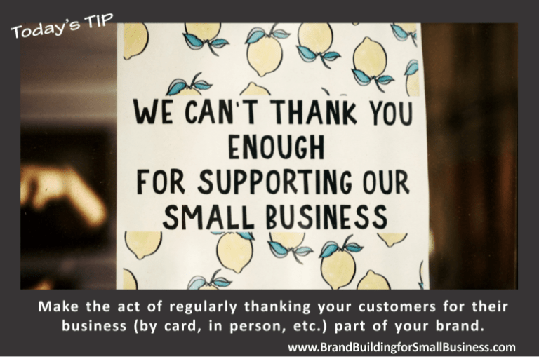
  • Embodying a strong customer service orientation
  • Creating mission and vision statements to serve as a reminder of your brand and your short- and long-term goals as an organization
  • Building the visual elements of your brand (such as your logo, letterhead, envelopes, business cards, etc.)

Note:  Learn more about these brand “building blocks.”

In fact, we have focused on providing concrete tips and instruction (and sometimes even templates) to assist the budding entrepreneur in being successful in creating a brand without having to break an already tight budget.  Basically, we’re trying to share some of the knowledge that we acquired the hard way through trial and – all too often – error!  To enable you to avoid some of our missteps, we’ve tried to help you define your brand and create the tools needed to have a unique visual identity. We have tried to emphasize and demonstrate the importance of creating an attitude toward customers that gives real life and substance to your brand and shows that you both “walk the walk” and “talk the talk.”

In addition, we have sought to help you recognize the importance of seizing every opportunity to promote your brand to the public.  Toward that end, we discuss some of the many chances an entrepreneur has while still maintaining a DYI focus.  For instance, we offer instruction on creating and inexpensively disseminating press releases as well as creating sales collateral, web sites, direct mail materials, ads, thank you cards, editorial calendars, and more.  In particular, we have sought to impress upon you the importance of using such platforms to highlight your brand . . . while simultaneously using your branding experience to enhance the effectiveness and results of such opportunities.

About a year ago, we started supplementing our longer, more in-depth, instructional materials with some Quick Tips and Monday Motivational messages to serve as fast, easily absorbed reminders that might help keep the subject of branding at the forefront of your minds and consciousness.

While we have been gratified to watch our audience grow, we are always hoping to reach even more of you even faster . . . and are particularly appreciative when we recognize a regular, repeat reader.  You’d might be surprised to know that some of you who have consistently “Liked” our content have actually become quite important to us and are even part of the way in which we measure the success of a specific article.  When we have NOT seen you “Like” a post or comment upon our content in a while, we miss you and feel like we have left you down!

All that said, we do plan to keep keeping on . . . but would love to receive some more feedback about how you think we are doin’ so far . . . as well as some requests about where you would want to see us head in the future.  Such interaction would be extremely helpful and would better enable us to help you even more.  You can use the Comment box below to get a message to us or you are welcome to send us a private e-mail at brandbuildingforsmallbusiness@gmail.com.  We promise to consider your input carefully.

Meanwhile, good luck with your branding efforts . . . and keep checking out AND SHARING our newest content at www.brandbuildingforsmallbusiness.com.

Blue

I recently realized the 50th Anniversary of one of my favorite albums (i.e., vinyls for those under 30) is upon us – Blue by Joni Mitchell.

While that fact has little to do with this blog, hearing the song did get me thinking that the time had come to write a piece that offered a reminder about the potential importance of color selection in building a brand . . . and also reminded me that I have spent a disproportionate amount of several decades staring at various shades of the color blue while at work!

To quote information cited by Jill Morton at the Colorcam website in an article entitled Why Color Matters:

1. Research conducted by the secretariat of the Seoul International Color Expo documents the following relationships between color and marketing:

92.6 percent said that they put most importance on visual factors when purchasing products. Only 5.6 percent said that the physical feel via the sense of touch was most important. Hearing and smell each drew 0.9 percent.

When asked to approximate the importance of color when buying products, 84.7 percent of the total respondents think that color accounts for more than half among the various factors important for choosing products.

Source: Secretariat of the Seoul International Color Expo 2004

2. Research reveals people make a subconscious judgment about a person, environment, or product within 90 seconds of initial viewing and that between 62% and 90% of that assessment is based on color alone.

Source: CCICOLOR – Institute for Color Research

3. Research by the Henley Centre suggests 73% of purchasing decisions are now made in-store. Consequently, catching the shopper’s eye and conveying information effectively are critical to successful sales.

Pick Wisely for Many Reasons

During my decades of working in the field of communications, over 90% of my time was spent with the corporate color of blue – most recently PMS 301/C-100 M-43 Y-0 K-18/R-0 G-109 B-168 . . . but more about those cryptic codes later.  Admittedly, the exact hue and tone have changed three times, but blue has paid a particularly large role in my professional life.  Frankly, my only non-blue moments came from work done for a variety of business partners, subsidiaries, or off-shoots of my main employers.  When I would finally get to do green for a bank or a burgundy red for a data encryption company – the new sense of freedom was an enormous guilty pleasure!!

So . . . How Was Blue Chosen?

The initial selection was far enough back in time that branding had yet to become a separate phenomenon and discipline.  As a result, I’m inclined to think the choice was mostly a matter of good instincts or dumb luck or perhaps a bit of both on the part of my employers at that time.  You see, the company was involved in insurance and financial services – an industry that now seems to disproportionately and not coincidentally favor blue as a corporate color.

Why?

Much has been written on the characteristics and impact of various colors, so I won’t reinvent that wheel but will quote from one such example while letting you know that countless others are available with the similarities far outweighing the differences in message. 

At the Canva website in an article entitled Understand What Colors Mean, the following overview is provided:

 “A lot of research has gone into color theory. You can definitely get lost down the rabbit hole finding the story behind each color, however, here’s a quick summary to give you an idea:

Red is associated with danger, excitement, and energy. It’s also known for being the color of love and passion.

Pink is feminine, it’s sentimental and romantic. Different shades, like hot pink, can be youthful and bold.

Orange, like it’s namesake, is fresh and full of vitality. It’s also creative, adventurous, and associated with being cost-effective.

Yellow is optimistic. It’s a color associated with being playful and happy.

Green is natural, often used to demonstrate sustainability. But it can also align with prestige and wealth.

Blue is trustworthy and reliable. It’s calming or often associated with depression.

Purple is royalty and majesty. It can be spiritual and mysterious.

Brown is down-to-earth and honest, often used for organic wholesome products.

White is pure. It conveys simplicity and innocence, often with a minimalistic feel.

Black is both sophisticated and elegant. It can be formal and luxurious, but also sorrowful.

Multicolor is united or open to anything. It’s great for capturing the spirit of diversity.

Of course, within this spectrum, there is a raft of additional colors. Different hues, such as baby blue or navy, also contribute to the color story.

Also, I suggest you look at an article entitled The Business of Color by vistaprint, which associates specific industries with particular colors and includes a useful graphic for quick reference.

More About Color

While I have been describing color in terms of broad generalities such as “BLUE” – be aware that an almost infinite number of tones, hues, and variations exist . . . and every time you use or reference the color you have chosen for your brand, you must be sure to reproduce the exact same variation regardless of the media, which can be challenging!!  Fortunately, a number of color systems (i.e., palettes) exist that allow you to successfully match exact colors AND communicate with potential vendors (like web site designers, printers, novelty manufacturers).  Furthermore, becoming familiar with these industry-standard systems of identification at the time of selection can prevent some later headaches.  For example, I was once involved in choosing a color, and we based our selection exclusively upon look . . . only to find that we had picked a specific tone with no 100% match under two of the most common matching systems!

Remember my earlier cryptic reference to:   PMS 301/C-100 M-43 Y-0 K-18/R-0 G-109 B-168?  Well, PMS refers to a color matching system produced by Pantone and universally recognized as one industry standard.  CMYK is a system based on mixing Cyan-Magenta-Yellow-Black to produce essentially any color imaginable and is the method most commonly used by commercial printers and imprinters.  Similarly, RGB is a Red-Green-Blue based system most frequently used to identify colors for onscreen use like websites, a/v presentations, etc.  And yet, still other variations such as HEX exist, each with strengths and weaknesses for specific applications.  Ideally, you want to select a color that produces a specific matching value under each of the most common systems.  (In that instance I mentioned earlier, the fact that the color we had chosen did not have an RGB and CMYK value that represented the exact same color – a fairly rare circumstance –resulted in continual headaches that could have been easily avoided. )

As you have opportunities to use these systems in specific applications, you will begin to appreciate that color matching is as much as art as a science . . . but we’ll save further exploration of that topic for a future article.

Where Will You Use Your Corporate Color?

Everywhere.  That repetition is the essence of good branding – building quick, positive, and familiar recognition.

Specifically, your chosen color will become part of your logo, web site, advertisements/ad campaigns, novelty items, store decor, product displays, clothing/uniforms etc. 

Color does matter.  Frankly, I can’t imagine Joni Mitchell’s classic album Blue would have lasted 50 years had another color – such as red – been chosen!

Landing Pages and Sales Campaigns (i.e., Make Them Land on Your Brand)

Whenever you are conducting a sales campaign, you are certain to have a “pitch” about the differentiating qualities of your product or service that results in a call to action such as a request to buy from you.  In our experience, a simple, well-executed, Internet landing page can be the most effective vehicle for accomplishing that task . . . and your landing page can provide an important opportunity to reinforce (and capitalize upon) your brand.

What Is a Landing Page?

According to “Unbounce” (a developer in the field):

“In digital marketing, a landing page is a standalone web page, created specifically for a marketing or advertising campaign. It’s where a visitor ‘lands’ after they click on a link in an email, or ads from Google, Bing, YouTube, Facebook, Instagram, Twitter, or similar places on the web.” (https://unbounce.com/landing-page-articles/what-is-a-landing-page/)

Getting Started

That said, landing pages are of course web pages . . . but unlike home pages or other content pages on your site, these have a very dedicated function and are constructed differently.  Whereas home pages – for instance – are created to communicate lots of information and encourage exploration, landing pages basically:

  • Reinforce your sales pitch as concisely as possible.
  • Offer supporting evidence (such as testimonials or research data) to help clinch the sale.
  • Provide a simple form to complete the transaction.
  • Include a logo that links to your home page (but just that) for those who need more information to finalize the sale.
  • Reflect the branding of the company to take advantage of past efforts to establish a readily recognizable identity that adds value to the product and/or service being sold.  (IMPORTANT:   Be sure your web site/homepage, sales vehicles, and landing pages all reflect the branding elements decided upon in your Style Guide to gain maximum value from each of them.)

Whether you are building your landing page from scratch . . . or are simply customizing one of the many templates now available, we have found a few key points worth remembering during your development:

  • Your goal is to be as simple, direct, and concise as possible.
  • Your headline and any body copy should reflect your sales pitch (i.e., differentiating sales qualities) being used at that time in ads, direct mail pieces, social media, mass e-mails, etc.  (Remember:  Landing pages are for TRANSACTIONS so keep copy and content short.  If a bullet point or two will suffice, use them.  Save your long, persuasively written copy for your web site and sales tools.)
  • Include art/graphic elements but limit the quantity to one or two mirroring the images of your sales pieces and consistent with the elements of your branding Style Guide.
  • Typically, a form will be used to complete the sale or other transaction.  Keep your requests as lean as possible with the absolute minimum number of fields required to accomplish your mission.  For example:  If your ultimate goal is to collect e-mail addresses to build a data base, just get that piece of information and use that at a later date to gather other details.  Your goal is to enable the interested party to complete the transaction as quickly and easily as possible, guarding against losing them along the way.
  • As part of incorporating your brand, plan (as previously mentioned) to include a copy of your logo that links back to your home page.  However, other navigation that does not fulfill the call to action should be excluded.  (Why risk the distraction?)
  • Sales campaigns usually use multiple media such as ads, direct mail, social media, etc.  Employing the same landing page for each of them can facilitate tracking efforts . . . but you want to be sure you can identify the source that generated the lead.  While a number of alternative strategies exist, one way to accomplish this objective is to use multiple copies of the same page with an identification such as “1” for ads, “2” for mass e-mails, “3” for snail mail, etc.  With all of your results arriving via your landing page, you get a very clear picture of your most successful sales vehicles AND have a bit more control over the closing of the sale, including any necessary follow up of now qualified leads that might be required.   Since so much time, effort, and expense is invested in developing a warm lead, you can’t afford to have any fall between the cracks.  (In my past life, we felt so strongly about this issue that our landing page was the only contact information provided on our sales vehicles; we did not include a phone number because we wanted to make sure all telephone contact was as timely and structured as possible.)

A Word About Testing

Like other sales materials, landing pages can be constructed in a number of different ways.  In our experience, running a controlled test of multiple versions before a limited audience should reveal which elements work best and which version should ultimately become part of your sales campaign.

Land on Your Brand!

Just for emphasis, we will close this article by repeating the importance of making your landing page reflect both the branding elements and the design and pitches used in the corresponding campaign.  Since your landing pages are designed to “seal the deal,” failure to fully reflect your branding wastes the time, effort, and resources spent shaping your identity and misses the last opportunity to have a positive impact upon the sales process.

Note:  To further develop this theme, a future article will be devoted to creating a landing page for our blog that further illustrates these principles in action.  For now, those interested in learning more can check out the writings of Neil Patel:  https://neilpatel.com/blog/beginners-guide-to-landing-pages/.

Role of Branding in Business Plans

As a small business entrepreneur, you’ve probably had one or more of the following needs to prepare a business plan.  To:

  • Help start up a new business.
  • Get capital for an existing business to fund growth.
  • Recruit investors.
  • Obtain a grant.
  • Develop strategic alliances with potential partners.
  • Sell a company.
  • Expand into a new area of operation.
  • Attract employees.
  • Plan for the future.
  • Etc.

If so, you already know that most templates and discussions about appropriate content seem to contain similar advice. 

Being a bit different can help you stand out from the crowd.

For example, Indeed.com offers the following:

10 essential components of a business plan

Effective business plans must contain several key components that cover various aspects of a company’s goals. The most important parts of a business plan include:

  1. Executive summary
  2. Business description
  3. Market analysis and strategy
  4. Marketing and sales plan
  5. Competitive analysis
  6. Management and organization description
  7. Products and services description
  8. Operating plan
  9. Financial projection and needs
  10. Exhibits and appendices”

(See https://www.indeed.com/career-advice/career-development/parts-to-a-business-plan#  for more information.)

If you go to Wikipedia (https://en.wikipedia.org/wiki/Business_plan), you will find a very similar general outline, though with a few variations such as a separate subsection for the company Mission Statement.  However, I personally have not found that many of these discussions and templates have chosen to overtly incorporate a discussion about branding.

Frankly, mine have, and yours should!

Specifically, consider including a section labeled “Branding” that incorporates a discussion of the current status (showing any research done) as well as plans and expectations for the future.  These days, brand has a very real and monetary value.   I’m sure all of us have heard of someone buying another company “for the name” because the reputation associated with that entity has value in the marketplace.  These days, I believe you should think of brand similarly.

 Although I do believe brand can be appropriately included as a separate named section, you can also build your content into several of the sections traditionally included in most Business Plans.

For instance:

Business Description – Since your brand encompasses both your product and the services used to deliver that product, any Business Description will benefit by including a discussion of this kind.  Also, the process of defining your brand identifies your audience which, in turn, clearly suggests the needed distribution channels.

Market Analysis and Sales Plan – Your chosen niche within the marketplace is defined by the way in which you identify and communicate your brand.  By discussing your market in this way, your analysis will be more precise and your strategy will be more persuasive.

Competitive Analysis – A well-formed brand communicates the way in which you’ve chosen to differentiate yourself from others and highlight the sales advantages you’ve carved out for your operation.   If you try to write this section without incorporating your brand (i.e., who you are), a clear description of your competitors (those who share some of the same products and services) will not be possible.

Products and Services – This section generally includes additional details about the products and services provided by your company, so highlighting the qualities that distinguish them (i.e., their branding) is both appropriate and useful.  Also, a discussion of your brand can illustrate some of the “spin offs” that can evolve to take advantage of the existing audience of your brand.  Furthermore, part of the brand of your company is your underlying service philosophy and the standard of excellence you establish.  Such qualities are the ones that help create a corporate culture associated with your brand in the eyes of both your customers and your staff.

Operating Plan – In discussing the day-to-day operations of your company, including how you go about delivering your products and services to consumers (number of employees, equipment required, etc.), be sure to highlight the ways in which a strong, branded corporate culture supports those activities as well as describing any visual clues you might be using to help define yourself.  For example, will uniforms be required?  What kind of signage will support operations?  What form of communication will be put into place to set customer expectations and ensure smooth trouble-free operations?  If a separate section for Risk Factors is not included, that content might become part of this section, and the success and failures of your branding play a huge part.

Exhibits and Appendices – Among the typical exhibits you might find in the appendices are brief bios of key staff, organization charts, flow charts, etc.  Similarly, you should consider including any research done to support the success of your branding.  For example, results of a survey that suggest a high degree of name recognition within the community would be very useful as well as commentary from focus groups that suggest your brand has positive connotations.  I would also consider adding a page about your Brand Style Guide or perhaps a copy.  (See https://brandbuildingforsmallbusiness.com/2019/09/17/brand-basics-part-3-the-role-of-a-brand-style-guide/.)  Finally, your Brand Plan should be addressed similarly.  (An upcoming article will be devoted to the creation of this separate document.)

As these examples suggest, a company’s branding can play a part in virtually every section of your business plan.  When drafting a section, you just need to continuously remind yourself to consider whether some thoughts about the role of branding should play a part.  Nine times out of ten, the answer will be “yes,” though the references can range from the incidental to the extensive.

The One that Got Away . . . !

During the course of your career, you will more than likely have a few opportunities to brand or rebrand a business from scratch.  While very exciting, recognize that such moments occur sparingly . . . so be sure to approach the task with appropriate enthusiasm and seriousness of purpose.  Also, be forewarned that – once you become personally invested in the process – some serious disappointment can follow.

Failure is just part of a normal learning curve!

Many years ago, I had one such chance very early in my career – in this case, to brand a bank.  My employer at the time had just purchased a very small, rather archaic financial institution and was planning to broaden and modernize the level of services provided under a new national charter . . . while hopefully maintaining the modest, existing customer base within the immediate community.

Clearly, this circumstance called for some advertising and publicity to let customers know about present and future plans (trying to generate some enthusiasm for the changes) while reassuring them that the key qualities they already liked would not be lost.

An interesting . . .and difficult challenge!

To get started, we looked at the bank’s name and byline.  Since we hoped to build a bridge between the past and future, we retained part of the original name . . . but with some tweaking.  We were also looking to build upon the existing community identity but signal that enhancements in size, scope, and capability were coming, so we adopted the byline “Your Neighborhood National Bank,” which seemed to capture the idea (and benefits) of big and small in few words. With those two decisions and a few more about logo, color, and font already behind us, we were off and running to the next phase of our rebranding.

Working with a graphic artist, the two of us developed a proposal for an extensive branding campaign.  Since funds were available but somewhat limited, we knew such an initiative would have to unfold over time.

Deciding to give life to our new corporate byline (“Your Neighborhood National Bank”), we created a line drawing/cartoon of a typical community, showing the various elements – both commercial and residential – that would be touched by the bank throughout the course of the year.  For each structure portrayed, we saw a story being featured.  For example, the houses would be used to tell the tale of a family’s first mortgage with another involving the tale of a home improvement loan to add a new bedroom for the addition of a child.  A contractor’s truck in front of the latter provided a vehicle for illustrating small business loans . . . while a tale of college tuition being made available could be triggered by the photo of a teenager in a cap and gown getting a family picture taken up the street.  We would even try to highlight our bank’s growth into areas like new car auto loans by showing a billboard featuring the product.  Basically, we believed this flexible theme could be used to highlight every possible product while a consistent neighborhood brand got promoted that emphasized the very real human stories that got affected every day by the actions of our community bank.

Over time, we figured the regularly reused neighborhood artwork would become very familiar and well-known . . . and people would eventually understand, identify with, and care about the stories being told. Furthermore, the slice of the community shown could be enlarged as needed to accommodate new products and services featured by the bank . . . AND the overall approach worked well across multiple media – from print ads and brochures to TV and radio spots as well as billboards and novelty items.

In other words, we had a very broad vision for developing a brand that could support years of repetition while retaining sufficient flexibility to change and grow as needed to reflect reality in a fresh way and ever-evolving goals.  In our minds, we already saw the customers of the bank getting sufficiently attached to this neighborhood to do whatever was necessary to get the latest Christmas Club toy bank giveaway item for their homes.   Obviously, we had a vision for this brand and had allowed ourselves to get very excited by the possibilities.

So, Was this Campaign and Brand Strategy Successful?

Given the buildup I’ve already presented and the clear sense of the faith we had in our plan, the logical question that comes to mind is – WAS THE CAMPAIGN SUCCESSFUL?

Unfortunately, we will never know because this proposal is the one that got away!

At that time, funds were somewhat limited because the bank had just been purchased and lots of systems modernized with newer technology – all of which represented a significant investment AND expense.  While a certain amount of money had been allocated for advertising and publicity, some of the senior sales staff was proposing the available funds be used instead for a shorter-term promotion aimed at encouraging growth of a passbook savings product (a once very popular form of saving account that had already become a bit passe).  While we pitched our use of the funds for our longer-term branding plan, the head of sales was all for publicizing a 6% return on passbook savings with the focus of all publicity being a BIG  6 – including a full-sized Formica sculpture to sit outside the bank as well as in huge ads in the local newspaper.  Convinced this approach would do some immediate, short-term good, the sales team backed this pitch with full enthusiasm and argued that a branding proposal would not address our immediate need for growth.

In the end, the “BIG 6” campaign carried the day and was launched shortly thereafter.

Woulda, Shoulda, Coulda

In my mind, our extensive and elaborate branding plan woulda/shoulda/coulda worked to build a loyal and solid base of customers – a foundation for long-term growth.  Instead, the prototype artwork for the neighborhood sat in my desk for many, many years gathering dust.

Decades have now passed since this missed opportunity first occurred . . . but I still look back with disappointment and wonder whether the plan would have been successful. However, I’ll never know because this pitch is the one that got away.

On the other hand, the promotion that was implemented (with my help and participation I might add) was moderately successful and basically accomplished the more modest, very specific intended goal of savings account growth.  Furthermore, the bank increased in size and scope over time before eventually being sold to a much larger bank that was eventually swallowed up by an even larger bank.

So, was the decision to go with the Big 6 campaign the wrong one?  I’m quite certain that I’m the only one who was left with a sense of unanswered questions about this choice . . . and a few regrets.

The Moral of this Story

 I guess this particular story and experience come with several “morals”:

  • When developing a new brand, think BIG.  Come up with a plan that’s broad enough to encompass many initiatives in many different media over time . . . while still promoting the same basic, simple brand message.
  • Branding is a long-term effort that will often (if not always) end up competing with short-term needs for the use of the same funds (i.e., promotions).  Therefore, select branding that can support both long- and short-term strategies . . . if at all possible.
  • Learn to be resilient in dealing with failures – those magnificent pitches that lose out to “lesser” plans.  As an entrepreneur, you understand that loses are just part of the learning curve to success and that nine ideas out of ten will “crash and burn” . . . but you only need that one to make progress.   In other words, learn to “live to fight another day” and give yourself time and opportunity to find your one victory among the defeats. 

Overtime, the key role of branding has become more widely recognized and appreciated . . . but is still a “hard sell” very often because the benefits are not always either immediate or easy to quantify.  I kind of suspect that anyone involved in product branding long enough will have their own sad story about a plan that would woulda/shoulda/coulda transformed the company to a billion-dollar enterprise – in other words, their own versions of the one that got away.